Preview image. Unlock full-res
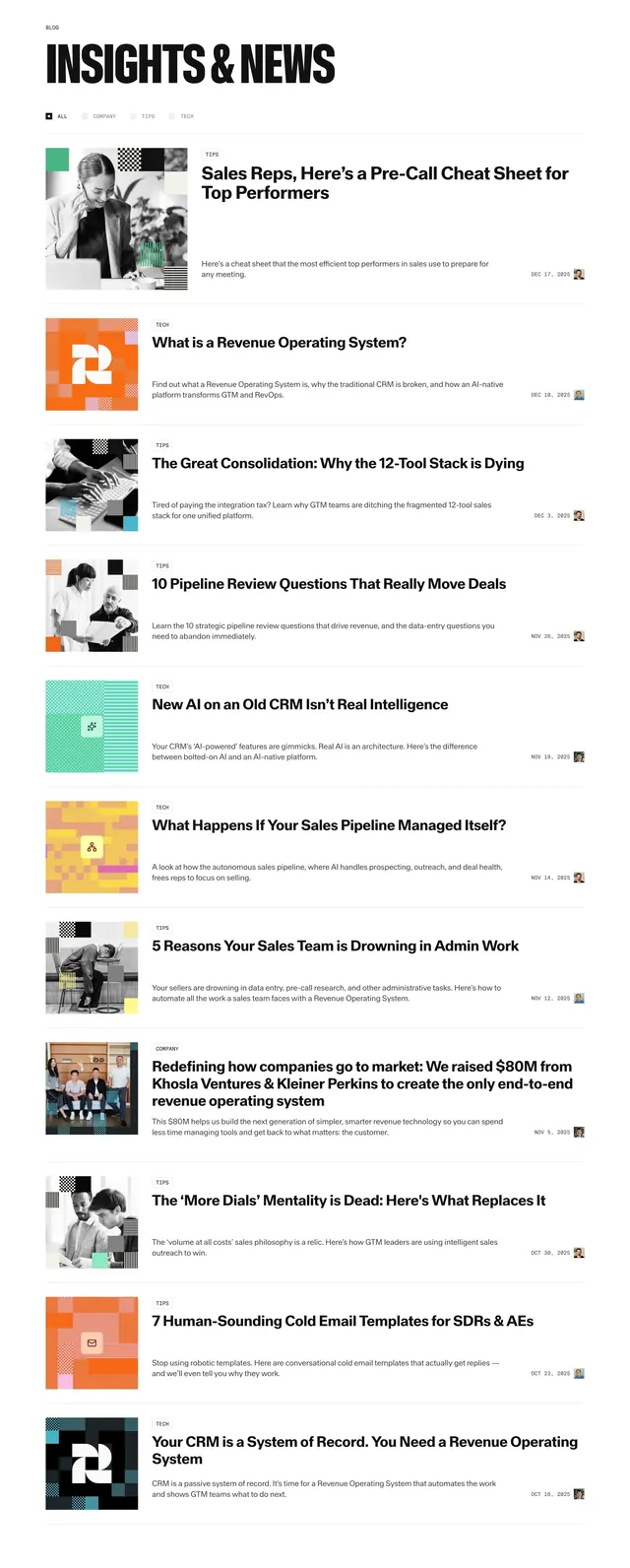
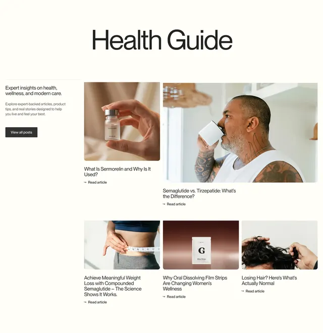
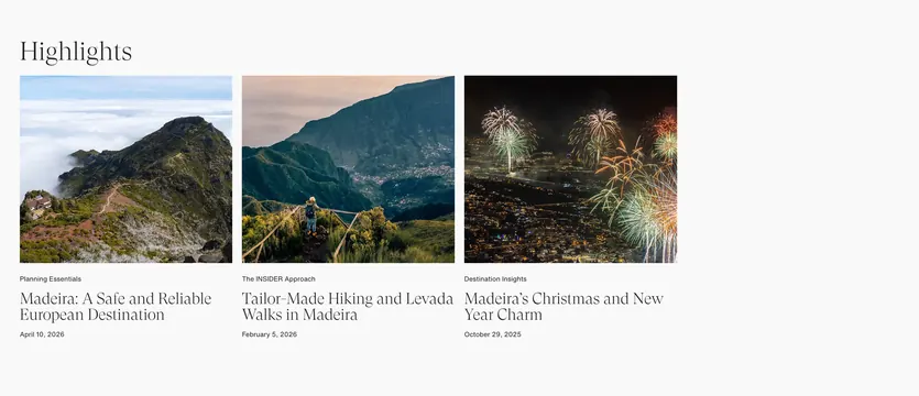
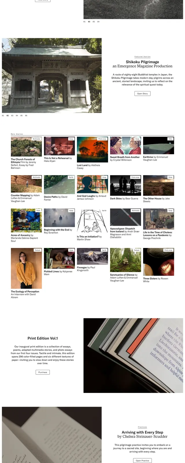
A minimalist magazine homepage with a centered editorial intro, dense article grids, and large photographic feature modules on a bright white canvas.
Summary
A minimalist magazine homepage with a centered editorial intro, dense article grids, and large photographic feature modules on a bright white canvas.
Visual description
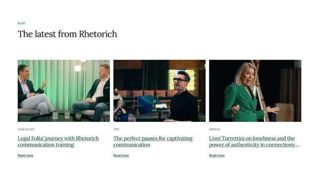
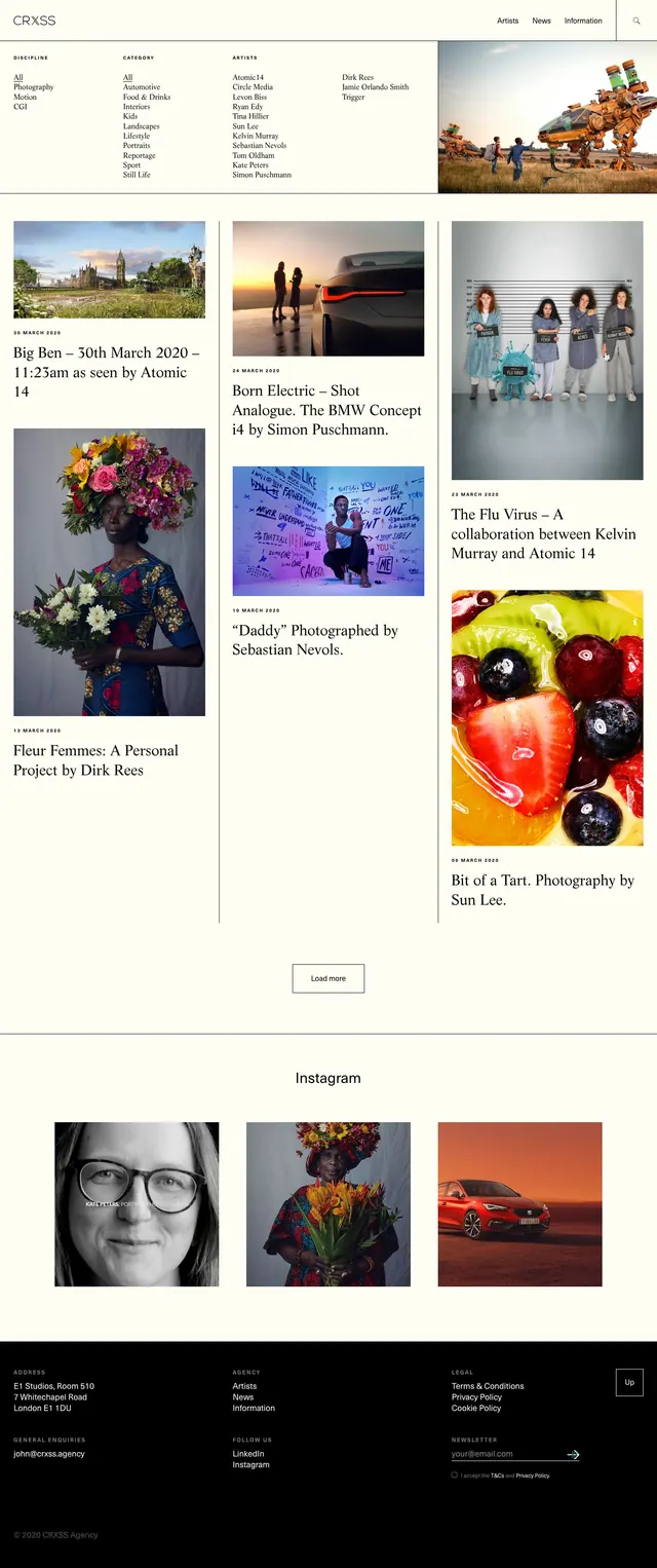
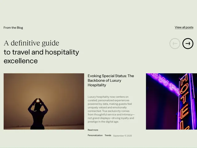
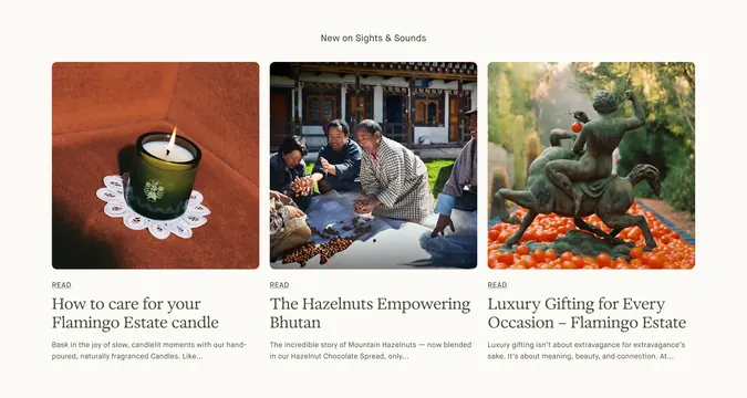
The page uses a large amount of white space with a small top-left logo and compact top-right links for Login and Menu. A centered editorial note sits above a row of story cards with thumbnail images, category badges, and serif headlines. Lower on the page, the layout shifts into wider feature blocks and multi-column article grids, ending with a dark footer and repeated brand mark. The overall look is image-heavy, text-light, and tightly organized like a digital magazine front page.
Key takeaway
Strong use of whitespace and restrained navigation lets the photography and article titles carry the page. The mix of small UI labels, serif headlines, and modular cards creates an editorial rhythm that feels curated rather than promotional.
Reuse notes
Use this pattern for media sites, essays, or content libraries where stories need to feel premium and browsable. It works best when the imagery is strong and the content can be grouped into featured cards, sections, and a simple footer.