Preview image. Unlock full-res
A playful fintech landing page with a bold editorial hero, illustrated line-art figures, and peach gradient promotional sections.
Summary
A playful fintech landing page with a bold editorial hero, illustrated line-art figures, and peach gradient promotional sections.
Visual description
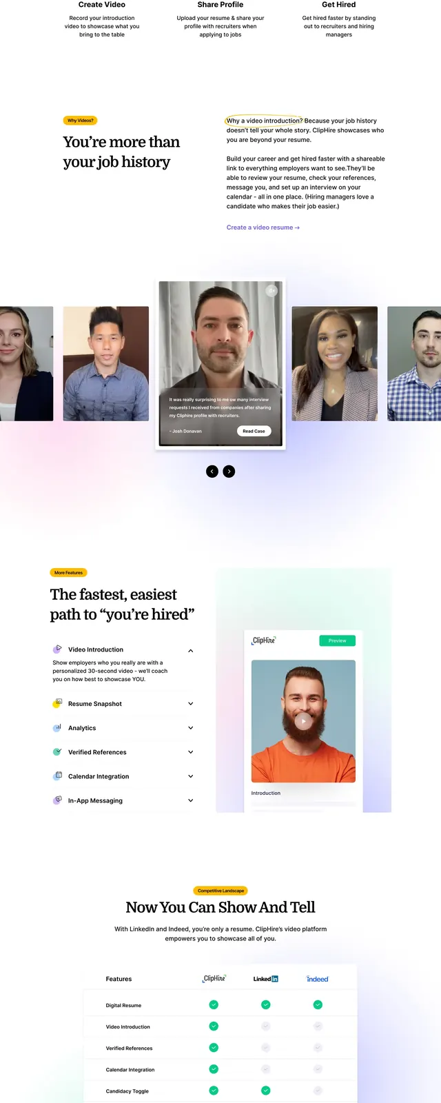
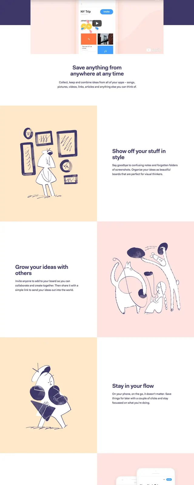
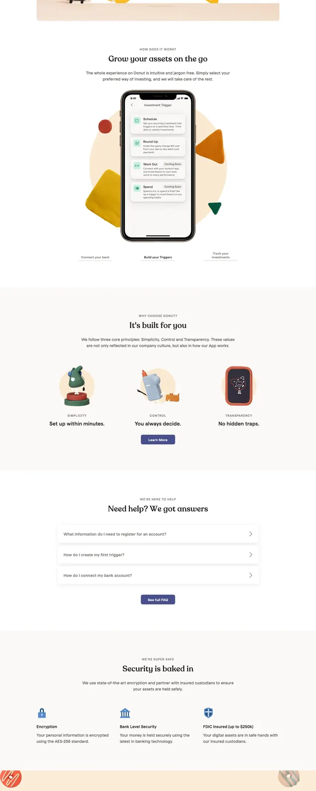
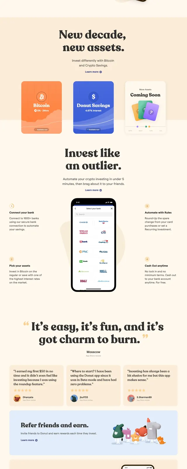
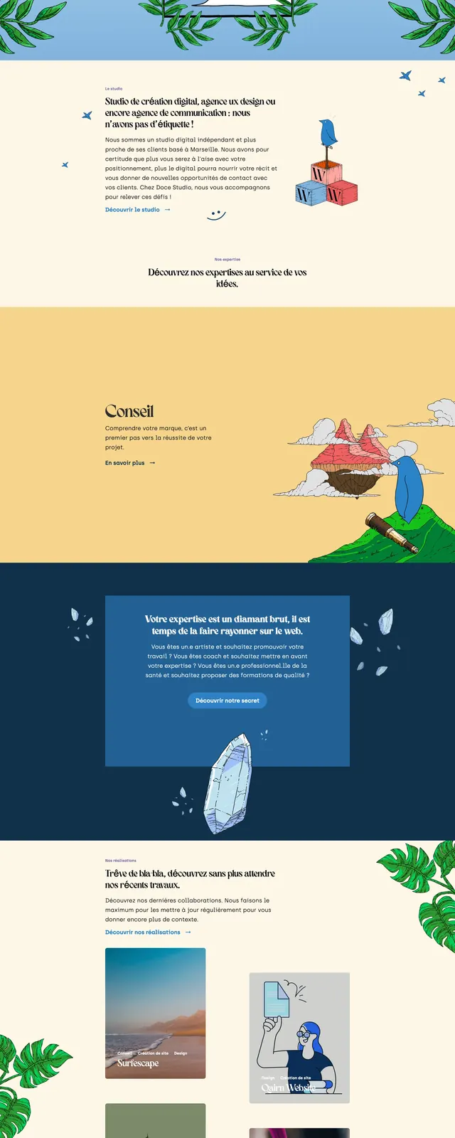
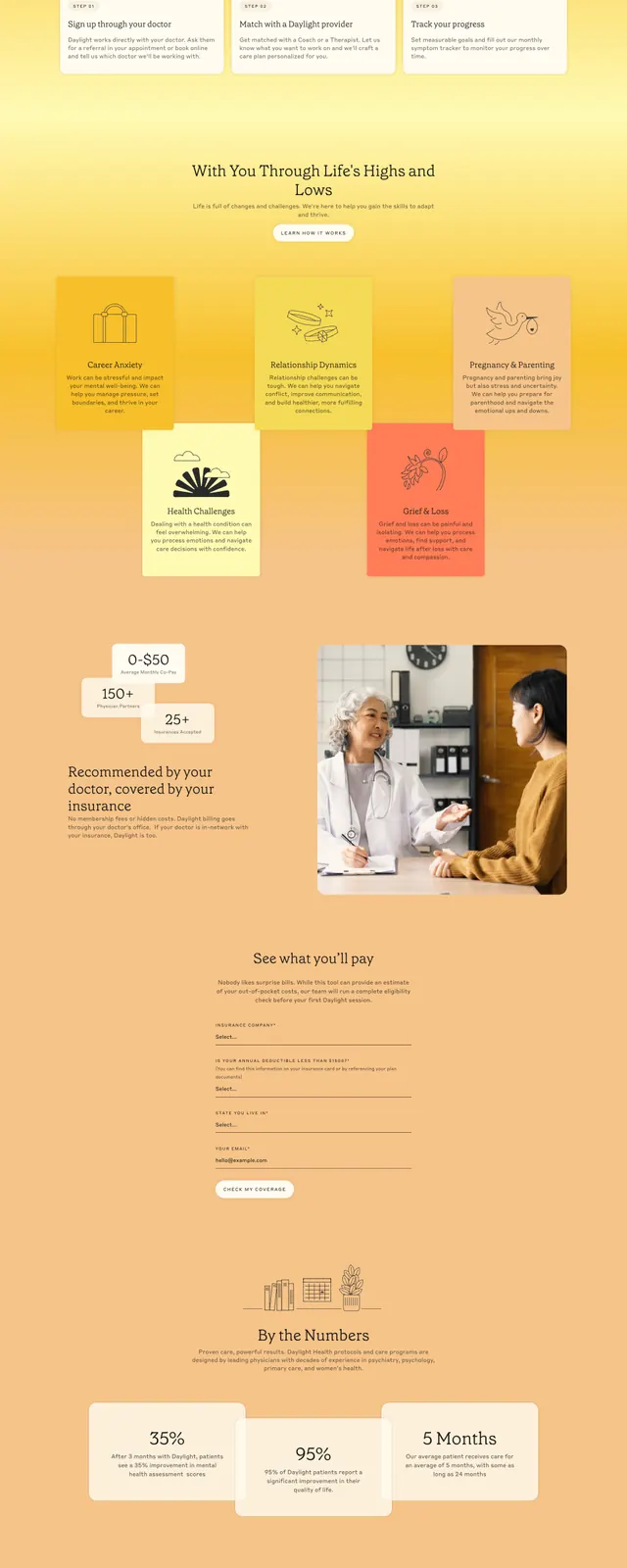
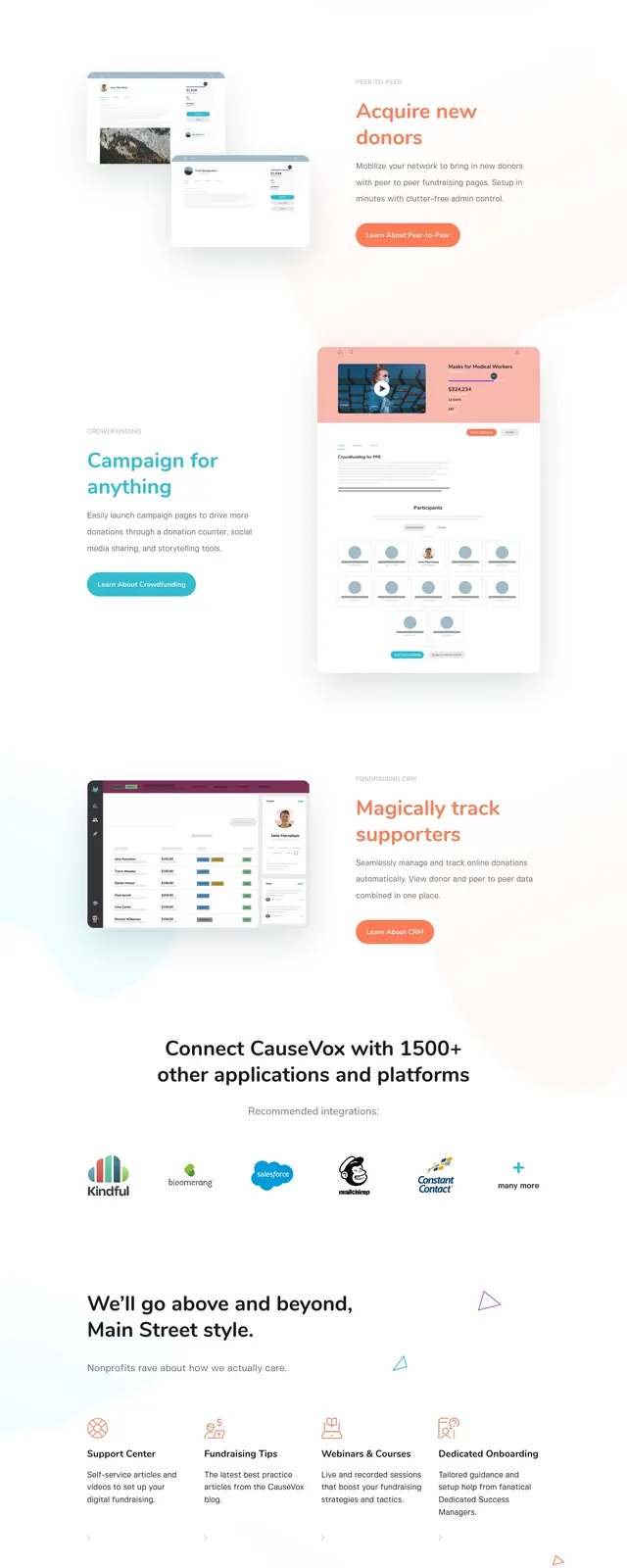
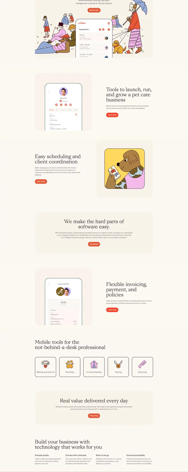
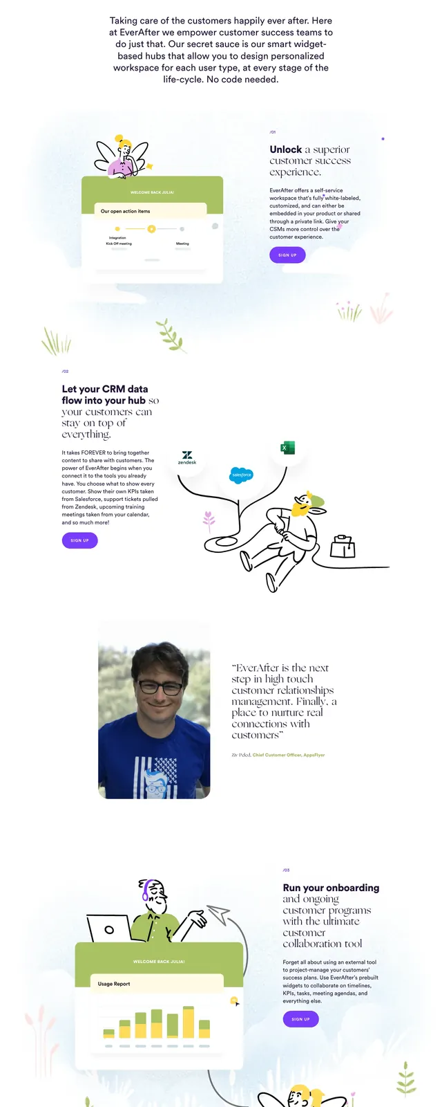
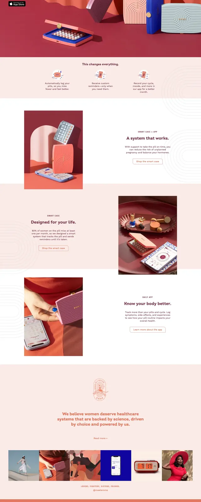
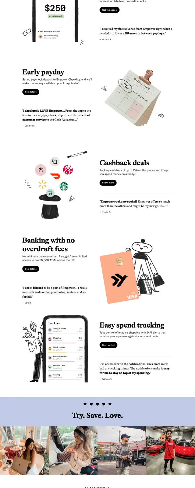
The page opens with a centered top navigation, a large serif headline on the left, and a hand-drawn illustration on the right. Below the hero are trust badges and a series of vertically stacked promotional sections with alternating image-and-copy layouts, including app-store promotion, cashback deals, overdraft fees, and spend tracking. The design uses generous white space, peach-to-pink gradient panels, and sketch-like graphics alongside small black CTA buttons. The footer switches to a dark block with compact links and legal copy.
Key takeaway
The strongest pattern is the contrast between editorial typography and informal hand-drawn illustration, which makes a financial product feel approachable. The alternating split sections and warm gradient banners create a strong reusable landing-page rhythm.
Reuse notes
Use this structure for consumer fintech or any app that needs trust plus personality. It works best when paired with simple CTAs, short benefit statements, and custom illustrations rather than heavy product screenshots.