Preview image. Unlock full-res
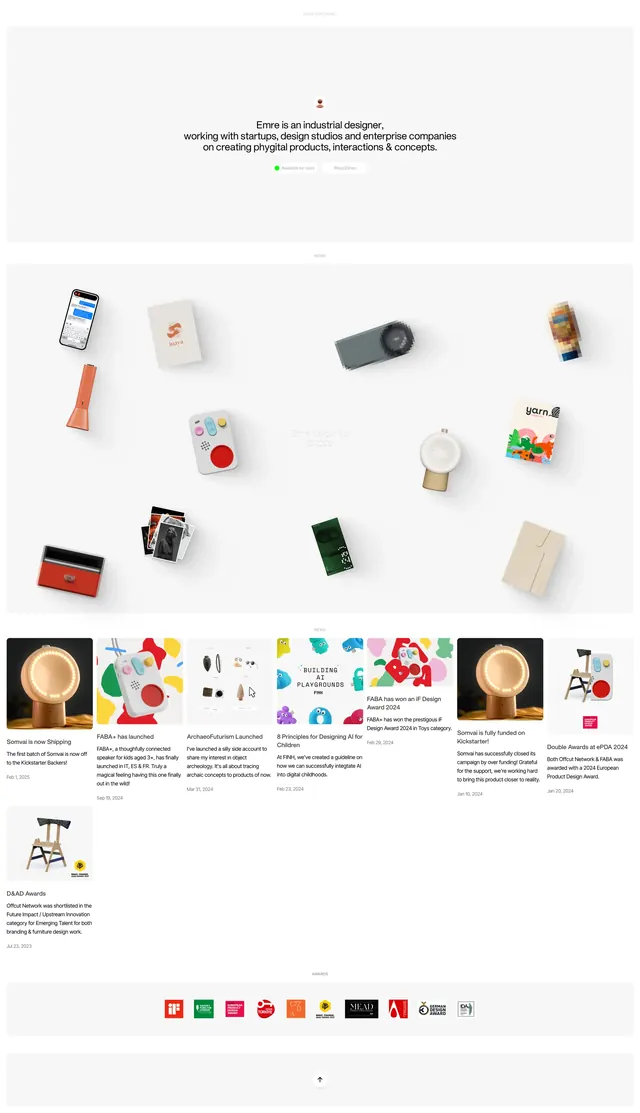
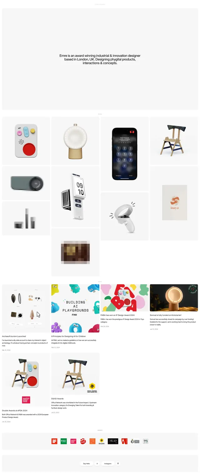
Minimal portfolio-style landing page with a centered intro and a stacked grid of product and project cards below.
Summary
Minimal portfolio-style landing page with a centered intro and a stacked grid of product and project cards below.
Visual description
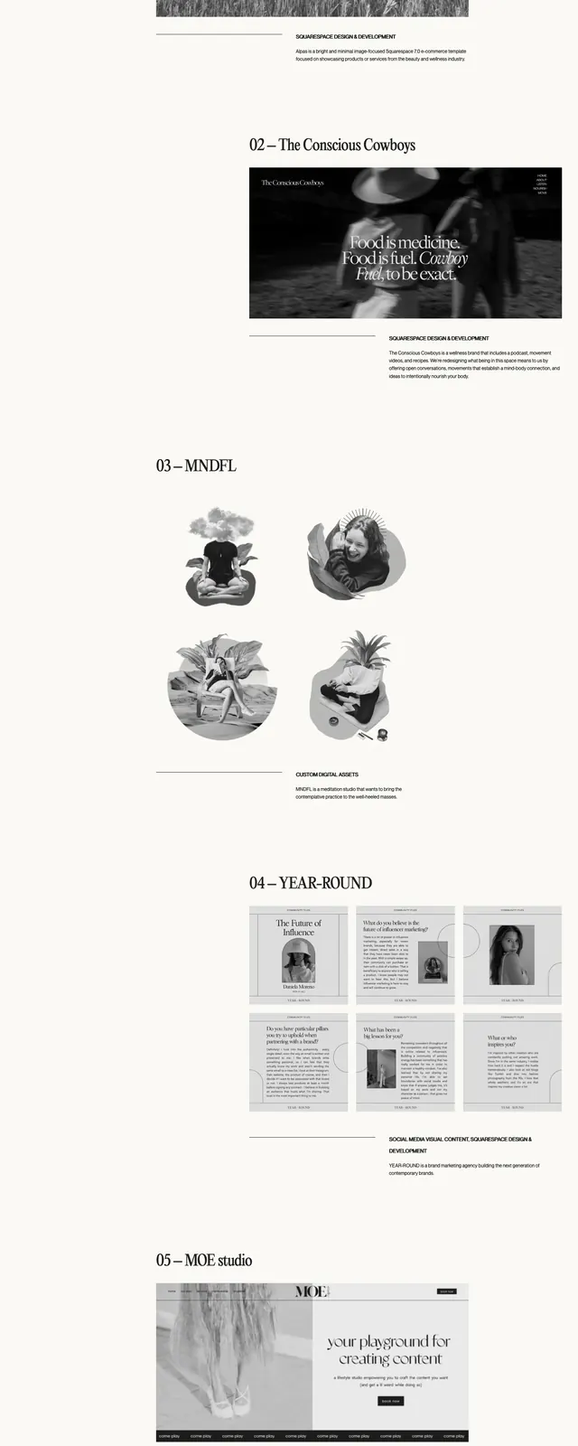
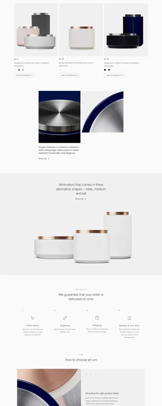
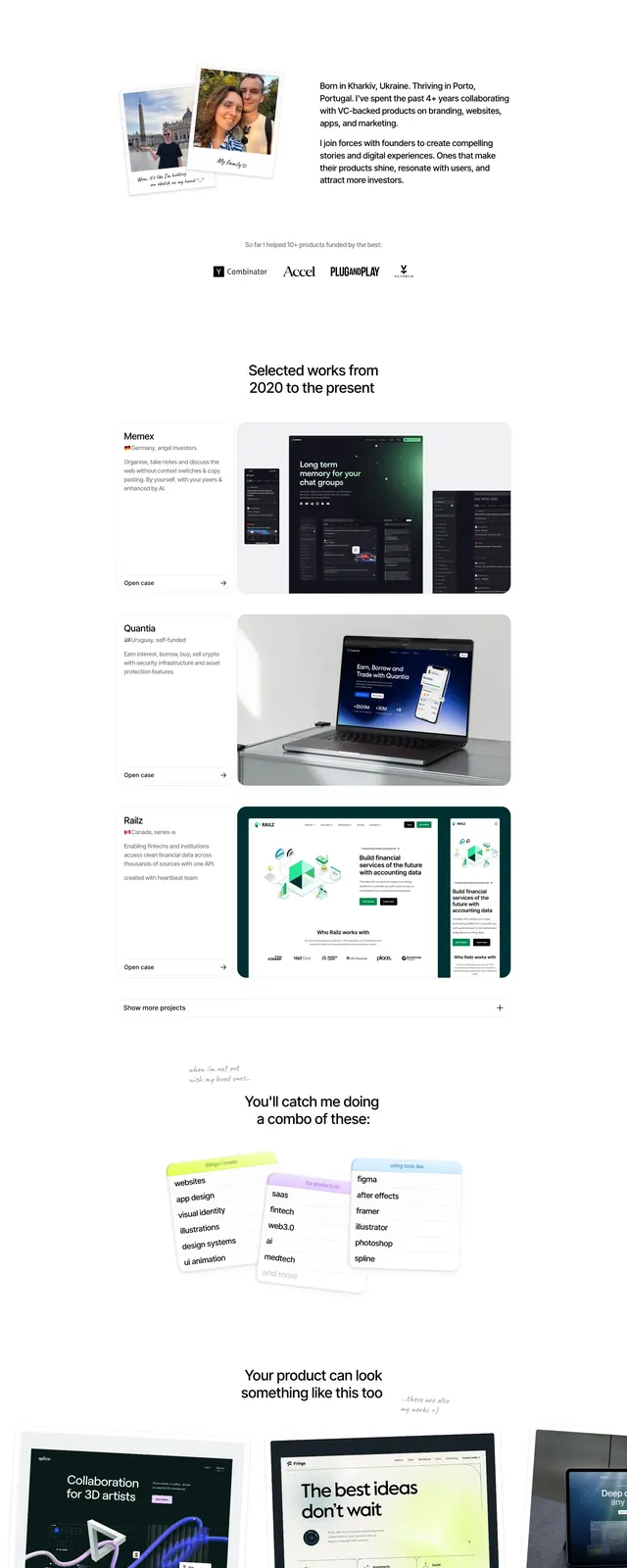
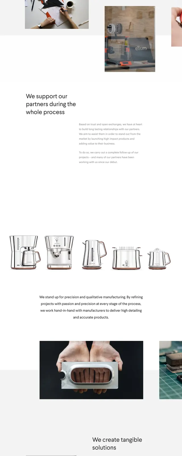
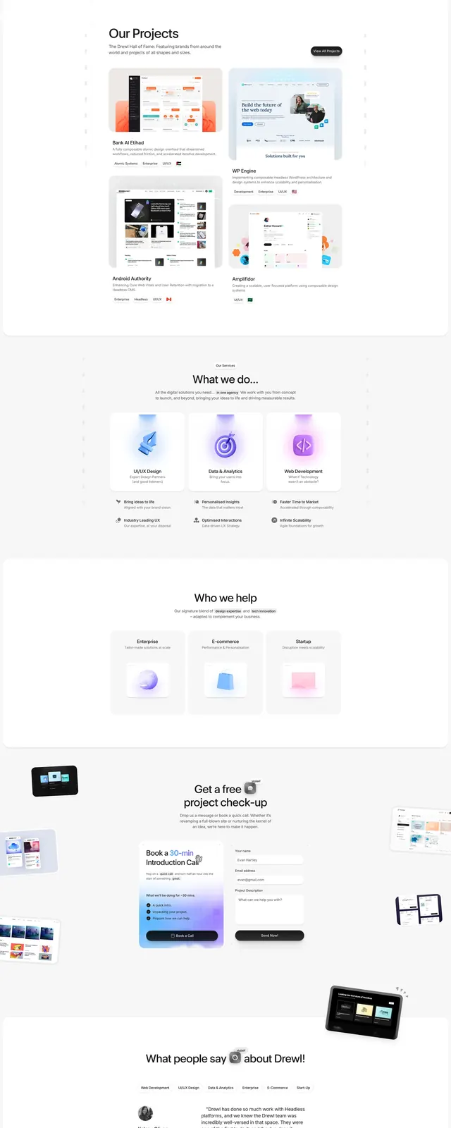
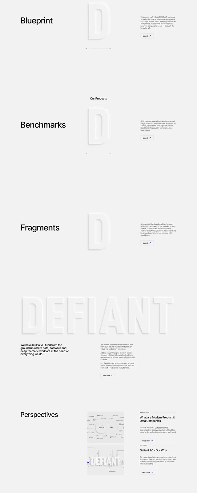
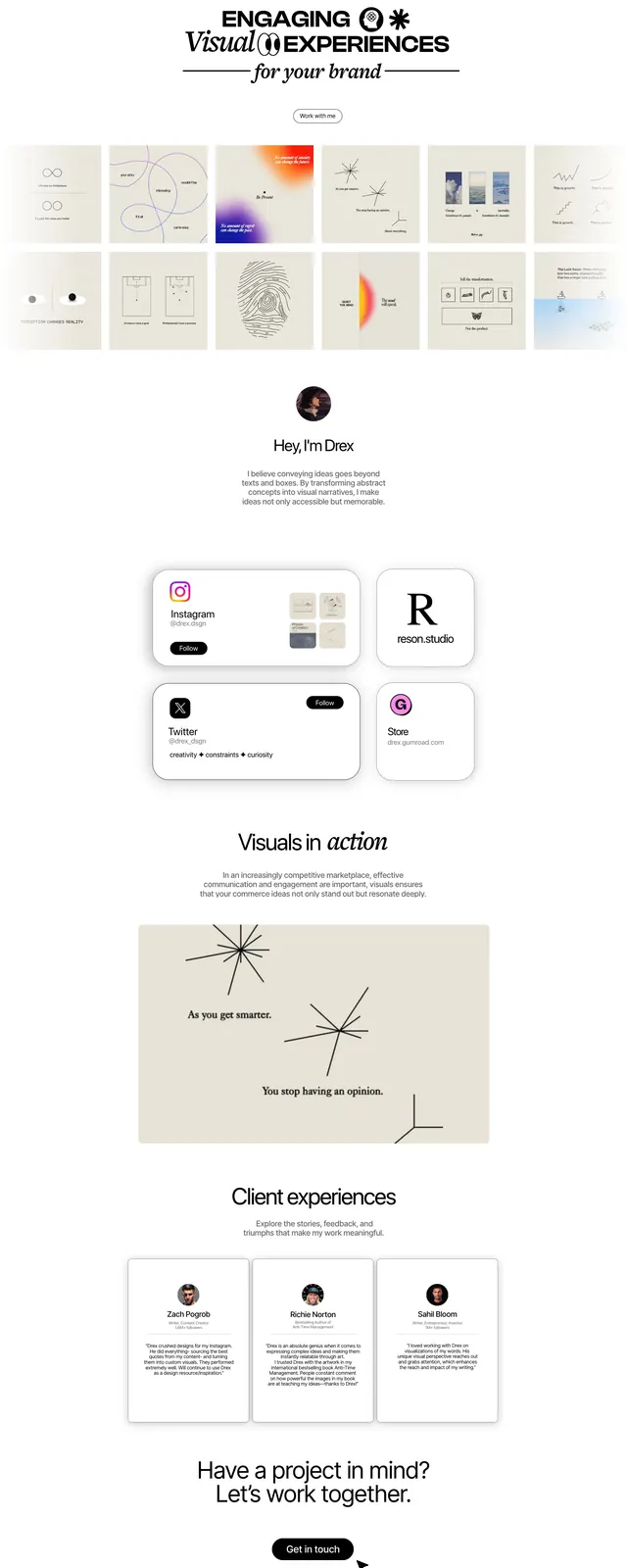
The page opens with a large, pale hero area on a white background, with a small centered intro line and lots of empty space around it. Below, a four-column grid presents product and object imagery in evenly spaced cards, followed by additional stacked rows of project thumbnails and short text snippets. Near the bottom there is a compact awards/logo strip and a small footer area with pill-shaped links and social/contact buttons. The overall composition stays very light, airy, and grid-based, with thin spacing and minimal decoration.
Key takeaway
The strongest reusable move is the restrained white canvas paired with a dense but orderly project grid. It creates a clean portfolio feel while keeping the page visually active through varied imagery.
Reuse notes
Useful for portfolio sites, design studios, and product designers who want the work to carry the page. It works best when the content mix includes strong visuals, short captions, and a small logo or awards row for credibility.