Preview image. Unlock full-res
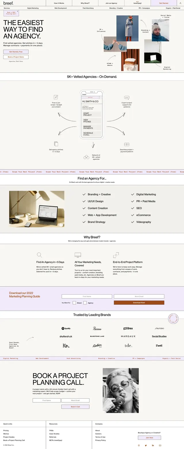
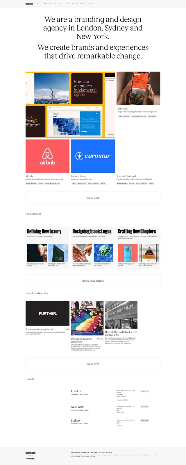
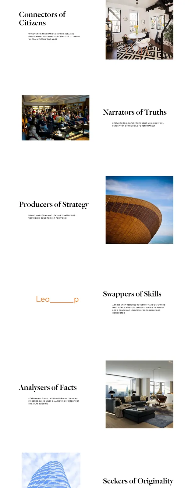
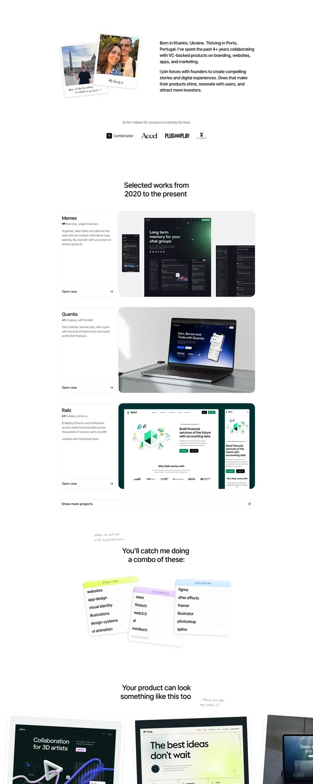
A warm editorial agency homepage with oversized serif headlines, airy spacing, and overlapping project and client blocks.
Summary
A warm editorial agency homepage with oversized serif headlines, airy spacing, and overlapping project and client blocks.
Visual description
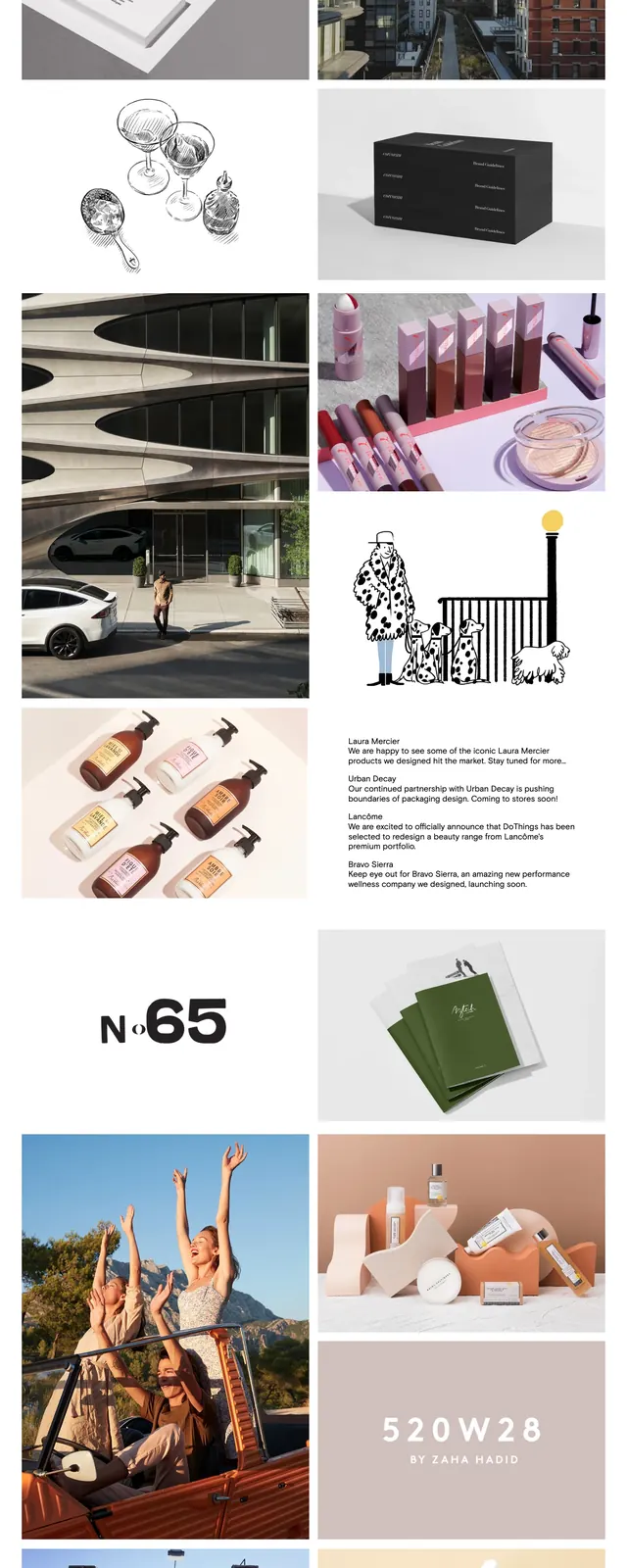
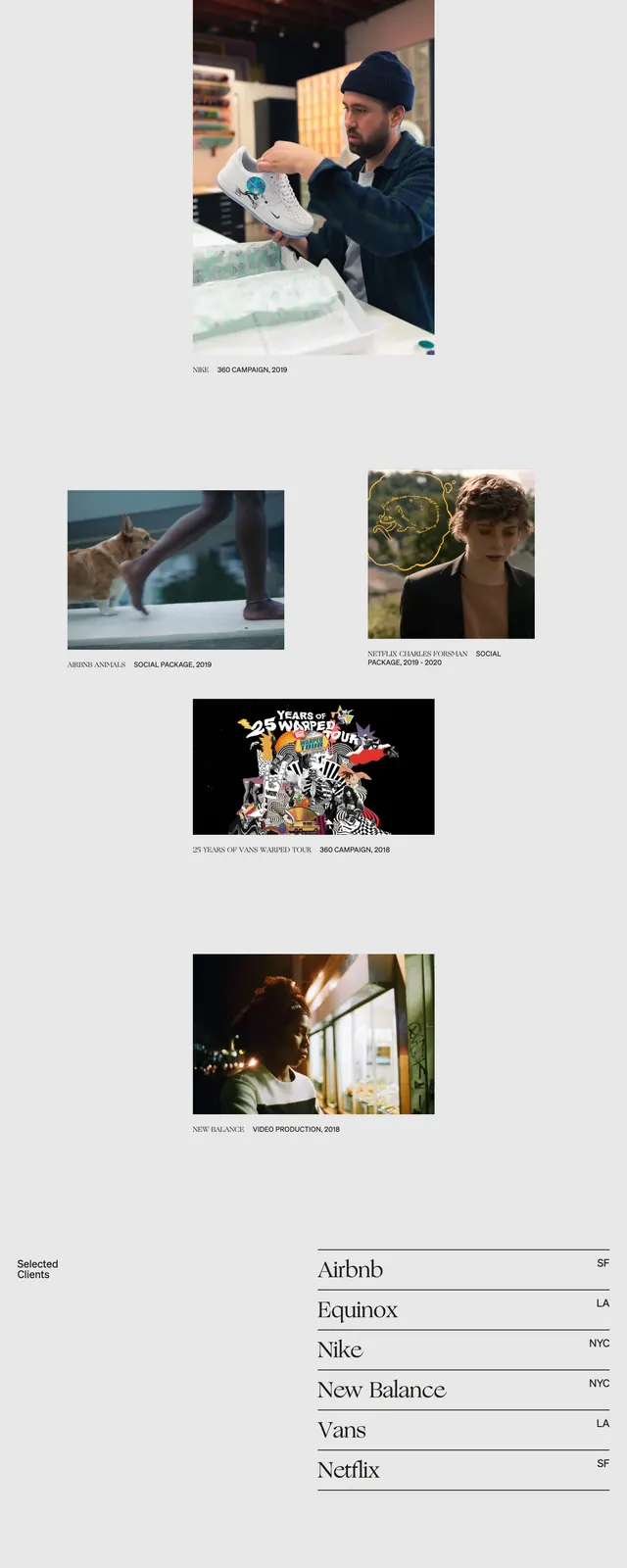
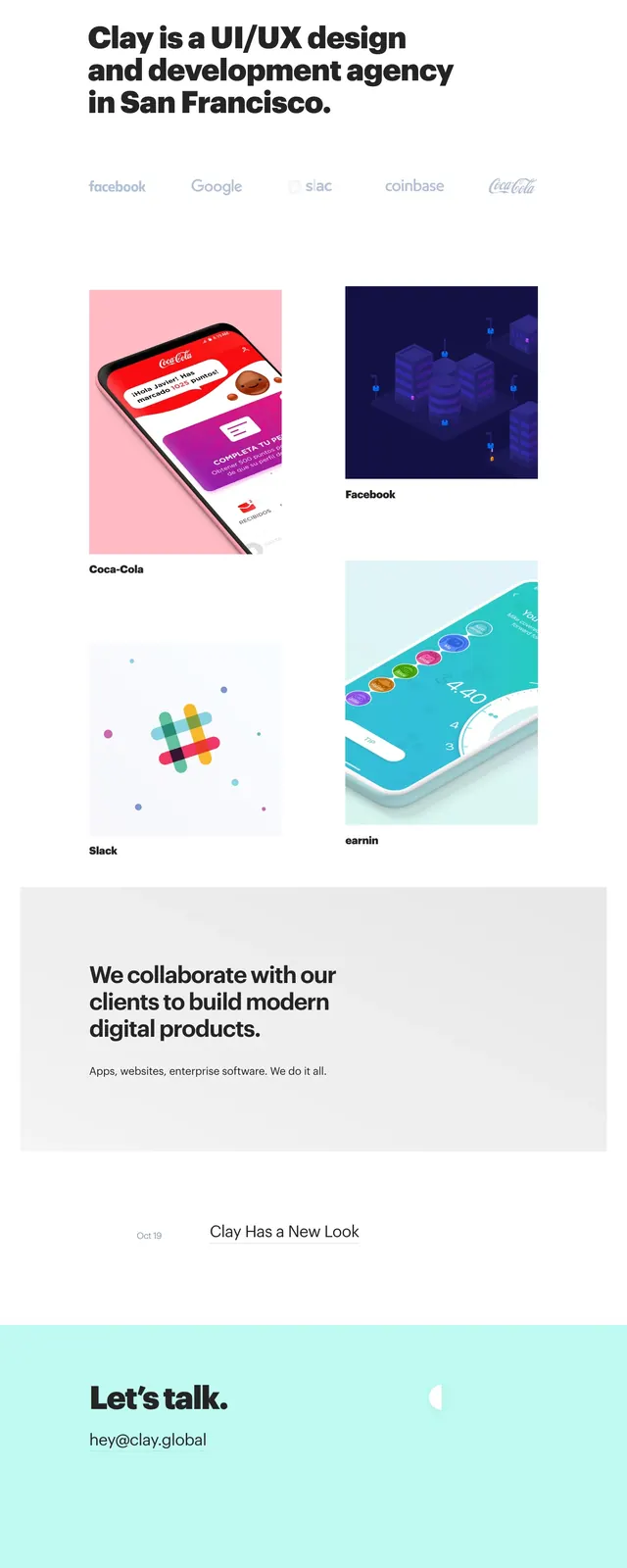
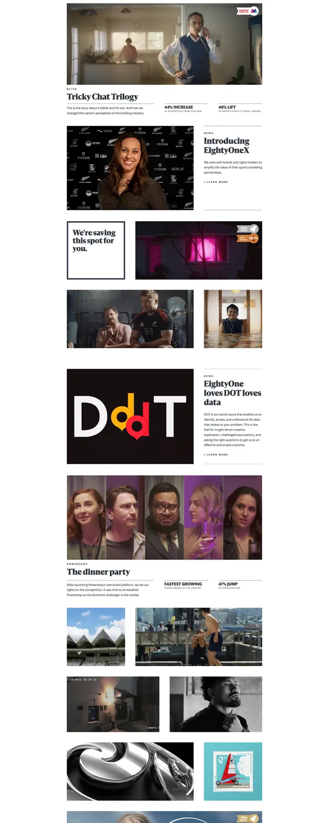
The page uses a clean white canvas with a top navbar, a large serif hero statement, and a dark rectangular call-to-action button. Below the hero, a pale client-logo panel overlaps the next content block, creating a layered editorial feel. The mid-page alternates between project cards, a wide featured case-study image, and a cream CTA band with another button. The footer is simple and spacious, with a circular logo mark and three small text columns.
Key takeaway
This layout relies on strong typography, generous whitespace, and overlapping content panels to feel polished and design-led. It works well as a reusable agency homepage structure with clear hierarchy and understated luxury.
Reuse notes
Reuse the oversized serif headline, compact dark CTA button, and floating logo strip for a premium studio look. The overlapping cards and wide case-study image are the main pattern to carry into other brand or portfolio sites.