Preview image. Unlock full-res
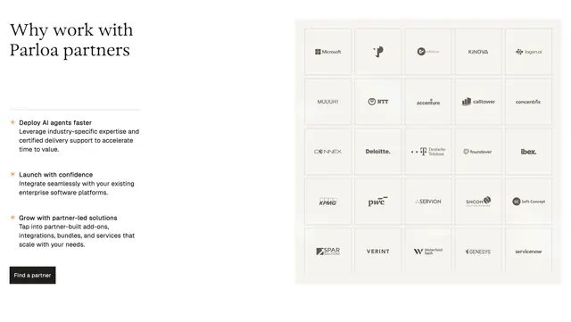
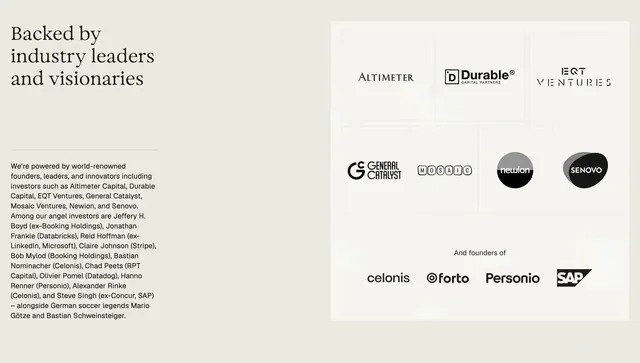
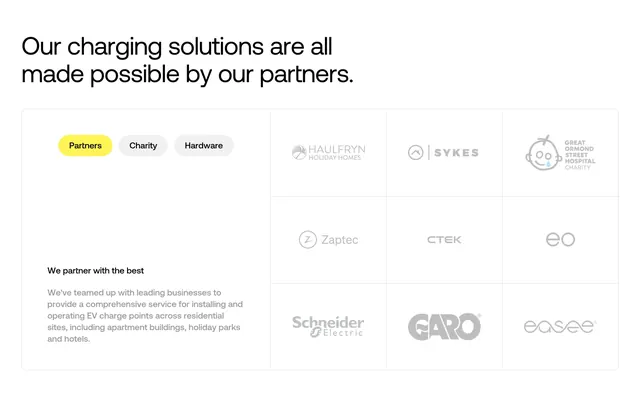
Partners section with pill tabs, explanatory copy, and a bordered nine-cell logo grid inside a large rounded card.
Summary
An about-page partners block that combines category tabs, sidebar copy, and a uniform gray logo wall in a single contained card under a full-width headline.
Visual description
White background with a large black sans-serif headline top-left: "Our charging solutions are all made possible by our partners." Below, a wide rounded rectangle with a thin light-gray border holds the content. Top-left inside the card are three pill tabs: "Partners" active in bright yellow with black text, "Charity" and "Hardware" inactive in light gray. Lower-left holds bold subhead "We partner with the best" and a paragraph about teaming with businesses for EV charging at residential sites. Right two-thirds is a 3x3 grid divided by thin gray rules; each cell centers a partner logo rendered in uniform medium gray (Haulfryn, Sykes, Great Ormond Street Hospital Charity, Zaptec, CTEK, eo, Schneider Electric, GARO, easee).
Key takeaway
The tabbed filter plus logo grid inside one bordered container: it turns a static logo wall into a browsable section without leaving the page. Rendering every logo in one gray tone keeps mismatched brand colors from clashing.
Reuse notes
Useful for hardware, infrastructure, or B2B services sites with multiple partner categories. Yellow accent gives wayfinding on an otherwise neutral layout. Needs enough logos to fill the grid; sparse sets will feel empty. Tab labels should map to real content swaps.