Preview image. Unlock full-res
A dark, editorial jewelry ecommerce homepage built around large product photography and refined serif typography.
Summary
A dark, editorial jewelry ecommerce homepage built around large product photography and refined serif typography.
Visual description
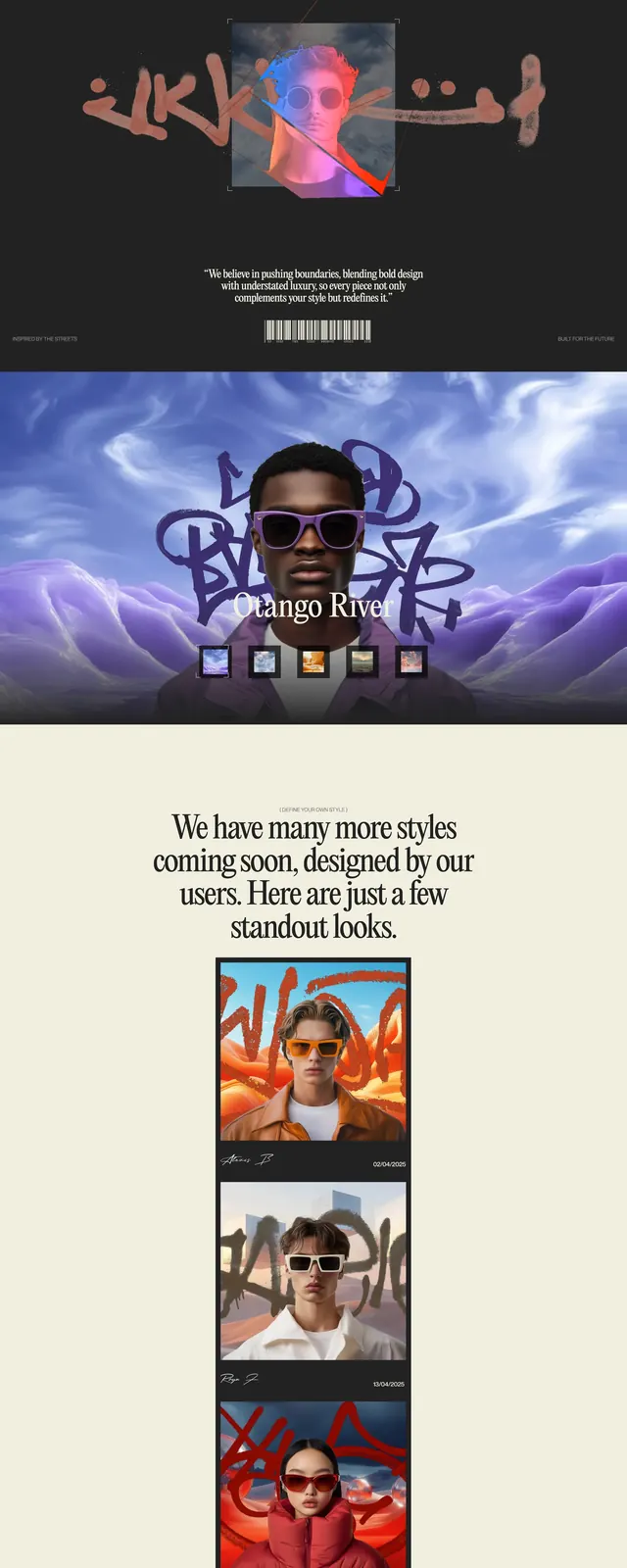
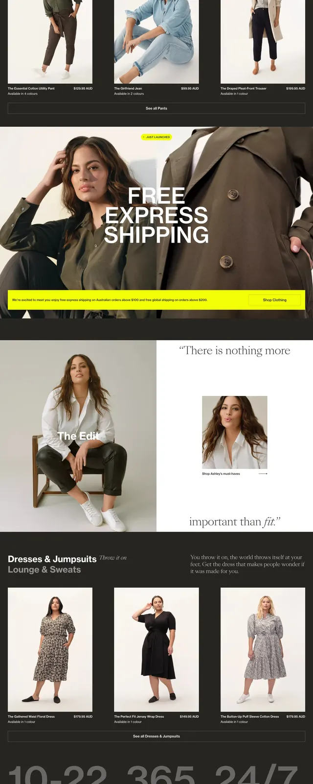
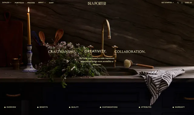
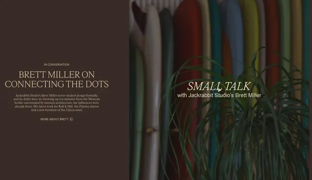
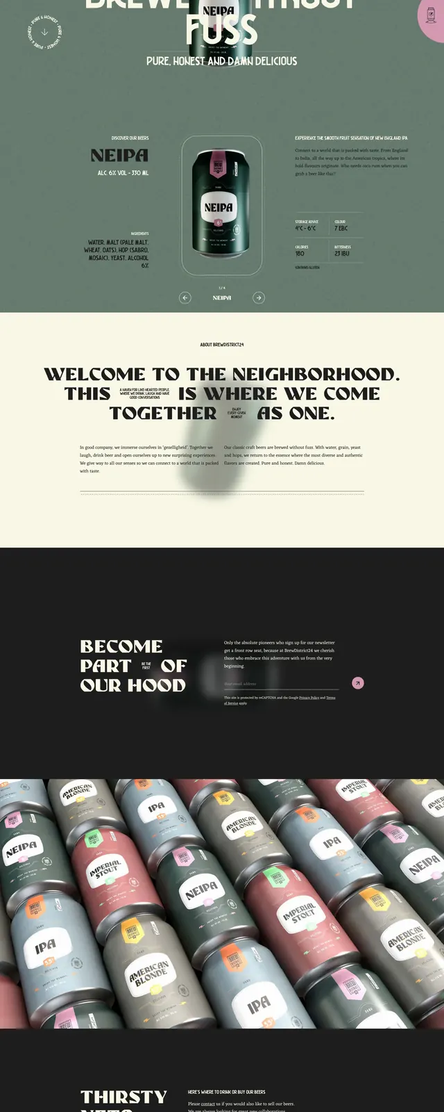
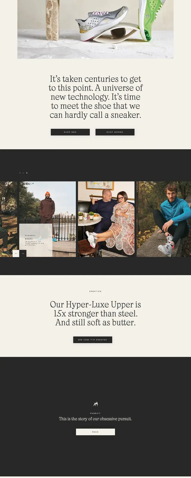
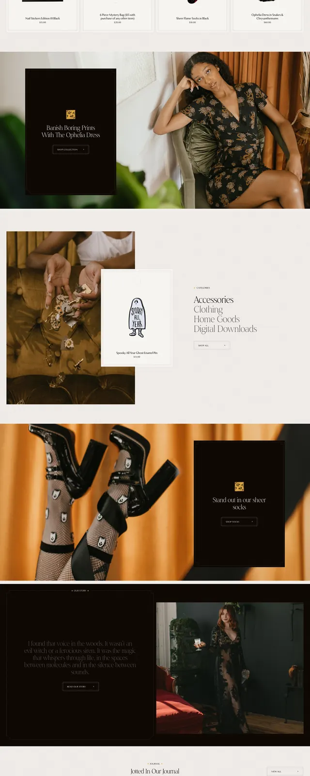
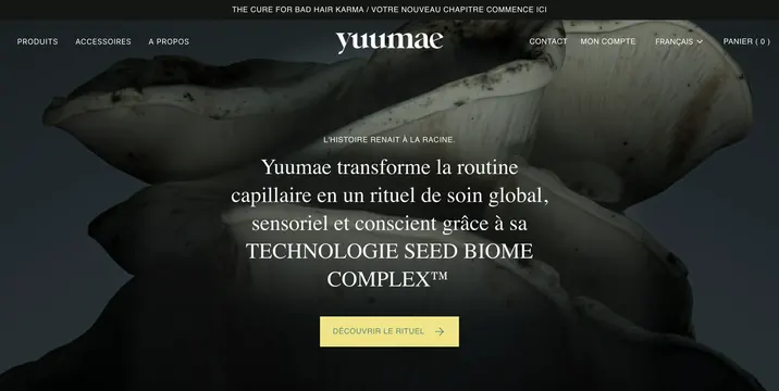
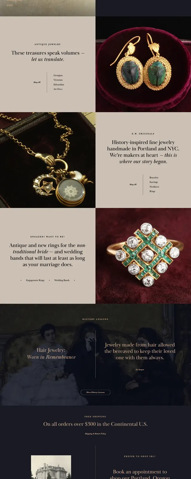
The page uses a dark, almost black background with warm beige sections and a strong editorial grid. Large close-up jewelry photography dominates the left and lower-right panels, while the right side uses centered serif headlines, small uppercase labels, and a thin outlined call-to-action button. A simple top navigation, brand wordmark, and footer-style information blocks reinforce the boutique storefront structure.
Key takeaway
The main reuse idea is the high-contrast mix of full-bleed product imagery with restrained serif typography and deep neutral backgrounds. It feels premium without relying on heavy ornamentation.
Reuse notes
Best for luxury ecommerce, antique, or craft brands that need an elevated, museum-like presentation. Works especially well when product photography is rich and close-cropped, and when the layout can alternate image and text blocks.