Preview image. Unlock full-res
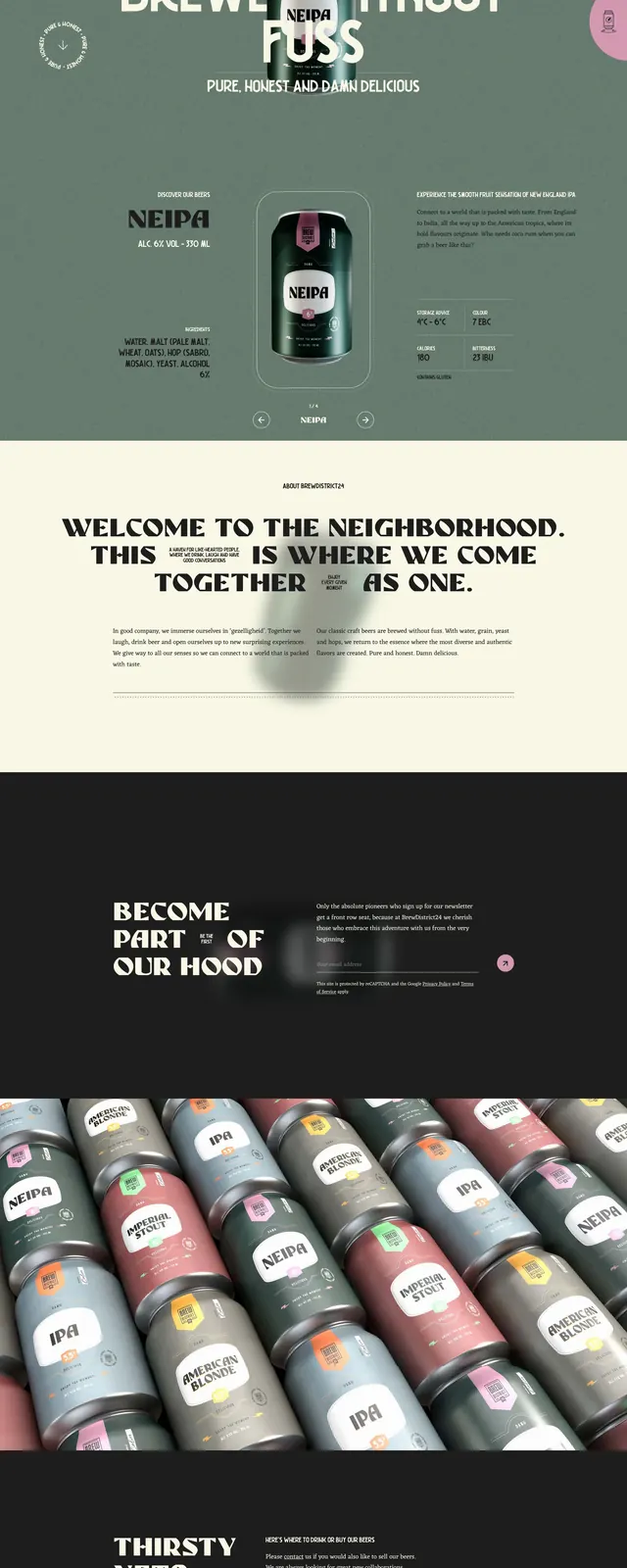
A bold, full-page brewery website with oversized editorial typography, centered product imagery, and a gritty premium craft-beer aesthetic.
Summary
A bold, full-page brewery website with oversized editorial typography, centered product imagery, and a gritty premium craft-beer aesthetic.
Visual description
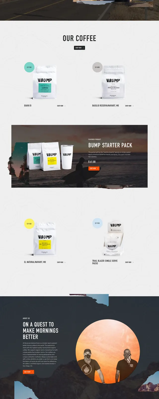
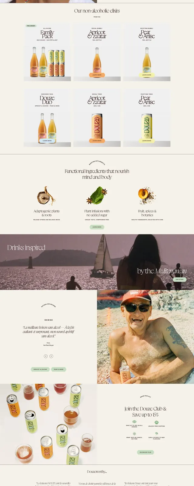
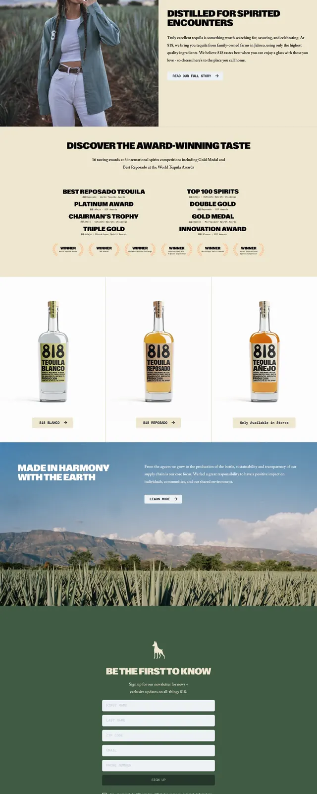
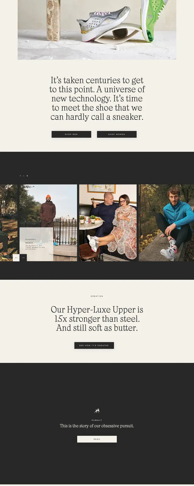
The page opens with a muted green hero section featuring a centered beer can mockup layered over a large cream headline. A slim top navigation, small circular accents, and compact product details frame the main product image. Below, the layout alternates between a bold cream about section, a dark newsletter CTA band, a wide can-pack gallery strip, and a footer-style contact area with multiple stockist names. The overall composition uses strong contrast, oversized type, and repeated product photography to create a premium craft-beer identity.
Key takeaway
This design relies on editorial-scale typography and product-focused photography to make a simple brewery site feel distinctive and upscale. The repeating dark/cream/green palette and stacked section rhythm make it easy to reuse for premium food and beverage branding.
Reuse notes
Reuse the oversized headline treatment, centered product hero, and alternating light/dark section blocks for a strong branded landing page. The compact spec blocks, newsletter CTA, and stockist footer are useful patterns for product marketing sites that need both story and conversion.