Preview image. Unlock full-res
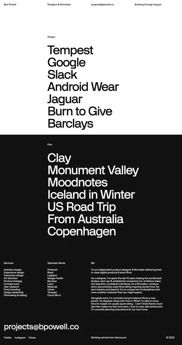
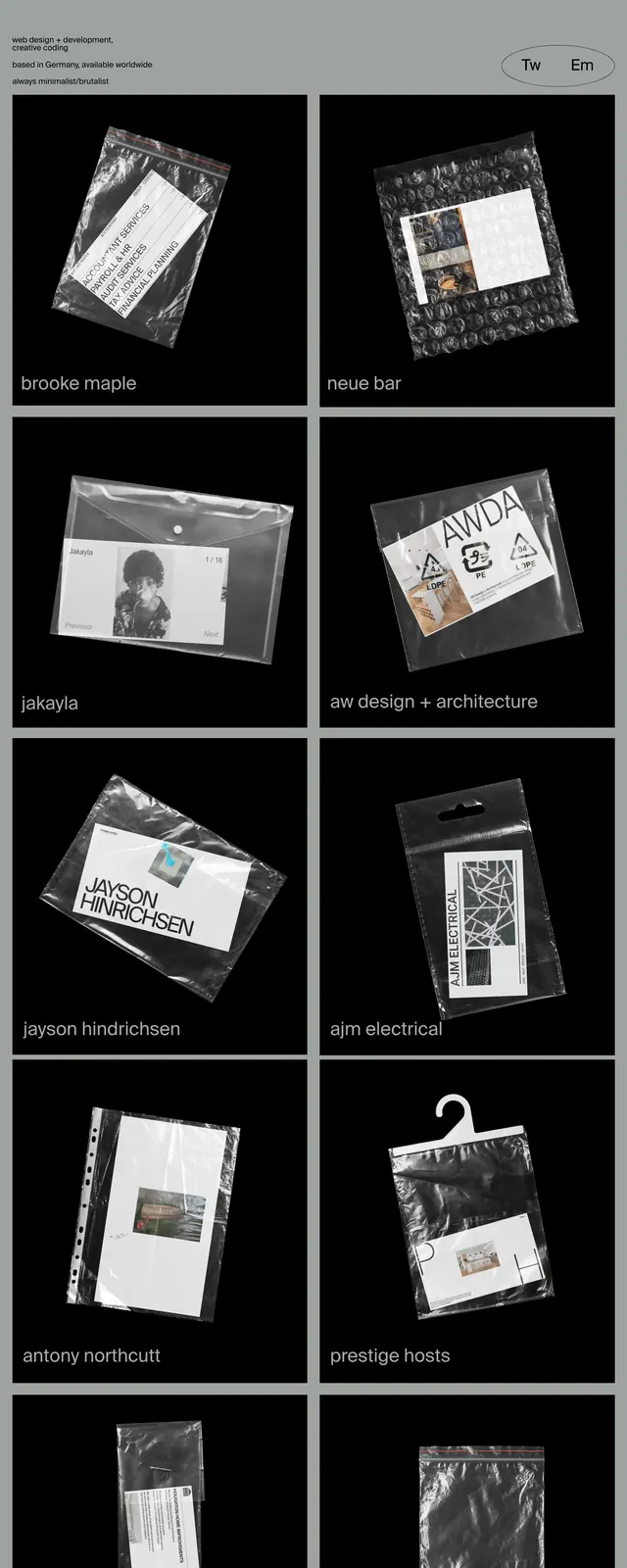
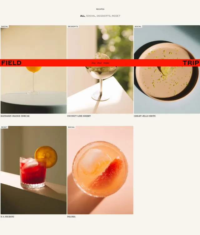
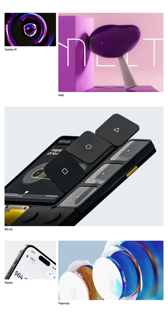
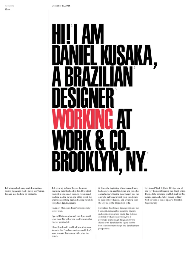
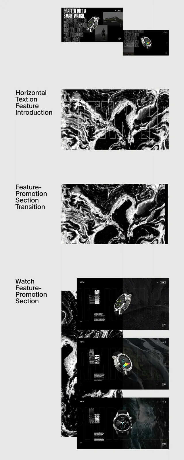
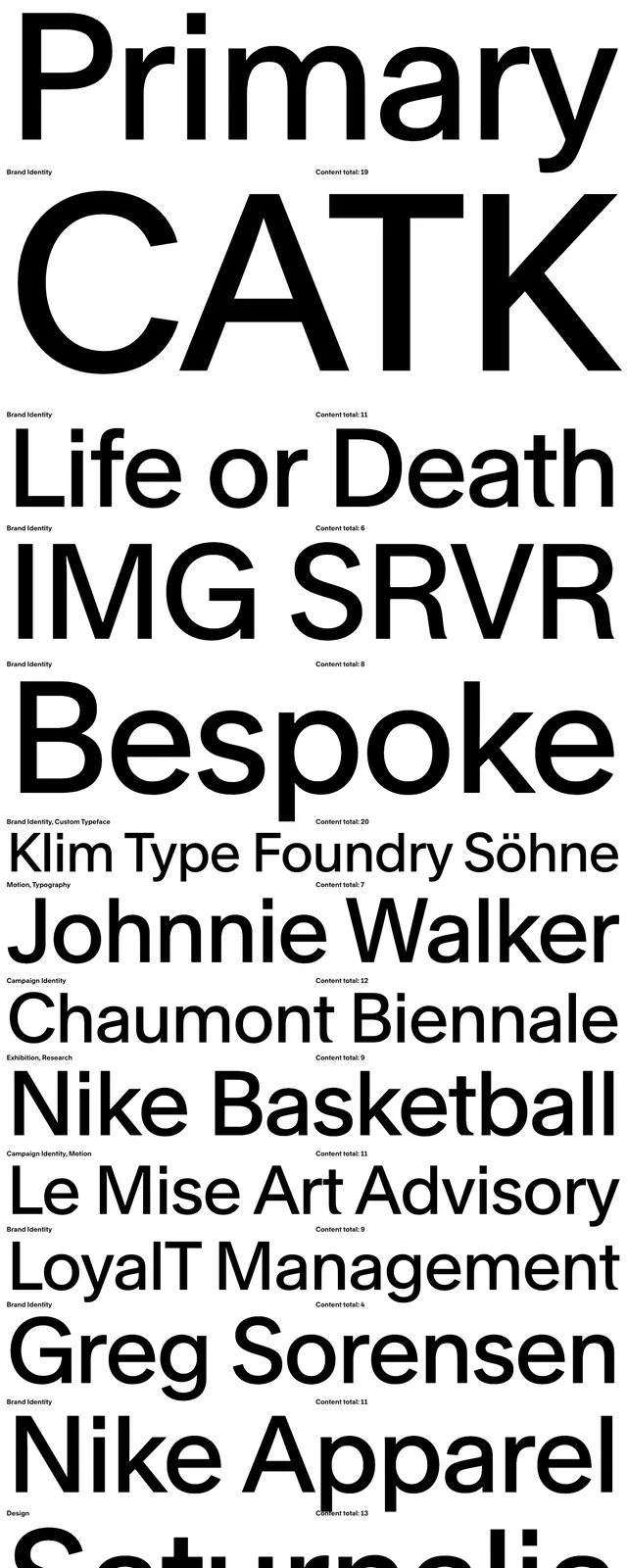
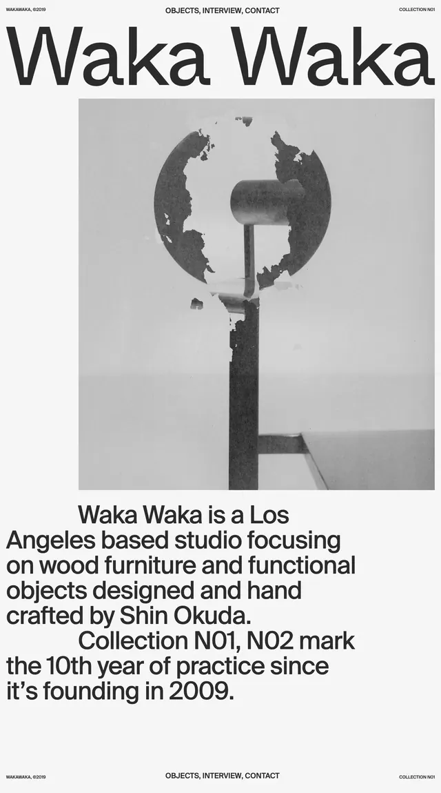
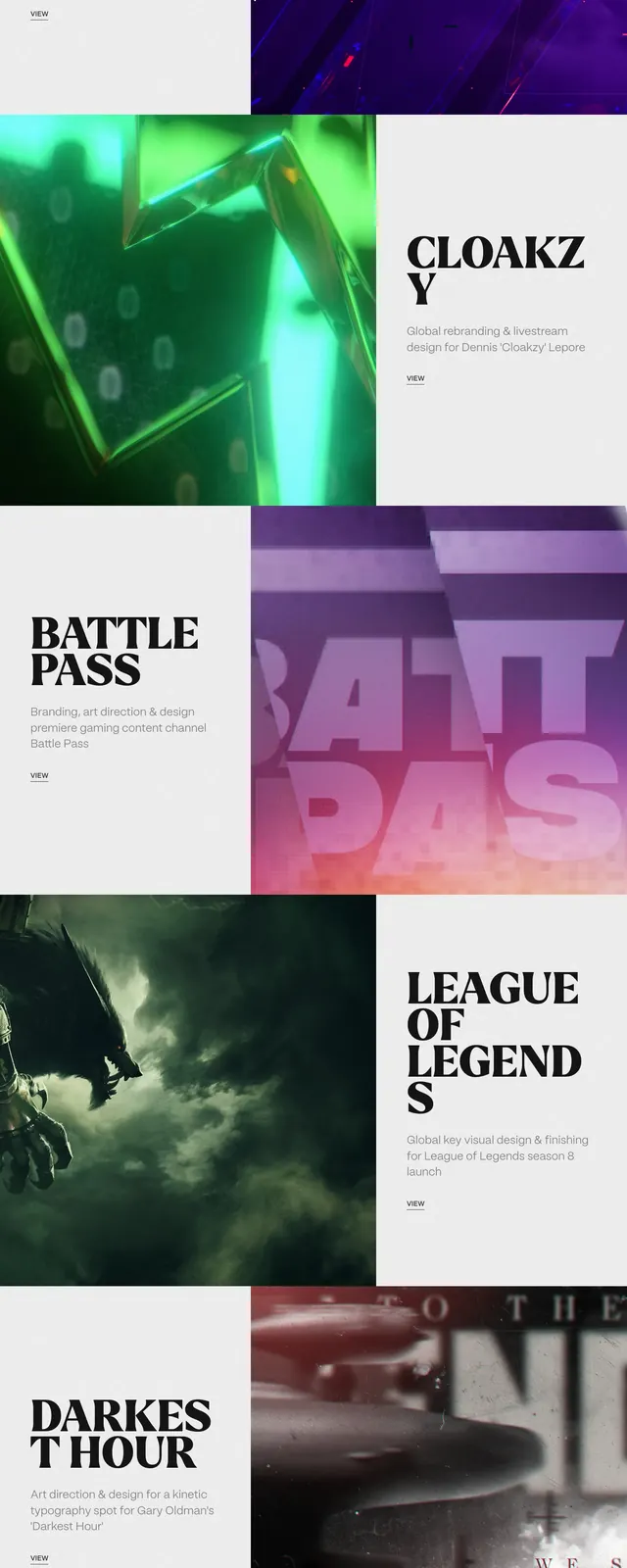
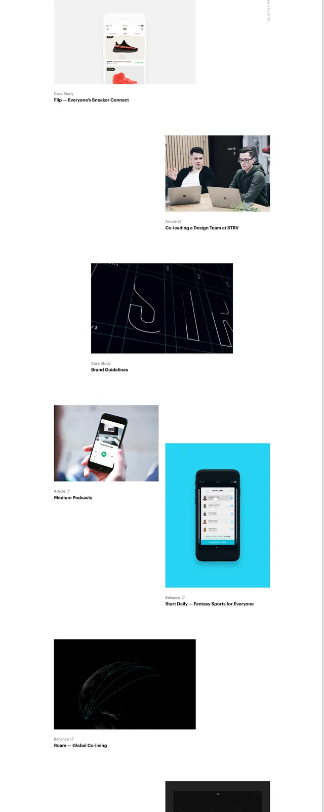
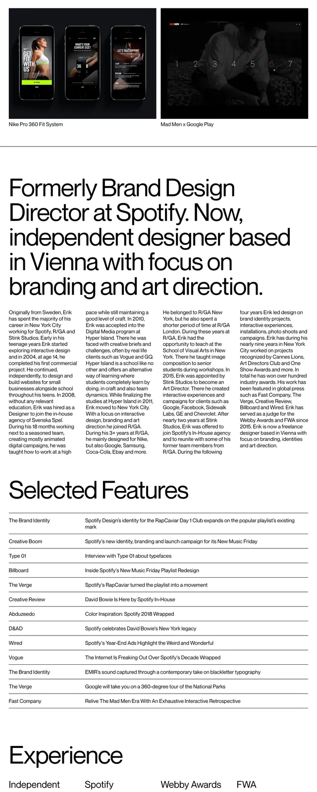
A clean portfolio page with oversized typography, a grid of project imagery, and dense bio and client information laid out in a newspaper-like format.
Summary
A clean portfolio page with oversized typography, a grid of project imagery, and dense bio and client information laid out in a newspaper-like format.
Visual description
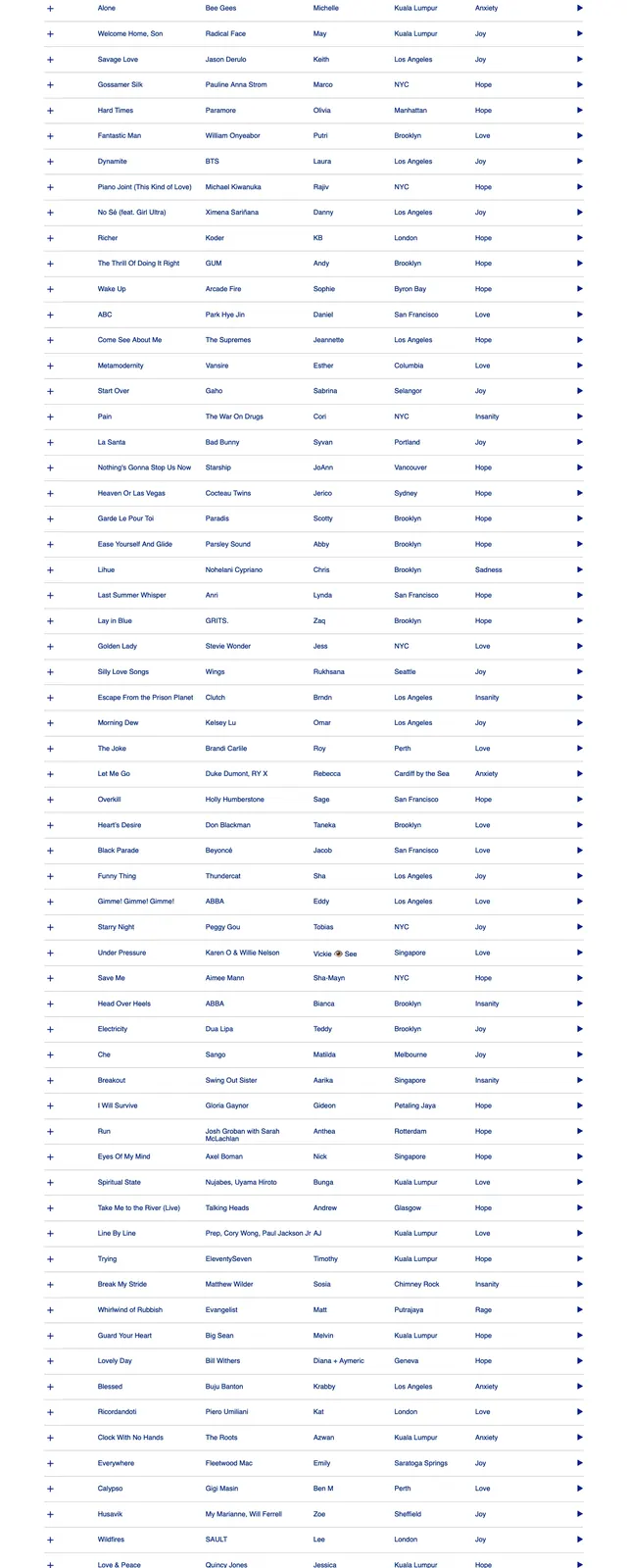
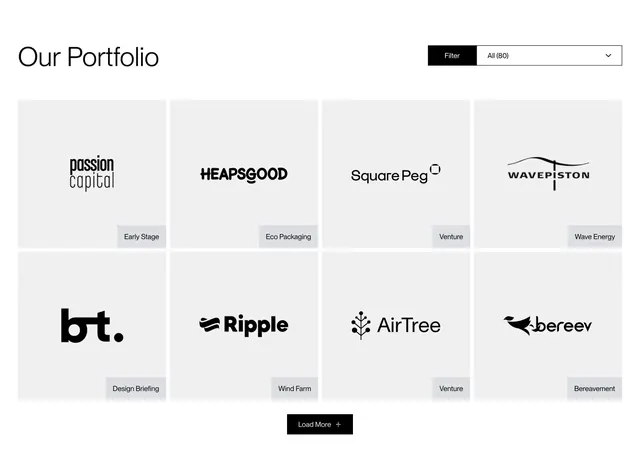
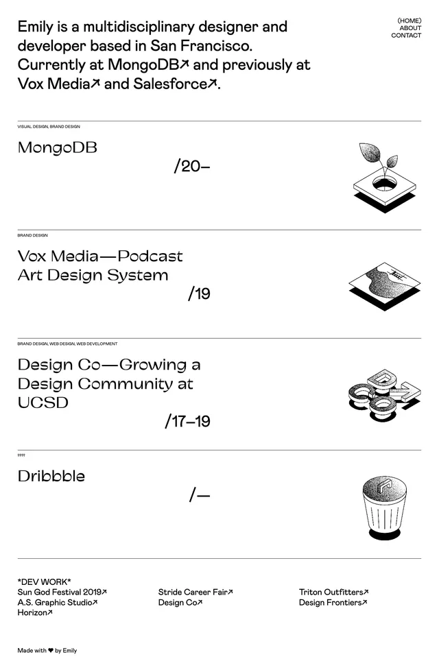
The page uses a white background with black text and a highly restrained editorial layout. At the top, a small header sits above a 2x2 grid of project images with short captions, followed by a very large cropped headline spanning multiple lines. Below that, the content continues in narrow text columns, then a ruled features table, and finally a multi-column client list, all separated by generous whitespace and thin divider lines.
Key takeaway
The main pattern is a portfolio page that combines gallery imagery with magazine-style typography and dense informational sections. The oversized headline and strict black-and-white treatment give the layout a refined, authoritative feel.
Reuse notes
Use this structure for designer portfolios, studio bios, or personal sites that need to balance visual work with credibility and background information. It works best when the content is strong enough to support a minimal presentation and when the goal is editorial polish rather than marketing flair.