Preview image. Unlock full-res
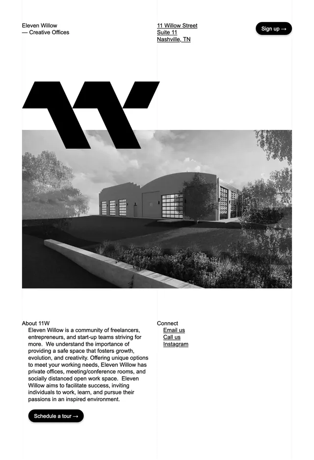
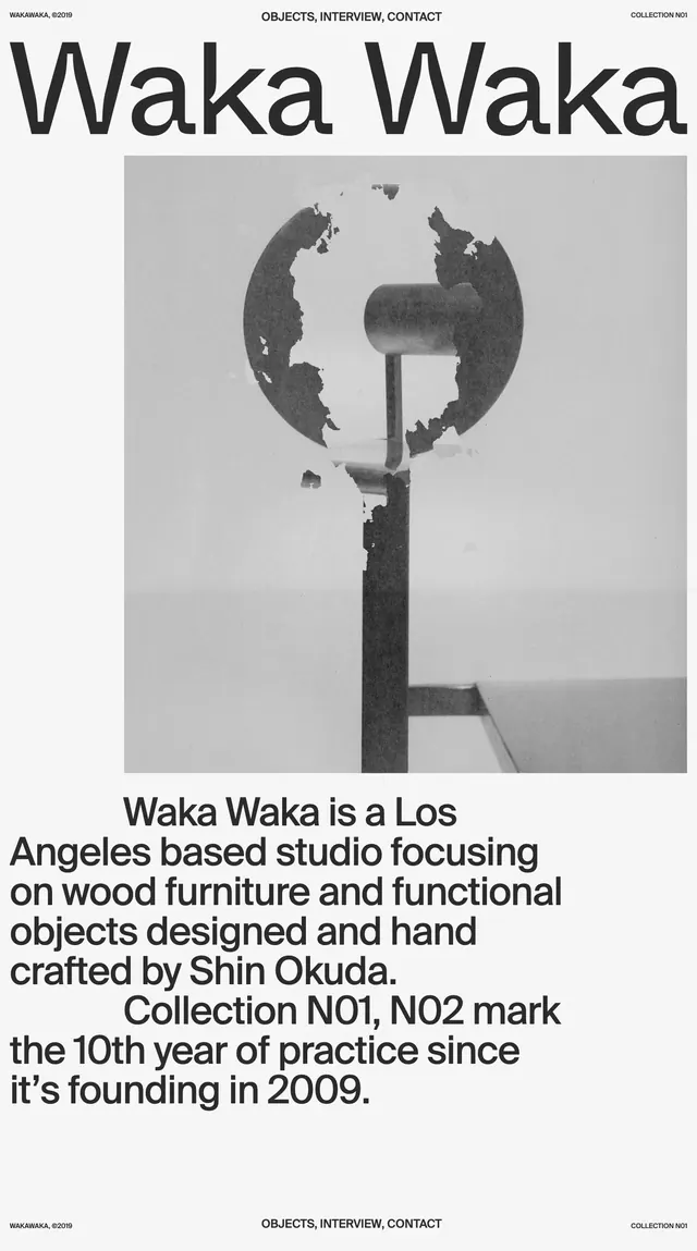
A monochrome, type-led landing page for Collection Wakawaka with oversized headline text, a centered grayscale image, and a dense editorial intro block.
Summary
A monochrome, type-led landing page for Collection Wakawaka with oversized headline text, a centered grayscale image, and a dense editorial intro block.
Visual description
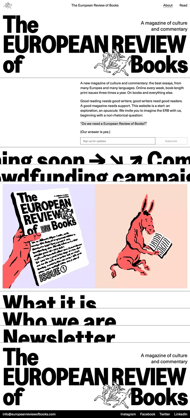
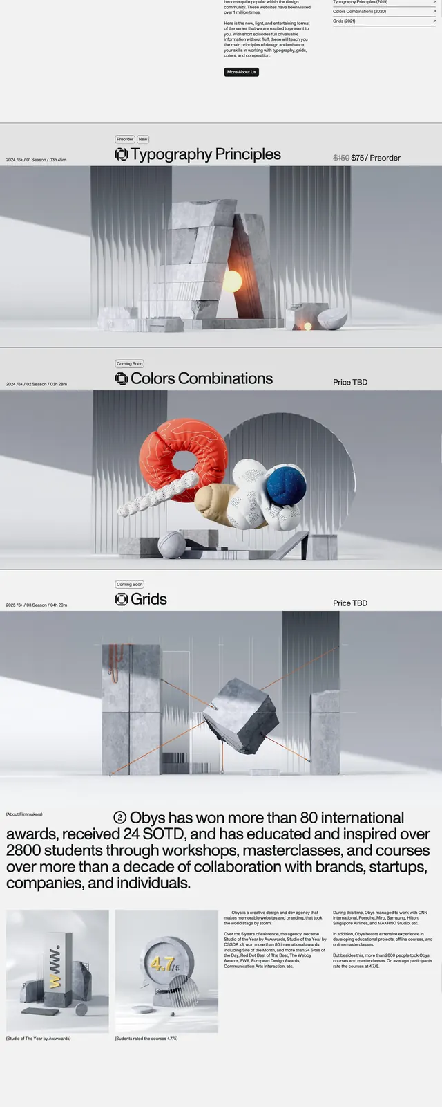
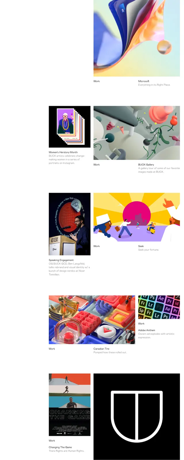
The page uses a stark white background with small utility text aligned to the top edges and a very large black headline spanning nearly the full width. A centered grayscale image sits below the title, framed by wide margins and followed by a heavy, tightly set paragraph block. The composition feels like a magazine spread translated into a webpage, with all content arranged in a vertical stack and very little decorative UI.
Key takeaway
The strongest move is the combination of oversized typography and restrained grayscale imagery, which gives the page a polished editorial feel. The spacing and centered alignment make the layout feel intentional and high-end without needing additional UI elements.
Reuse notes
Use this approach for portfolio, studio, or cultural pages where the work should feel curated and art-directed. It works best when the content can carry the page with one strong image, one dominant headline, and minimal navigation.