Preview image. Unlock full-res
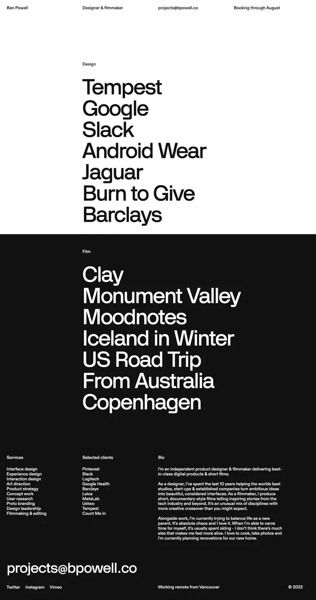
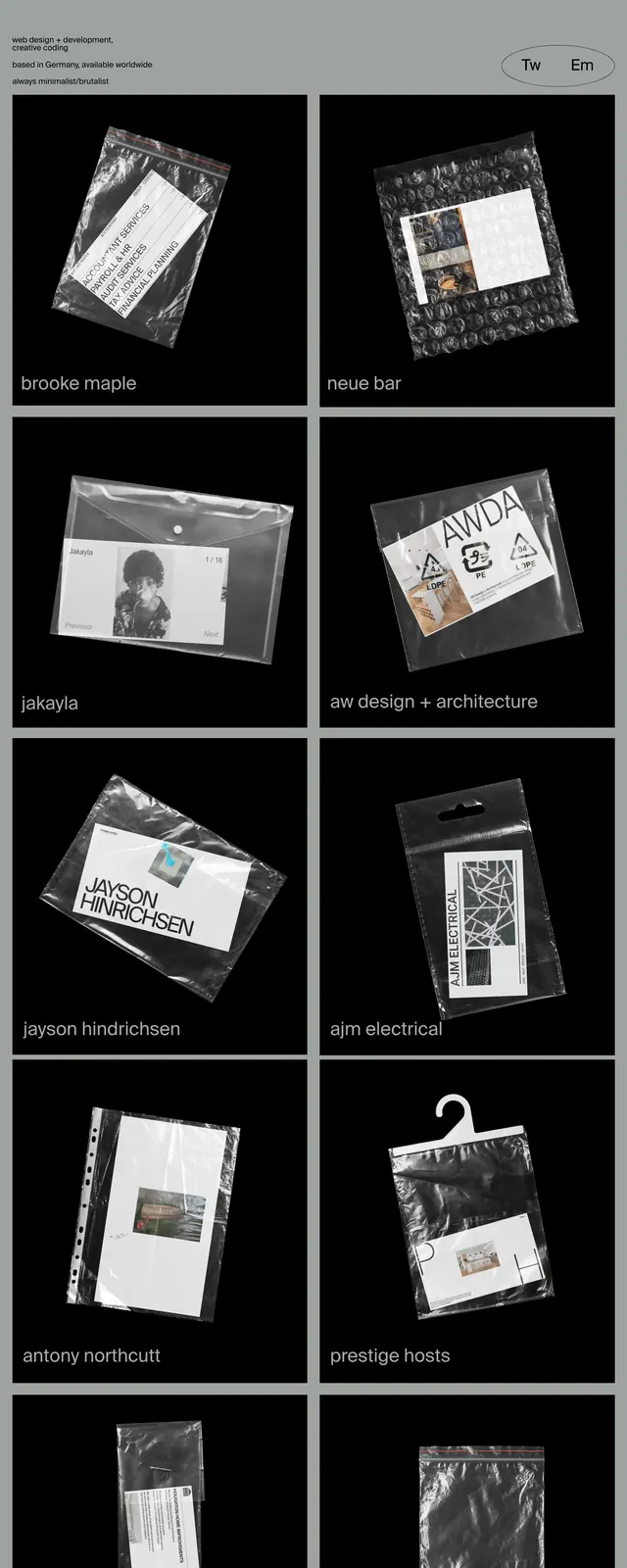
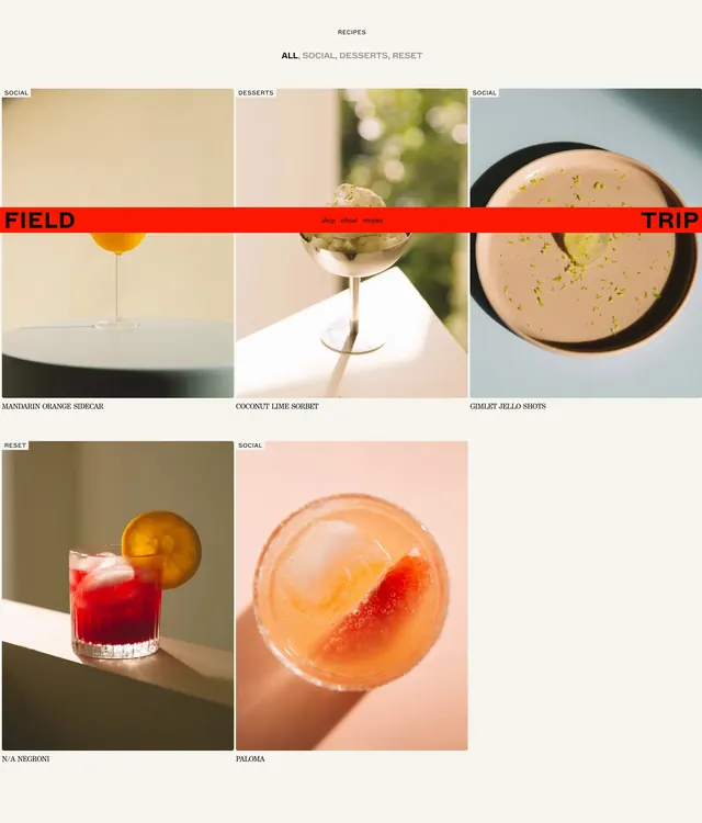
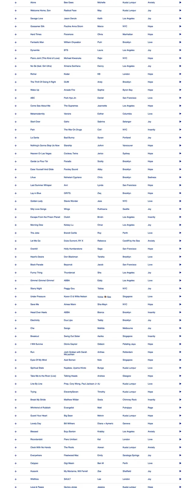
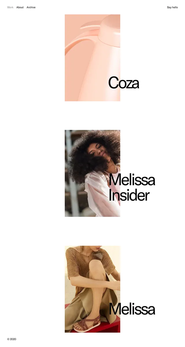
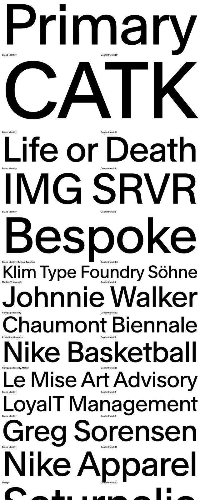
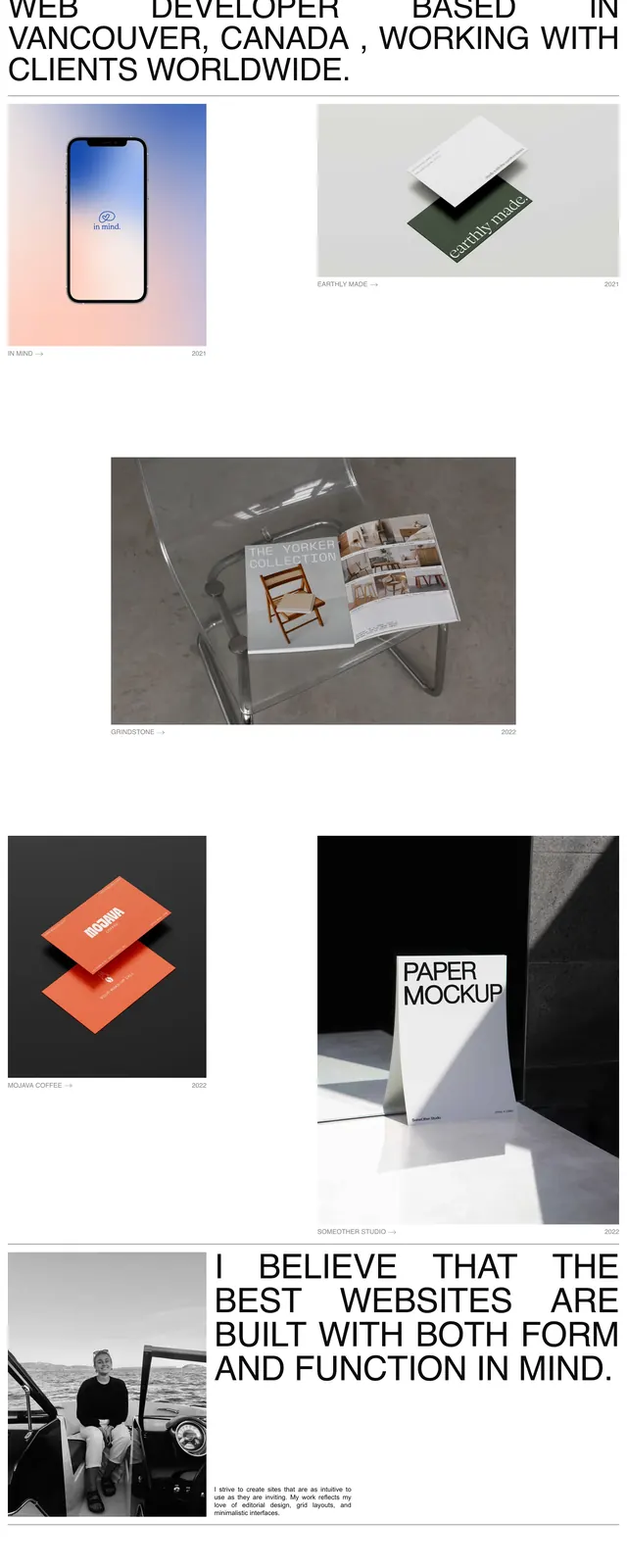
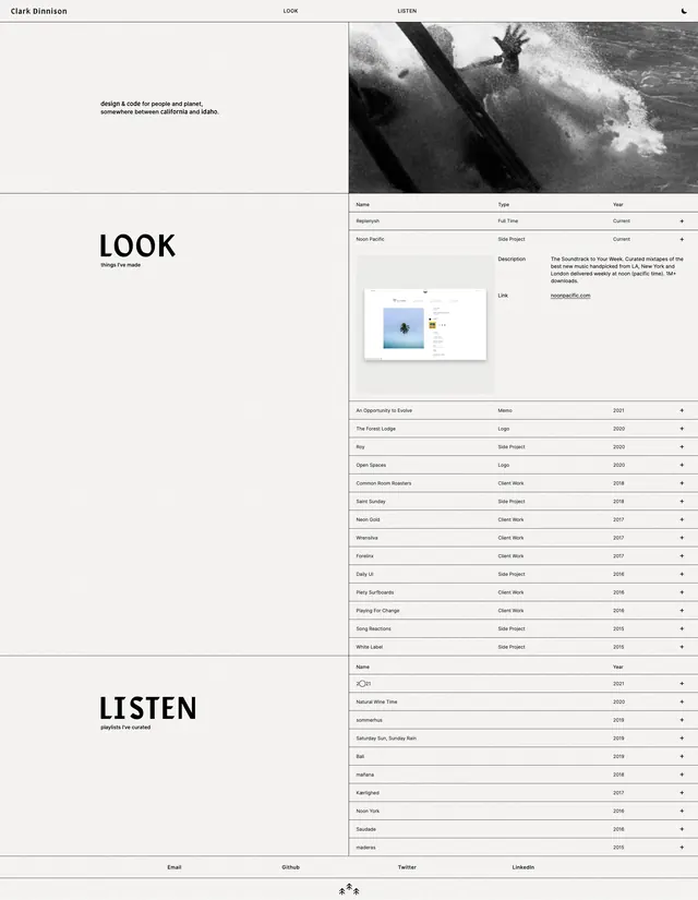
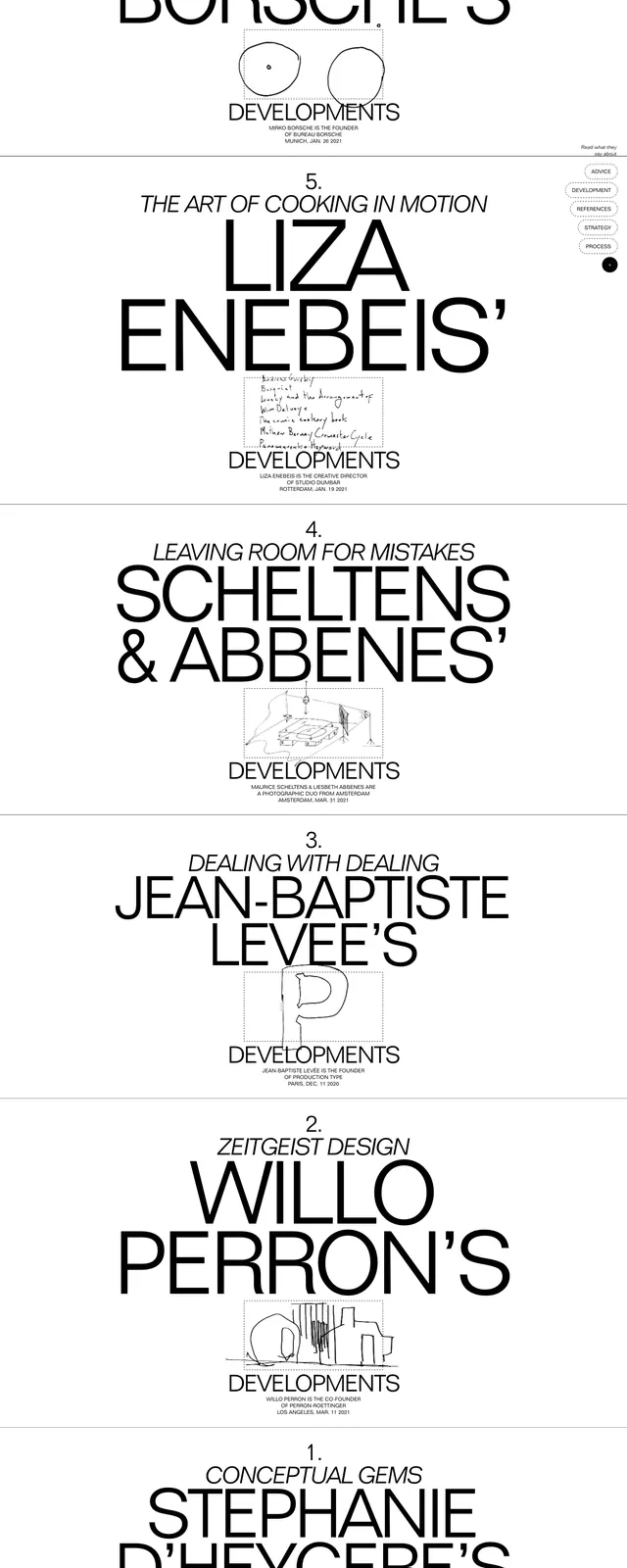
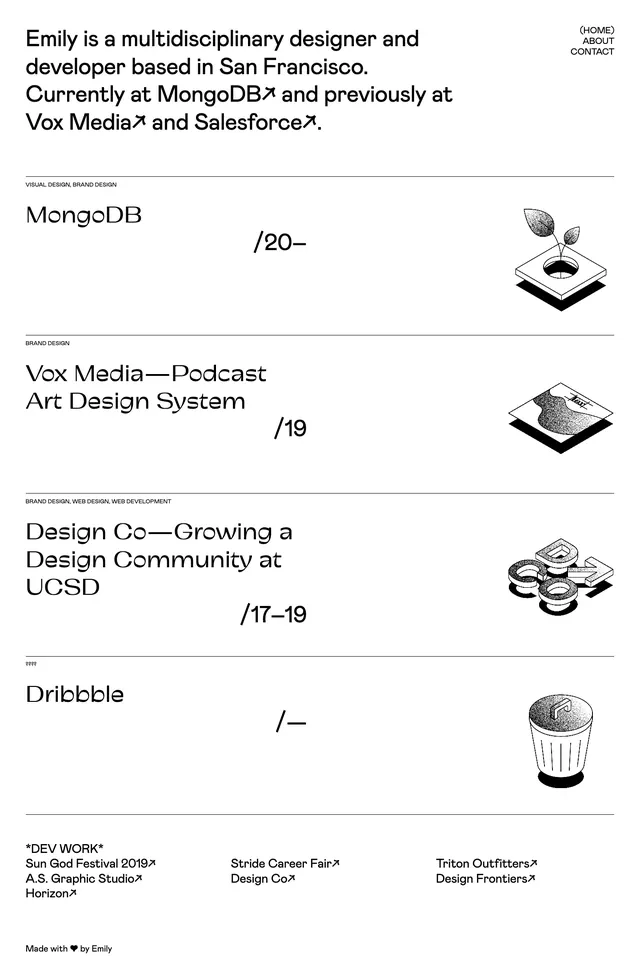
A sparse portfolio homepage with a large intro headline and a vertically stacked list of projects separated by thin rules and small illustrated thumbnails.
Summary
A sparse portfolio homepage with a large intro headline and a vertically stacked list of projects separated by thin rules and small illustrated thumbnails.
Visual description
The page uses a white background with black text and thin horizontal dividers to separate each project entry. A large intro statement sits at the top left, while a small vertical nav is aligned in the top right. Below, each portfolio row pairs oversized project titles and dates with small monochrome illustrated thumbnails on the right. The overall composition is airy, text-led, and highly structured.
Key takeaway
The strongest move is the editorial project-list format: big typographic hierarchy, minimal chrome, and compact visual thumbnails. It feels like a portfolio that prioritizes scanning and credibility over decoration.
Reuse notes
Use this structure for personal portfolios, creative studios, or case-study indexes where the goal is to make multiple projects feel curated. It works best when the content is mostly text and the supporting visuals can stay small and monochrome.