Preview image. Unlock full-res
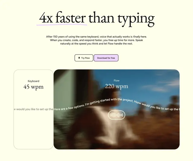
Light feature section comparing keyboard 45 wpm to Flow 220 wpm with a hand-drawn underline accent, dual CTAs, and a large photo-backed stat card.
Summary
A cream feature block leading with "4x faster than typing" and a side-by-side wpm comparison between a small keyboard card and a large Flow card over a lifestyle photo.
Visual description
Off-white cream background. Centered oversized serif headline "4x faster than typing" with a hand-drawn lavender underline stroke beneath "4x." Muted sans-serif body copy below explains voice as a faster interface after 150 years of keyboard use. Two centered CTAs: white bordered Try Flow with microphone icon and lavender Download for free. Lower half splits into two stat cards. Left, a small vertical card labeled Keyboard showing 45 wpm in large serif. Right, a much larger rounded rectangle with a blurred photo of a person in a sunlit room, white Flow label, 220 wpm in serif, streaming white transcript text across the middle, and a white pill with a waveform graphic at the bottom center.
Key takeaway
Asymmetric card sizing makes the winning metric feel dramatic without extra copy. A single hand-drawn underline adds personality to an otherwise minimal stat headline. Photo-backed proof card grounds abstract speed claims in a real usage moment.
Reuse notes
Strong for voice, AI, or productivity tools selling speed. Needs a credible benchmark number and a strong lifestyle image for the large card. Cream and lavender palette stays approachable; swap metrics for other product comparisons.