Preview image. Unlock full-res
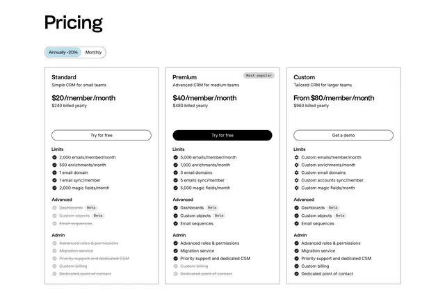
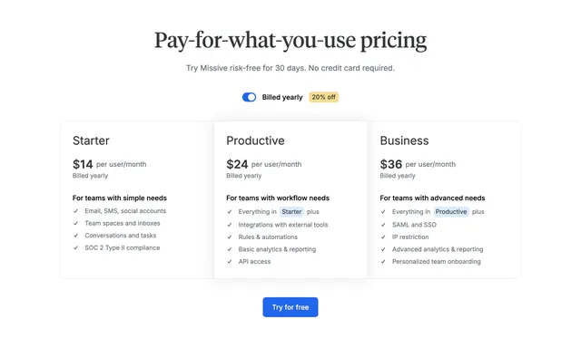
Light three-column pricing table with a billing toggle, a highlighted middle plan, and unavailable features shown as struck-through rows.
Summary
A clean three-column pricing table with a billing-period toggle, a highlighted middle tier, and feature rows that strike through what each plan does not include. The defining move is showing unavailable features as dimmed strikethrough text instead of omitting them, so plans stay visually aligned.
Visual description
A white section with an oversized black "Pricing" heading top-left and a pill toggle below it set to "Annually -20%" next to "Monthly". Three equal bordered cards sit side by side: Standard ("$20/member/month", $240 billed yearly), Premium ("$40/member/month", $480 yearly) carrying a "Most popular" tag and the only filled black CTA, and Custom ("From $80/member/month", $960 yearly). Each card has a CTA button ("Try for free" or "Get a demo") then three grouped feature blocks labeled Limits, Advanced, and Admin. Included items show a solid black check; unavailable items appear in grey with a strikethrough and a faded check, and some carry small "Beta" badges. The aligned rows make the plans easy to compare top to bottom.
Key takeaway
Showing every feature in every column and striking through the ones a plan lacks, which keeps rows perfectly aligned for scanning and makes the upgrade gaps obvious. Grouping features under Limits/Advanced/Admin labels, and using a single filled CTA only on the recommended plan.
Reuse notes
Solid default for a per-seat SaaS with three tiers and many comparable features. The strikethrough pattern reads best with grouped, parallel feature lists; with very different plans it can get noisy. Pair the billing toggle with visible annual savings as shown.
More pricing table sections
See all


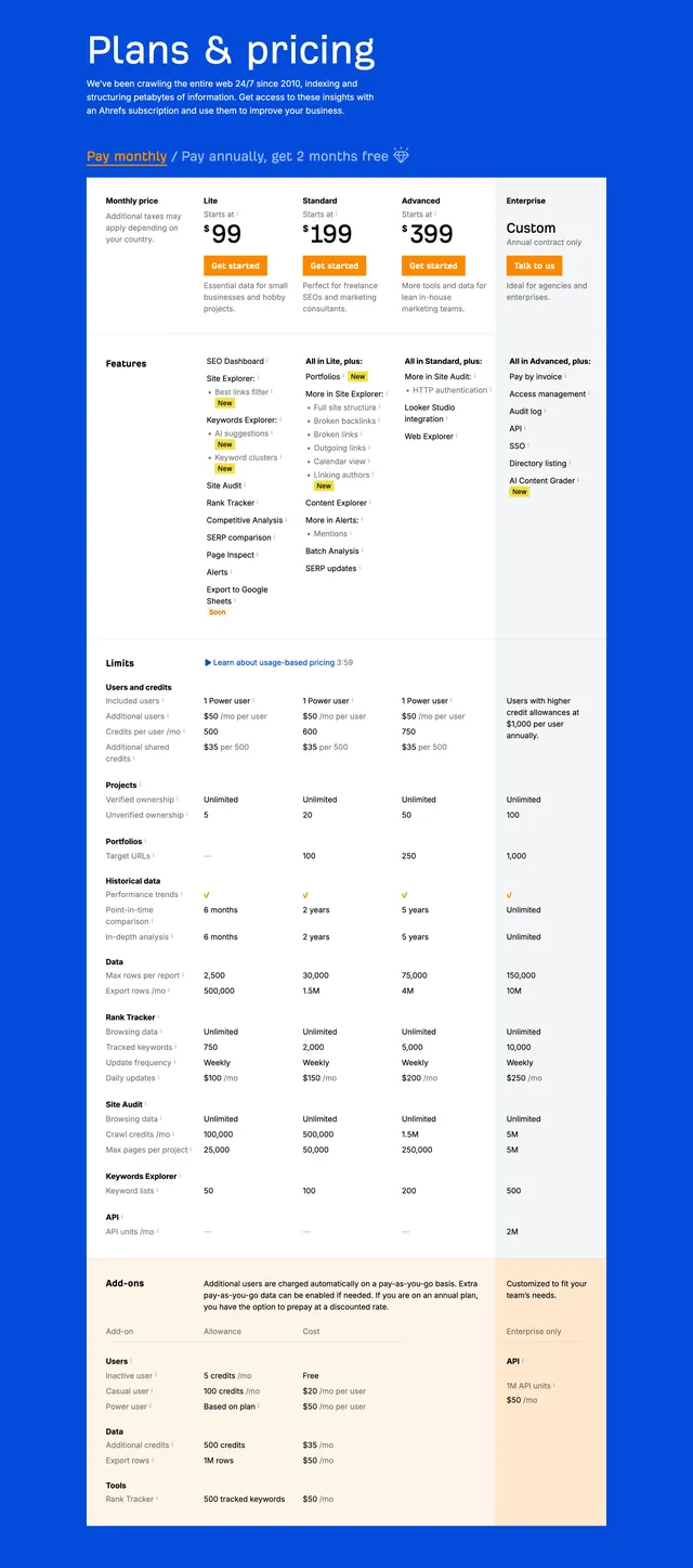
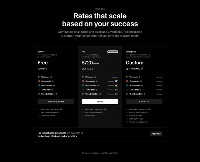
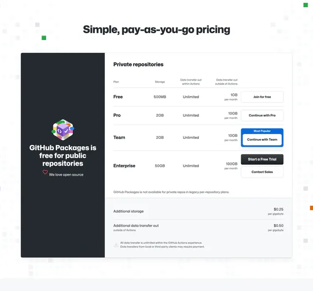
More like this

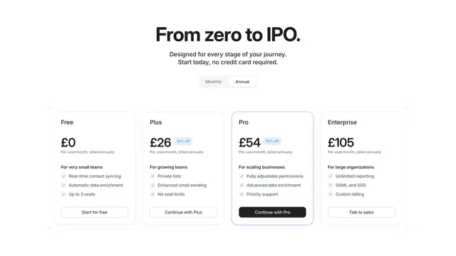


Keep what you find
A free account saves references to boards and can send you a weekly email of picks based on what you save.
To see every result, go Pro.