Preview image. Unlock full-res
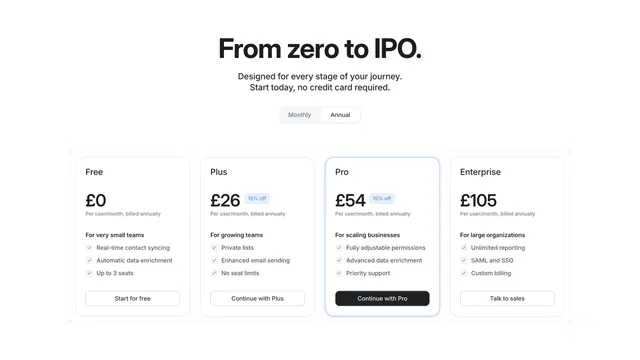
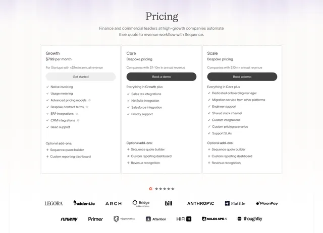
Clean four-column pricing table with a centered display headline, a monthly/annual toggle, and one highlighted Pro plan.
Summary
A four-tier pricing table under a bold centered headline, with a monthly/annual toggle and a single blue-outlined Pro column drawing the eye. The layout is crisp, light, and grid-aligned.
Visual description
A large black centered headline ("From zero to IPO.") sits over two lines of grey sub-copy and a pill-shaped Monthly/Annual toggle with Annual selected. Below are four equal pricing cards on faint grid lines: Free (£0), Plus (£26 with a blue "15% off" badge), Pro (£54, highlighted with a blue border), and Enterprise (£105). Each card has a plan name, large price, "Per user/month, billed annually" note, a bold audience line, three check-marked feature bullets, and a full-width action button. Free, Plus, and Enterprise use outlined buttons; the highlighted Pro card uses a solid black "Continue with Pro" button.
Key takeaway
Pulling the recommended plan forward with just a thin colored border and a filled button, rather than a loud banner or scale-up. The faint intersecting grid lines behind the cards keep the four columns feeling engineered and aligned.
Reuse notes
A reliable default for per-seat SaaS pricing with three to four tiers. The single accent color does all the emphasis, so it recolors cleanly to any brand. Keep bullet lists short and parallel as shown so the columns scan side by side.
More pricing table sections
See all

More like this


Keep what you find
A free account saves references to boards and can send you a weekly email of picks based on what you save.
To see every result, go Pro.