Preview image. Unlock full-res
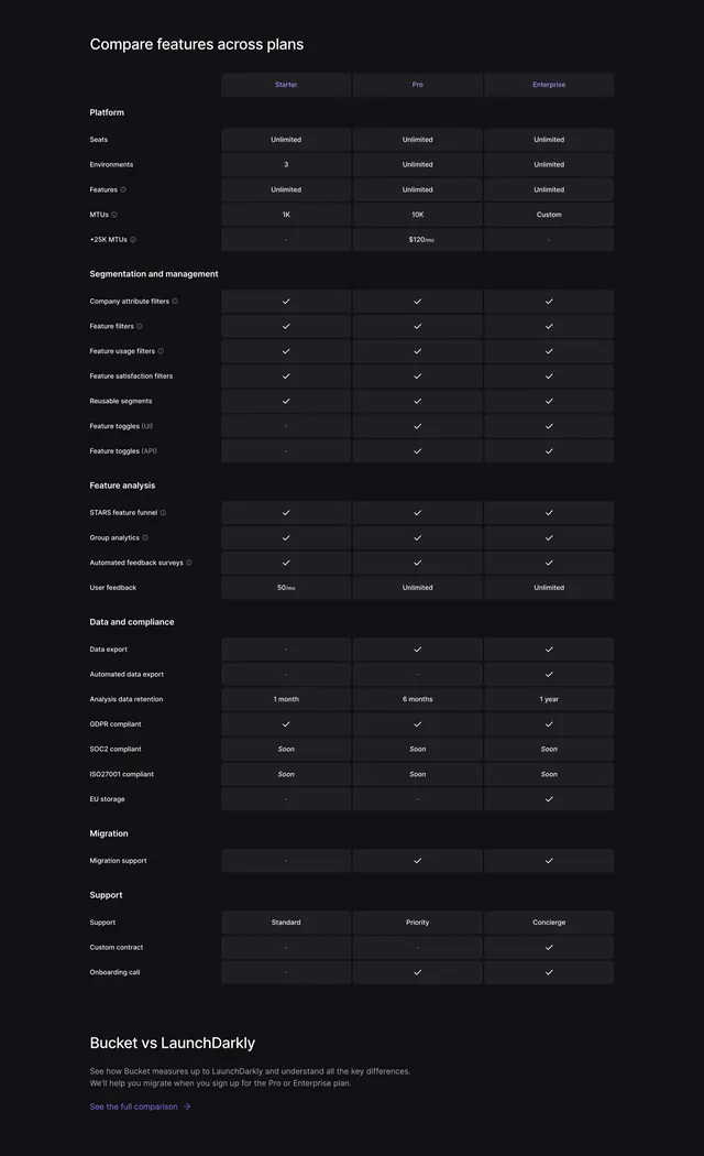
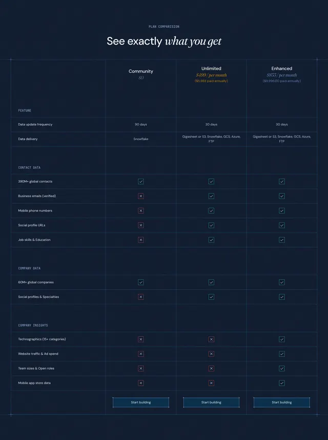
Dark, dense feature-comparison table across three plan columns, grouped into labeled sections, capped by a competitor cross-link.
Summary
A dark, full feature-comparison matrix that lays Starter, Pro, and Enterprise side by side across many grouped rows. The defining feature is the long, sectioned table that resolves into a competitor cross-link at the bottom.
Visual description
A left-aligned "Compare features across plans" heading sits above a three-column matrix headed Starter, Pro, and Enterprise in faint purple. Rows are organized under bold group labels: Platform, Segmentation and management, Feature analysis, Data and compliance, Migration, and Support. Cells hold either values (Unlimited, 1K, 10K, $120/mo, 1 month, 6 months) or small white checkmarks, with dashes for absent features and italic "Soon" markers for pending ones. Alternating row backgrounds give a faint zebra striping in the dark cells. Below the table, a "Bucket vs LaunchDarkly" heading with a short paragraph and a purple "See the full comparison" link points to a competitor page.
Key takeaway
The grouped, labeled row sections that keep a long feature matrix navigable instead of one undifferentiated list. Ending the table with a soft handoff to a dedicated competitor comparison rather than cramming rivals into the same grid.
Reuse notes
Use as the deep-dive companion below a simpler three-card pricing block, for buyers who want every detail. Dashes, checks, and "Soon" need consistent meaning across rows. The density only works with enough real features to justify the grouping.
More pricing table sections
See all


More like this


Keep what you find
A free account saves references to boards and can send you a weekly email of picks based on what you save.
To see every result, go Pro.