Preview image. Unlock full-res
Four-step vertical bento process section with bold color blocks, oversized step numbers, and UI mockups showing an AI asset workflow.
Summary
A stacked four-step process explainer where each step gets its own saturated color panel, large step numeral, headline, and embedded product UI mockup.
Visual description
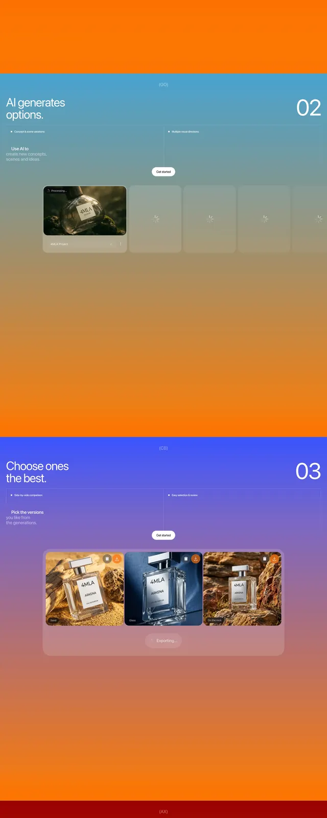
Vertical sequence of four full-width rounded color blocks under a black headline "From idea to assets in four steps." Step 01 on warm orange: "Add products and brand" with thin oversized "01" top-right; centered white card shows "Adjust look" with a row of five model headshots and a row of six gray 3D figure silhouettes; small step labels and white "Get started" button at bottom. Step 02 on teal: "AI generates options" with "02"; horizontal row of five cards, first showing a perfume bottle in a dark natural setting, remaining four empty with loading icons. Step 03 on purple-indigo: "Choose ones the best" with "03"; three large perfume product shots on varied backgrounds plus a translucent "Generating..." progress bar. Step 04 on deep red: "Ready-made assets export" with "04"; semi-transparent grid of dozens of small fashion images with a floating toolbar overlay and Create button.
Key takeaway
Assigning a distinct saturated color per step makes a long vertical scroll feel like distinct chapters. Thin oversized numerals anchor each block without competing with headlines. Real UI mockups inside each panel show the product doing work, not abstract icons.
Reuse notes
Ideal for AI or generative tools explaining a multi-step workflow. Color progression needs careful brand alignment; four strong hues can feel loud on conservative sites. Each panel is tall; best placed mid-page where users expect depth, not above the fold.