Preview image. Unlock full-res
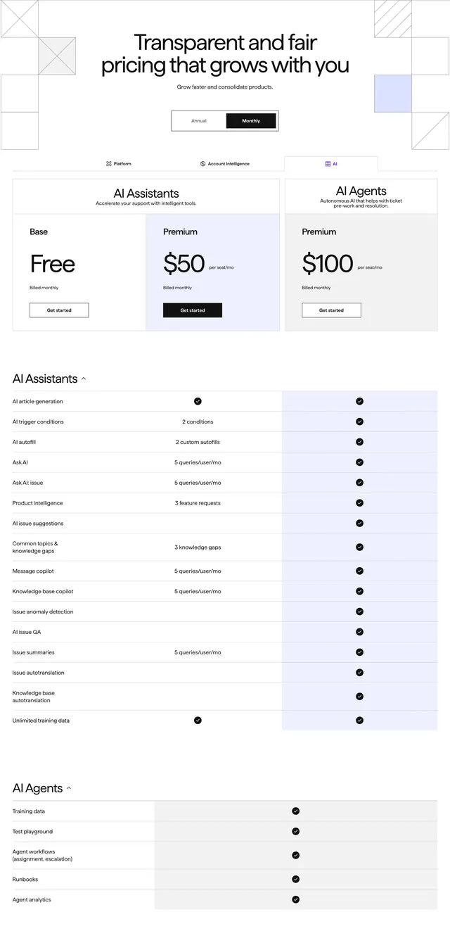
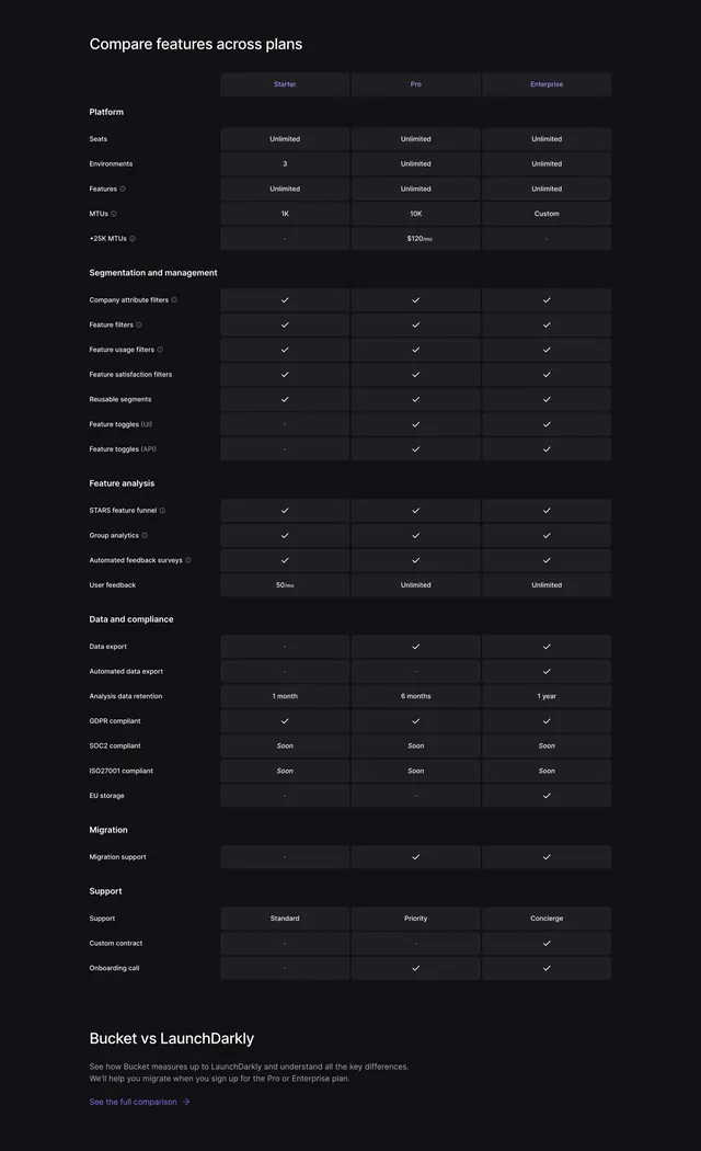
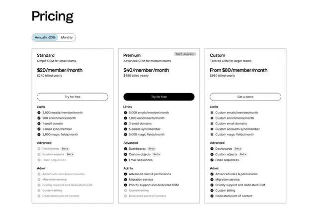
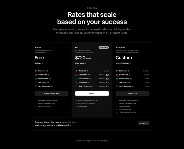
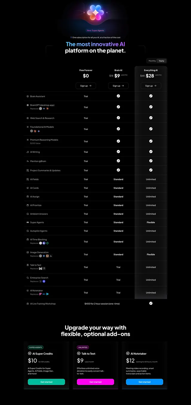
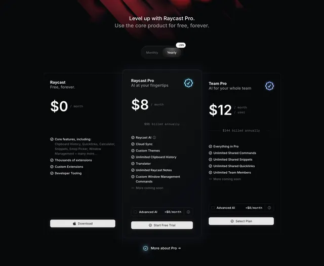
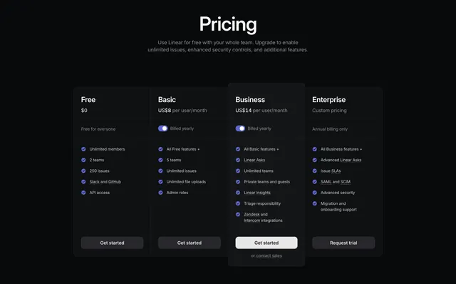
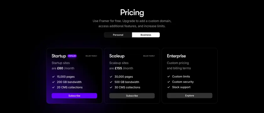
Dark centered three-column pricing with a segmented toggle and a violet-glowing popular plan carrying the only filled CTA.
Summary
A dark, centered three-plan pricing block with a Personal/Business segmented toggle, where the recommended plan is lifted by a violet glow and the only solid-violet CTA. The defining move is using a single colored glow and filled button to steer the eye to one plan on an otherwise black grid.
Visual description
A black section with a centered oversized "Pricing" heading and a two-line muted subhead. A dark segmented pill toggle below it switches between "Personal" and "Business", with "Business" active. Three dark rounded cards sit side by side: Startup (£60/month) with a violet "POPULAR" badge, a soft violet glow behind the card, and a filled violet "Subscribe" button; Scaleup (£155/month) with a dark grey "Subscribe"; and Enterprise (custom pricing) with a dark grey "Explore". Each card lists its name, a "BILLED YEARLY" label, the price, and three white check-marked features (pages, bandwidth, CMS collections, or custom limits/security/Slack support). The non-popular cards stay flat and low-contrast.
Key takeaway
Singling out the recommended tier with a colored glow plus the one filled accent CTA, so attention lands without borders or size changes. Keeping the other two cards dark and quiet makes the highlight do all the work, and the segmented toggle cleanly splits audience-based pricing.
Reuse notes
Strong dark-mode pricing for a developer tool or design SaaS with a clear hero plan. Needs a brand accent color that reads as a glow on black. The Personal/Business toggle pattern suits products with distinct audience tiers; for simple per-seat plans a billing-period toggle fits better.