Preview image. Unlock full-res
Light feature section stacking three alternating rows of serif copy beside floating product UI cards with soft hand-drawn accents.
Summary
A clean, light feature block built from three stacked two-column rows, each pairing a serif headline and short paragraph with a floating cluster of product UI surfaced as cards, charts, and progress bars.
Visual description
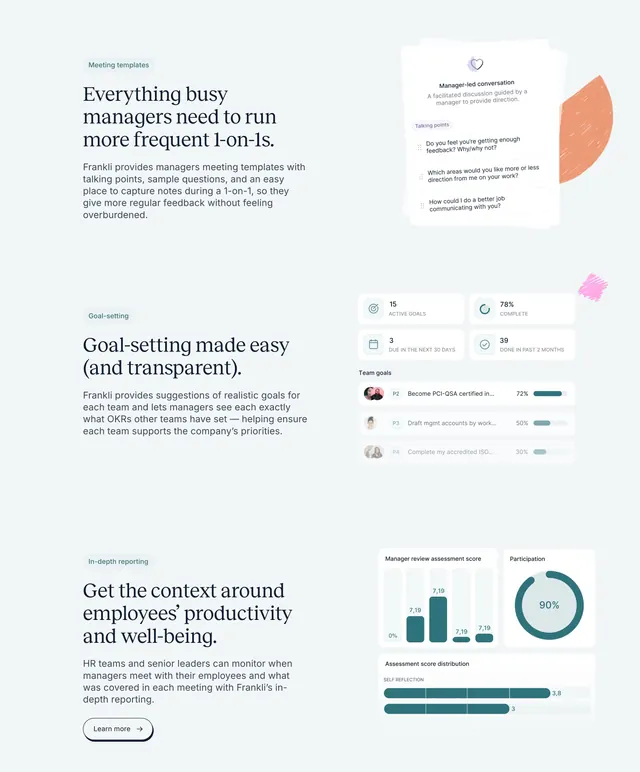
Off-white background with three feature rows stacked vertically. Each row has a small teal pill label ("Meeting templates", "Goal-setting", "In-depth reporting"), a two- to three-line serif headline, and a paragraph of muted sans-serif body copy on the left. On the right sit realistic product UI fragments: a stacked meeting-notes card with talking points, a goal-tracking panel with stat tiles and horizontal progress bars and avatars, and a reporting dashboard with a bar chart, a donut showing 90%, and score-distribution bars. Small hand-drawn scribble shapes in orange and pink peek behind the cards. The third row adds a small outlined "Learn more" pill button.
Key takeaway
The alternating serif-copy-plus-floating-UI rhythm that shows three distinct product capabilities without a hard container or heavy chrome. The tiny textured scribble accents add warmth to otherwise sterile dashboard screenshots.
Reuse notes
A reliable mid-page features layout for a data-rich SaaS product that needs to show real UI. Best when you have genuine, legible product screenshots to crop into cards. The serif headlines give it an editorial, trustworthy tone suited to HR or people-management tools.