Preview image. Unlock full-res
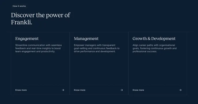
Dark three-column process layout with serif column headings, dotted dividers, and a "Know more" link with an arrow in each column.
Summary
A dark navy "How it works" block laid out as three text columns, each with a serif heading, a paragraph, and a dotted-rule-separated "Know more" link with a right arrow.
Visual description
Deep navy background. Top-left has a small rounded "How it works" pill badge, then a two-line serif headline ("Discover the power of Frankli.") in white. Below, a three-column grid divided by faint vertical rules holds "Engagement", "Management", and "Growth & Development", each a serif column title over three lines of muted sans-serif body copy. Near the bottom of each column a thin dotted horizontal rule separates the copy from a "Know more" label paired with a long right-pointing arrow. The columns are otherwise empty of imagery, keeping the section purely typographic.
Key takeaway
The disciplined, image-free three-column structure that reads as a clean step or pillar breakdown using only type, faint column rules, and a dotted divider above each arrow link. The long thin arrows give the "Know more" links a refined, editorial pull.
Reuse notes
Use when you want a calm, text-led overview of three benefits or steps without competing visuals. The dotted divider plus arrow pattern is a tidy way to footer each column with a link. Relies on a strong serif and generous spacing; on a busy page it could read as sparse.