Preview image. Unlock full-res
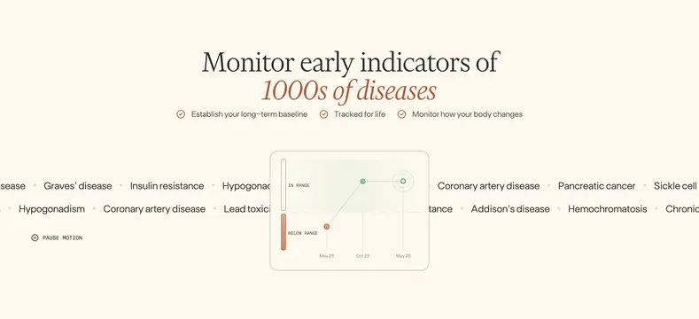
Cream disease-monitoring section with a serif headline, three checkmark value props, a central biomarker trend chart, and scrolling disease-name ticker rows behind.
Summary
A Function monitoring section pairing a serif headline about tracking thousands of diseases with three checkmark benefits, a central range chart showing improvement over time, and animated disease-name rows scrolling behind.
Visual description
Off-white cream background. Centered headline reads "Monitor early indicators of" in dark serif, with terracotta italic serif on "1000s of diseases." Below, three horizontal value props each with a terracotta checkmark icon: "Establish your long-term baseline," "Tracked for life," and "Monitor how your body changes." Center stage is a rounded card with a line chart: Y-axis split into green "IN RANGE" above and terracotta "BELOW RANGE" below; X-axis marks May 25, Oct 25, and May 26. Data points start below range (terracotta dot), then move into range (green dots) with the final point highlighted by concentric rings. Behind the card, two faint horizontal rows of disease names scroll (Graves' disease, Insulin resistance, Hypogonadism, Coronary artery disease, Lead toxicity, Addison's disease, Pancreatic cancer, Sickle cell, Hemochromatosis, Chronic, and more). Bottom-left shows a small circular pause icon beside all-caps "PAUSE MOTION."
Key takeaway
Layering a scrolling disease ticker behind a single trend chart makes abstract breadth feel tangible without a long list. The three checkmark props above the chart establish baseline, lifetime tracking, and change monitoring in one scan.
Reuse notes
Strong for diagnostics, longevity, or health SaaS explaining longitudinal monitoring. The ticker animation needs a pause control for accessibility. Chart color zones (in range vs below) translate well to any biomarker product. Pairs with other Function cream-and-terracotta sections.