Preview image. Unlock full-res
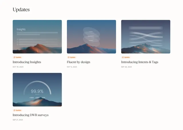
Light blog index titled "Updates" with a three-column card grid of product announcements, each pairing a frosted-glass UI thumbnail over mountain scenery with an orange update pill.
Summary
A minimal product blog section with a serif "Updates" heading and a three-column grid of announcement cards, each using a stylized mountain photo with a frosted UI overlay, orange "Update" pill, serif title, and date.
Visual description
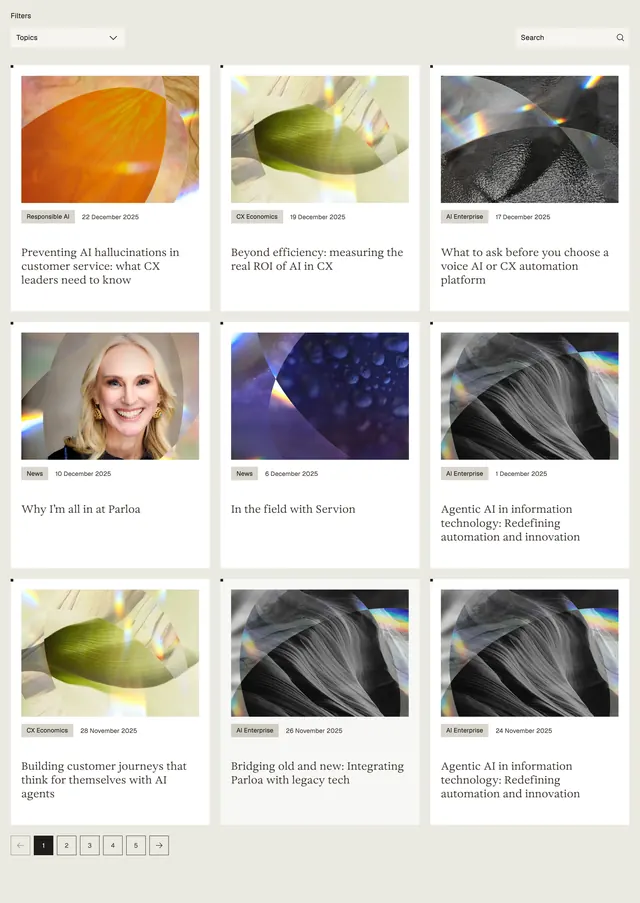
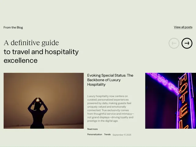
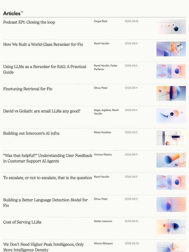
White page with generous margins. Top-left "Updates" in large black serif. Below, a responsive three-column card grid (three cards top row, one starting a second row left). Each card: rounded rectangular image showing blue-orange mountain landscape at dusk with a unique semi-transparent frosted-glass UI mockup overlaid (Insights dashboard bars, multilingual "Hola/Bonjour/Hello" ovals, Intents & Tags flow lines, DWR survey 99.9% arc). Under each image, a small light-orange pill with white bell icon and "Update" label. Black serif post title ("Introducing Insights," "Fluent by design," "Introducing Intents & Tags," "Introducing DWR surveys") and light gray sans date (OCT 19 2025 through SEP 21 2025). No sidebar, nav, or pagination visible.
Key takeaway
Using one consistent scenic photo base with different frosted UI overlays makes a changelog feel cohesive while still showing distinct features. The small orange update pill gives every card the same category signal without heavy chrome.
Reuse notes
Strong pattern for SaaS or AI product release pages that need a editorial changelog without photography shoots per post. Requires art direction for the shared backdrop and overlay mockups. Works on light backgrounds only; grid assumes at least three posts to fill a row.