Preview image. Unlock full-res
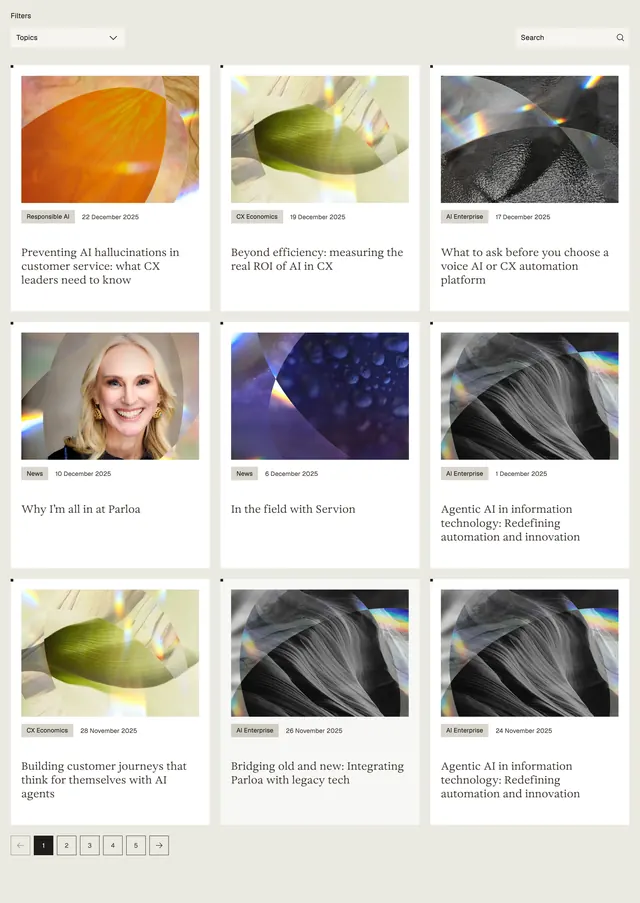
Light editorial blog grid with prism-tinted thumbnails, serif titles, topic filters, and numbered pagination.
Summary
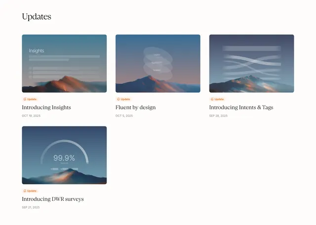
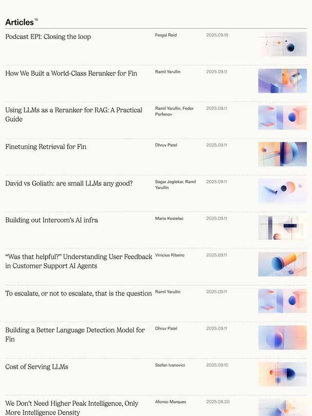
A three-column knowledge or blog listing on warm off-white, pairing abstract prism-lit thumbnails with serif article titles, topic filters, and square pagination controls.
Visual description
Warm beige page background with a top toolbar: a "Filters" label, a "Topics" dropdown on the left, and a search field with magnifying glass on the right. Nine white cards fill a 3x3 grid with even gutters. Each card stacks a rectangular featured image (mostly abstract organic shapes with rainbow light refraction; one card uses a portrait photo), a small gray category pill and date row, then a multi-line serif headline in black. Bottom-left pagination uses square buttons with arrows and numbered pages; page 1 is filled black with white type.
Key takeaway
The editorial card grammar: prism imagery as a repeatable art direction, tiny category metadata above a large serif title, and restrained square pagination instead of infinite scroll.
Reuse notes
Strong pattern for AI or enterprise content hubs that want a magazine feel without leaving a marketing site. Needs consistent abstract or portrait art direction across posts. Filters and search imply a larger library behind the grid.