Preview image. Unlock full-res
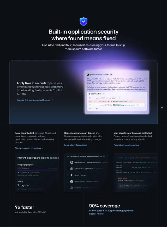
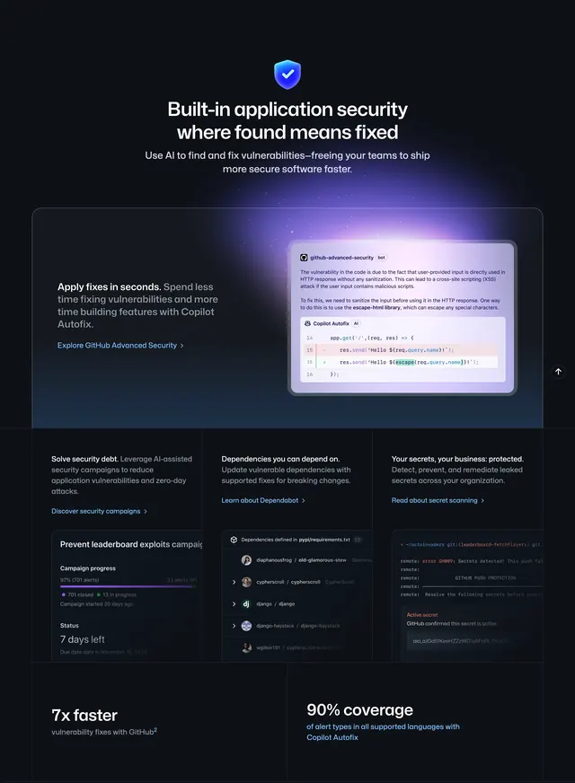
Dark application-security section with shield hero, Copilot Autofix feature card, three product columns, and proof statistics.
Summary
A centered security story led by a shield icon and bold headline, followed by a Copilot Autofix spotlight, a three-column product grid, and two large performance stats.
Visual description
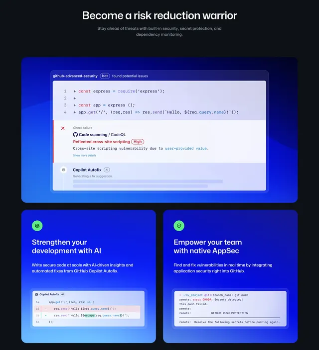
Near-black canvas with soft blue-violet glow at the base. Centered blue shield icon with checkmark anchors an oversized white headline about application security where found means fixed, plus gray AI vulnerability copy. A wide rounded card with purple rim light splits left copy (Apply fixes in seconds, Autofix description, blue Advanced Security link) from a right-side bot panel showing XSS explanation and a Copilot Autofix diff with escaped user input. Three columns below repeat heading, body, and link pattern: security campaigns with a 97% progress card, Dependabot with a dependency list and avatars, secret scanning with a terminal push-rejection UI. Footer stats read 7x faster vulnerability fixes and 90% alert-type coverage in large white type with smaller gray qualifiers.
Key takeaway
One iconic shield mark carries the entire section identity before product UI appears. The Autofix card treats the code diff as the hero image, making the fix tangible rather than abstract. Three sibling cards share identical information hierarchy so users can scan by product name alone.
Reuse notes
Ideal for B2B security or dev-platform pages selling multiple tools in one band. Requires authentic product screenshots; placeholder UIs will feel hollow at this fidelity. Dark gradient backdrop is mandatory for the glow effects to read. Pair with a lighter community or testimonial block below to avoid all-dark fatigue.