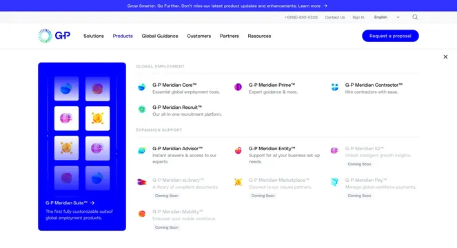
Preview image. Unlock full-res
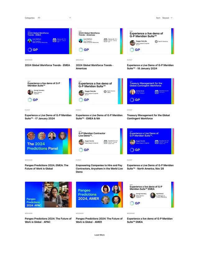
Filterable events and webinars grid with category and sort controls, colorful promo cards, and a load-more footer.
Summary
A three-column events and webinars listing with top filter/sort controls, uniform promo cards mixing blue graphic panels and photography, and a centered load-more button.
Visual description
White page with a top bar: "Categories: All" dropdown on the left and "Sort: Newest" dropdown on the right. Below, a 4x3 grid of event cards. Each card has an upper graphic panel and a lower text block. Graphic panels vary between solid bright blue backgrounds and white or photo backgrounds, always with a thin multicolor vertical stripe along the right edge and the G-P logo in the corner. Cards show event titles like "2024 Global Workforce Trends - EMEA" or "Experience a Live Demo of G-P Meridian Suite", speaker circular headshots with names and titles, calendar date/time lines, and region labels (EMEA, North America, APAC). Lower text area has a small grey "WEBINAR" or "EVENT" label and a bold black headline repeating the session title. One card uses a lifestyle photo of a woman on a laptop. Footer centers a pill-outlined "Load More" button.
Key takeaway
The consistent card shell (graphic top, metadata bottom, rainbow stripe accent) makes varied event types feel like one system. Layering speaker avatars, dates, and regions inside the graphic panel keeps the lower text area clean and scannable.
Reuse notes
Strong reference for B2B events, webinar, or resources pages with many recurring session formats. The filter/sort bar scales to large catalogs; load-more avoids pagination chrome. Photo and solid-color card variants add visual rhythm but need art direction to stay cohesive. Dense metadata may truncate on smaller card widths.