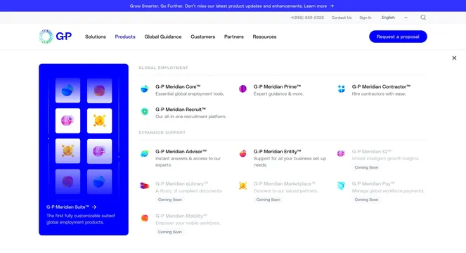
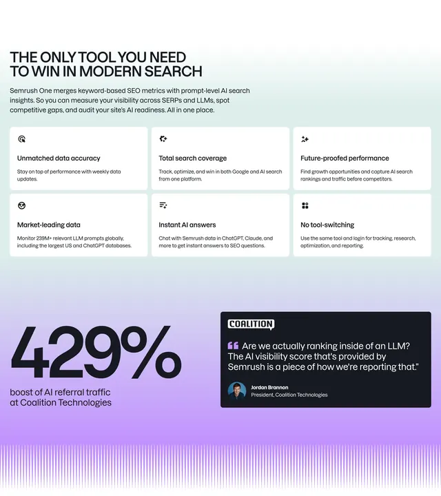
Long-form tabbed features section for G-P Meridian Core with category pills, 2x2 product UI cards, and mixed wide-and-stack layouts per feature group.
Summary
A multi-section feature explorer anchored by a gradient product name in the headline and horizontal category pills, then repeating category blocks with UI-forward cards that pair screenshots with short copy.
Visual description
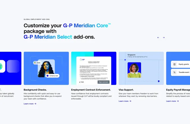
White page with a centered headline where "G-P Meridian Core" uses a blue-to-purple gradient. Five pill tabs sit below (Employer of Record active, plus HR Support, Advanced Tools, Customer Success, Select Add-Ons). Each category opens with a large left-aligned heading and gray intro paragraph. Employer of Record uses a 2x2 card grid: each card has a product UI screenshot on top (employee profile, contract generator workflow, benefits list, contract changes request) and a bold title plus body copy below. HR Support shifts layout: one wide card with a scheduling UI on the left and copy on the right, then two stacked cards (payroll table screenshot; solid blue block for time and expense). Blue is the dominant accent across UI chrome and decorative fills.
Key takeaway
Category pills turn a very long feature page into digestible chapters without leaving the page. Mixing 2x2 grids with one asymmetric wide card keeps rhythm across dozens of features. Real UI captures do the persuasion work; copy stays short underneath.
Reuse notes
Best for complex B2B platforms that need to prove depth (EOR, payroll, HR ops). Demands high-quality product screenshots for every card. The scroll is long; use on dedicated product pages rather than landing-page folds. Tabs imply in-page switching though only a still is shown.