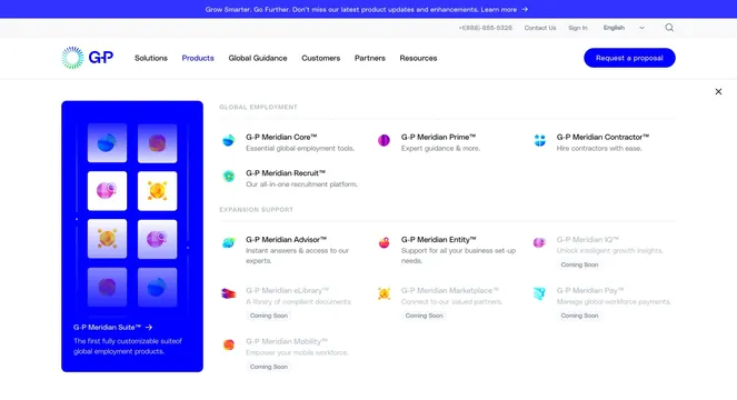
Light product catalog grid presenting five G-P Meridian growth products with gradient sphere icons, coming-soon labels, and circular arrow CTAs on a dotted grid frame.
Summary
A centered product lineup section with a headline about global expansion planning and five Meridian products arranged in a 2-over-3 grid, each with a colorful abstract icon, description, and arrow CTA.
Visual description
White background framed by faint gray grid lines and small blue corner dots. Small all-caps "GLOBAL EXPANSION PRODUCTS" label above a large black headline. Top row holds two larger cards side by side: G-P Meridian Advisor (blue-green globe icon) and G-P Meridian Entity (orange-pink sphere with location pin). Bottom row holds three smaller cards: Meridian IQ (purple magnifying glass), Meridian Marketplace (yellow hub-and-spoke), and Meridian eLibrary (stacked gradient sheets). Three bottom cards carry gray "Coming Soon" labels. Each card ends with a circular outlined arrow button. Thin grid dividers separate cells without heavy borders.
Key takeaway
The asymmetric 2+3 grid gives hero products more room while keeping a full suite visible in one viewport. Gradient sphere icons unify disparate products without literal screenshots. "Coming Soon" tags set expectations without hiding roadmap items.
Reuse notes
Strong for platform or suite pages where multiple related products need equal billing. Works on light backgrounds with a restrained grid system. Circular arrow CTAs feel premium but need consistent hover states on the live site. Less suited when every product needs a screenshot preview.