Preview image. Unlock full-res
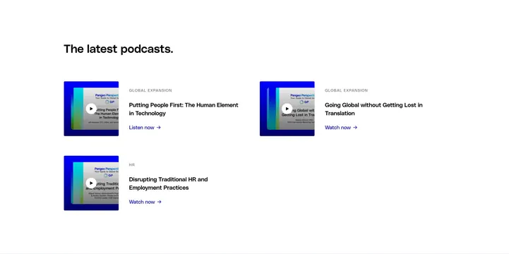
Podcast index grid with play-button thumbnails, category labels, episode titles, and listen or watch links on a white page.
Summary
A lightweight podcast listing with a left-aligned section heading and a two-column grid of episode cards, each pairing a video-style thumbnail with metadata and a blue action link.
Visual description
White background with generous padding. Bold black left-aligned heading reads "The latest podcasts." Below, three episode entries sit in a loose two-column grid: two cards on the top row and one on the bottom left. Each card has a square thumbnail with a dark blue outer frame, a teal-to-blue gradient inner panel, and a centered white play button icon. Under the thumbnail, a small grey uppercase category label ("GLOBAL EXPANSION" or "HR"), a bold black multi-line episode title, and a bright blue text link ("Listen now" or "Watch now" with arrow). Thumbnails share identical styling; only titles and link verbs vary.
Key takeaway
The uniform thumbnail shell makes mixed audio and video episodes feel like one series. Category as quiet uppercase metadata keeps the bold title and single blue link as the only competing focal points.
Reuse notes
Works for corporate podcast or media resource pages that need a compact teaser grid above a full archive. The asymmetric 2+1 layout reads well at desktop width but may leave awkward whitespace on wide screens; consider a third column or load-more for larger catalogs. Play-button thumbnails signal video even when content is audio-only.