Preview image. Unlock full-res
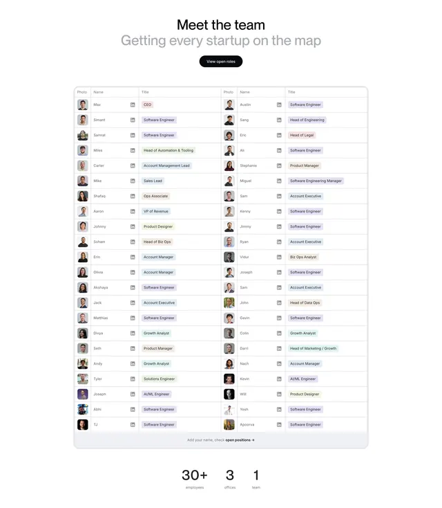
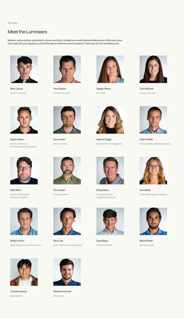
Light team section presenting the whole company as a dense two-up directory table with photos, roles, and stat counters below.
Summary
A team section that ditches the usual avatar grid and instead lists every employee in a dense two-column directory table, capped by a row of large stat counters.
Visual description
Centered black headline "Meet the team" with a gray secondary line and a small black pill "View open roles" button. Below sits a single bordered table split into two identical halves, each with Photo, Name, and Title columns. Every row carries a small circular avatar, a first name, a tiny LinkedIn glyph, and a colored capsule label for the role (soft purples, greens, and reds). A muted footer row invites "Add your name, check open positions." Beneath the table, three oversized numbers, "30+", "3", and "1", sit over small gray captions for employees, offices, and team.
Key takeaway
Rendering a large team as a scannable directory table instead of a portrait grid keeps a 40-person company compact and readable. The colored role capsules add visual rhythm to otherwise plain rows. The oversized stat trio under the table doubles as social proof.
Reuse notes
Best when the team is too big for a tidy avatar grid and you want roles to be quickly scannable. The two-up table layout needs many people to feel balanced; with a small team it would look empty. Pairs naturally with a careers or open-roles CTA.
More team sections
See all



More like this



Keep what you find
A free account saves references to boards and can send you a weekly email of picks based on what you save.
To see every result, go Pro.