Preview image. Unlock full-res
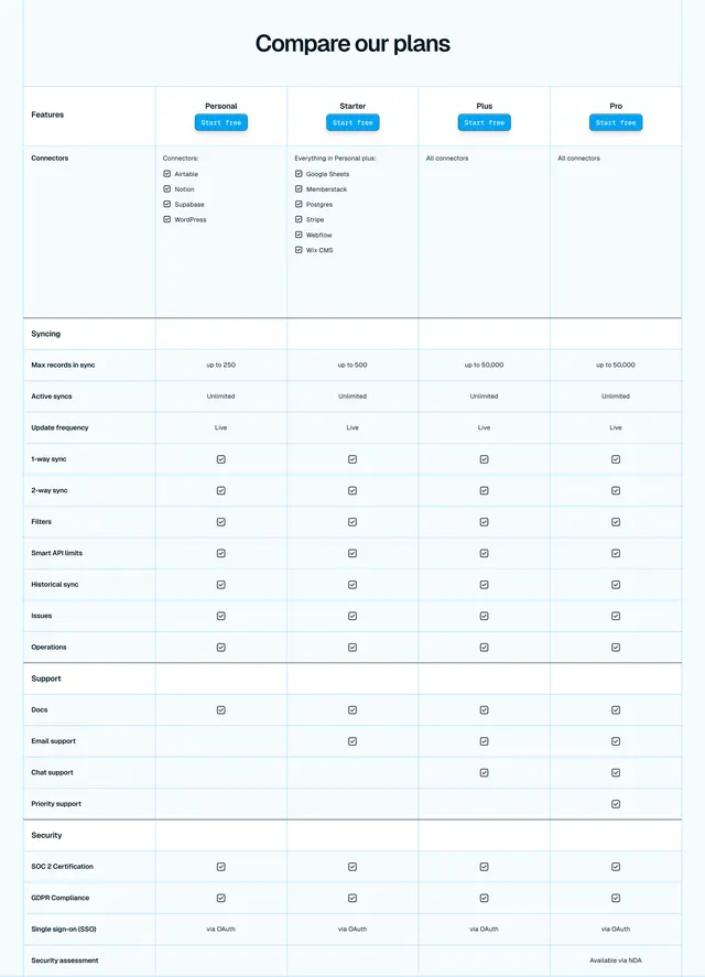
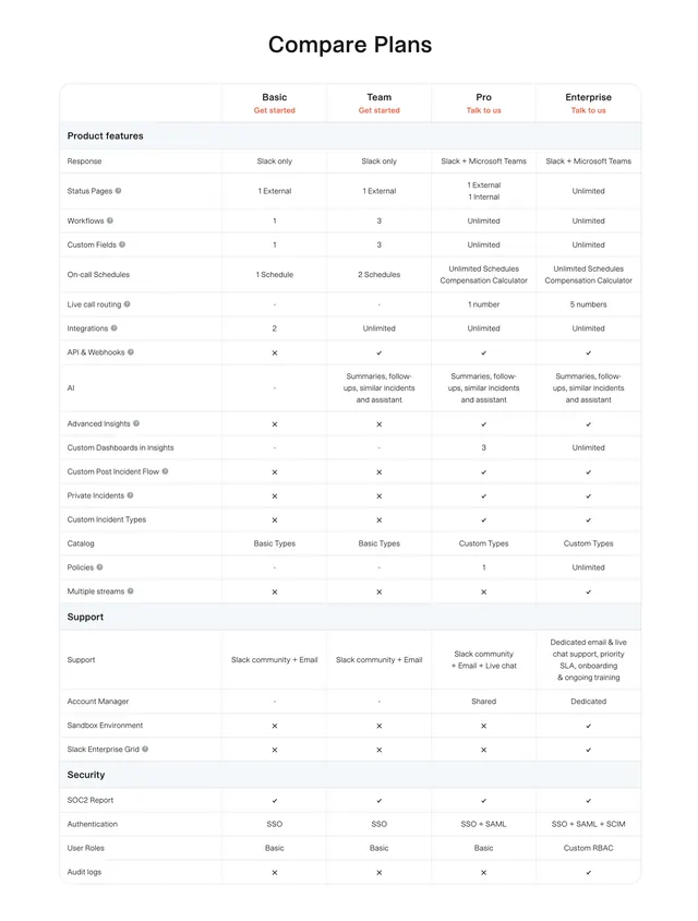
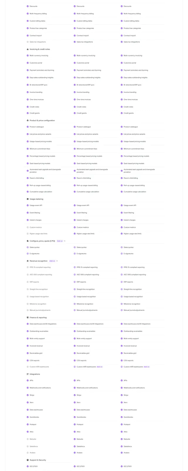
Detailed pricing comparison table with four plan columns, grouped feature rows, checkmarks, and Start free buttons per tier.
Summary
A "Compare our plans" table pits Personal, Starter, Plus, and Pro across Connectors, Syncing, Support, and Security sections with checkmarks and tier-specific values.
Visual description
Light background with centered bold headline "Compare our plans." Five-column table: feature labels left, four plan columns right. Each plan header has name and blue rounded Start free button. Sections grouped with light blue band headers: Connectors (specific app lists scaling to All connectors), Syncing (record limits from 250 to 50,000, plus sync features all checked), Support (docs through priority by tier), Security (SOC 2, GDPR, SSO, security assessment on Pro). Alternating white and pale blue row backgrounds with thin grey grid lines. Square checkmark icons mark included features.
Key takeaway
Grouped sections with band headers break a long comparison into scannable chunks. Per-column Start free buttons reduce friction at decision point. Escalating connector lists ("Everything in Personal plus") communicate upgrade value without re-listing everything.
Reuse notes
Standard pattern for SaaS pricing pages with four tiers. Table density requires responsive collapse strategy on mobile. Alternating row tint improves readability on wide tables.
More pricing table sections
See all

More like this
Keep what you find
A free account saves references to boards and can send you a weekly email of picks based on what you save.
To see every result, go Pro.