Preview image. Unlock full-res
Light bento features grid for a data product, each cell showing a charting, global-data, or comparison UI fragment.
Summary
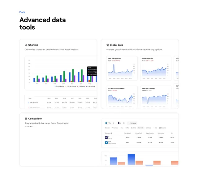
A light bento features grid for a financial-data product, where each card carries a short label, a sentence, and a cropped chart or table from the actual UI. The defining quality is that every cell is illustrated by real-looking data visuals.
Visual description
A small blue eyebrow ("Data") sits above a bold two-line sans headline ("Advanced data tools") in the top-left. Below, the content is arranged into bordered white cards on a faint grey field. The top-left card "Charting" shows a multicolor bar chart with a legend and a data table beneath. The top-right card "Global data" holds a 2x2 grid of mini line-chart tiles (S&P 500 PE Ratio, Shiller PE Ratio, 10 Year Treasure Rate, S&P 500 Earnings) bleeding off the right edge. A wide lower-left card "Comparison" pairs its copy with a floating comparison panel of company rows and a small blue/orange bar chart. Each card uses a tiny mono icon beside its label, and the charts sit in soft rounded containers.
Key takeaway
Filling each bento cell with a genuine slice of the product, charts, comparison rows, mini-tiles, sells a data tool far better than generic icons. Letting the mini-chart grid bleed off the card edge implies there is much more inside the app.
Reuse notes
Use for a fintech, analytics, or BI product with charts worth showing. The cards must hold real, legible data fragments or the section looks like placeholder boxes. Pairs naturally with the full-dashboard features variant from the same brand. Light background keeps the colorful charts readable.