Preview image. Unlock full-res
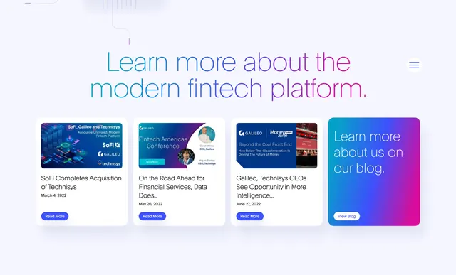
White blog section with a thin gradient headline and a four-column row of post cards plus a gradient CTA card.
Summary
A fintech blog teaser with an oversized gradient headline and four equal cards, three editorial previews and one branded gradient CTA.
Visual description
Plain white background with a large thin sans headline reading "Learn more about the modern fintech platform." in a cyan-to-magenta horizontal gradient. A small hamburger icon sits far right, aligned with the headline. Below, four cards share one row. Three blog cards each show a rectangular featured image, a two-line title, a date, and a small blue pill "Read More" button. Topics visible include SoFi/Technisys acquisition, a Fintech Americas conference, and a Money 20/20 panel. The fourth card is a full gradient block (blue to magenta) with white copy "Learn more about us on our blog." and a white outlined "View Blog" button.
Key takeaway
The gradient headline sets tone without a hero image. Reserving the last grid slot for a CTA card keeps the row visually balanced while driving traffic to the archive. Small pill buttons keep cards scannable without competing with thumbnails.
Reuse notes
Good pattern for B2B companies with steady press and event output. Thumbnail art quality matters; the gradient CTA card needs strong contrast for legibility. Pairs well with a darker footer or testimonial band below.