Preview image. Unlock full-res
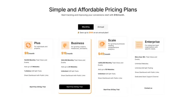
Light four-column pricing section with a Monthly/Annual toggle, an orange-outlined recommended plan, and per-tier icon, feature list, and CTA.
Summary
A light, centered four-column pricing block where a Monthly/Annual pill toggle sits above the grid and one middle plan is lifted out with an orange outline and a filled black CTA to steer the choice.
Visual description
Centered oversized black headline and a one-line subhead lead in. Below, a black-and-white segmented Monthly/Annual toggle with a small "Save up to $108 on an annual plan" line beneath it. Four pricing cards run left to right (Plus, Business, Scale, Enterprise), each with a small orange-tinted icon, plan name and one-line audience, a large orange price with "/month", a short bullet list with selected terms bolded, and a CTA. The second card (Business) is emphasized with a thicker orange border and a black filled "Start Free 30 Day Trial" button, while the others use ghost buttons; Enterprise drops the price for a "Contact us" button. Everything sits on white with thin light-grey card borders.
Key takeaway
Pushing a four-tier price table into one row and singling out the intended plan purely with an orange outline plus the only filled button, so the eye lands there without a loud "most popular" badge. The orange-only color treatment on icons and prices keeps the otherwise monochrome grid calm.
Reuse notes
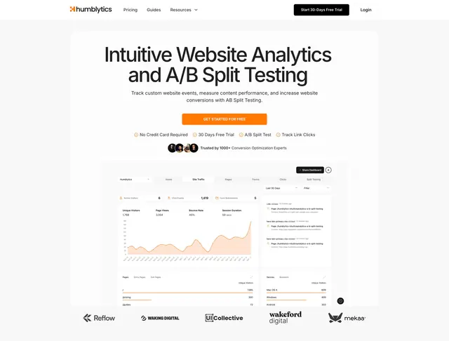
Use when a product has four genuine tiers including an enterprise "contact" path and wants a clean, contained look. Four columns get tight on narrower viewports, so plan for a stack or a tighter type scale. Pairs naturally with the matching Humblytics hero for a consistent single-accent system.