Preview image. Unlock full-res
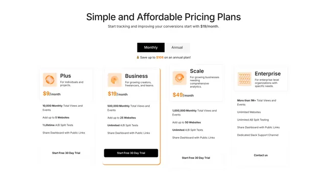
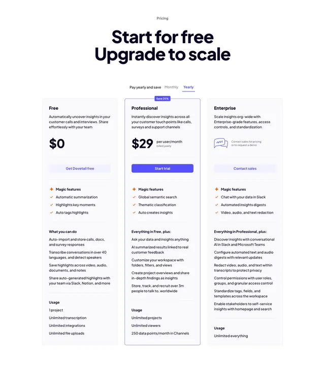
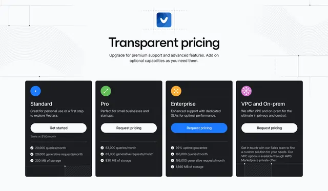
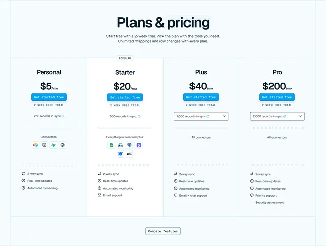
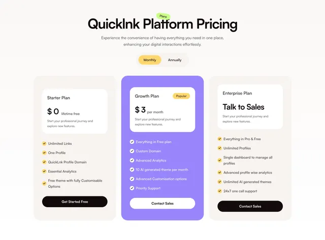
Light four-column pricing table with a yearly-monthly toggle and one dark highlighted plan among three light cards.
Summary
A light, centered four-column pricing block with a yearly-versus-monthly toggle up top and one dark card highlighting the recommended plan among three light ones. The single dark card is the only contrast move and it cleanly steers the eye.
Visual description
Soft off-white background with a very bold black sans headline "Plans that match your needs" and one line of muted sub-copy. A pill toggle below offers "Bill Yearly -20%" (active, white) and "Bill Monthly." Four pricing cards follow: Starter, Business, and Enterprise sit in light cards with thin borders, while Professional is a near-black filled card that pops forward. Each card shows an underlined plan name, a bold price with "/month," a one-line audience description, a green-checkmark feature list (posts, workspaces, AI credits, scans), and a blue "Try 7 Days Free" button.
Key takeaway
Using a single dark-filled card to mark the recommended tier needs no "Most popular" ribbon, the contrast alone does the work. The yearly toggle showing a "-20%" discount inline nudges toward annual without a separate callout.
Reuse notes
A dependable four-tier table for a product with clear usage-based limits per plan. The dark highlight reads best when only one plan is emphasized. Four columns crowd on mobile, so plan to stack. Green checks plus blue CTAs keep it conventional and trustworthy.