Preview image. Unlock full-res
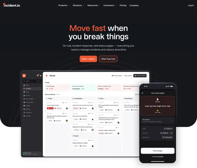
Centered dark incident-management hero with an accent-colored first word, dual CTAs, and a layered product dashboard plus mobile alert screen below.
Summary
A centered dark hero for an incident-management tool that colors only the first word of the headline orange and anchors the section with a layered product dashboard and a floating mobile alert screen.
Visual description
A near-black background carries a top navbar with the incident.io wordmark left, a centered menu (Products, Solutions, Resources, Customers, Pricing, Company) and a Log in link right. Centered below sits a two-line headline where "Move fast" is in orange and "when you break things" stays white. A two-line muted sub-headline follows, then two buttons side by side: a filled orange "Book a demo" and a ghost-outlined "Start free trial". The lower half shows a large light-mode dashboard screenshot of an incidents board with column lanes (Triage, Investigating, Fixing, Monitoring) and colored severity tags, with a dark on-call mobile screen overlapping it on the right showing a "User service high error rate" alert and Acknowledge buttons. Faint concentric arcs glow behind the product imagery.
Key takeaway
Coloring a single word of an otherwise white headline is a cheap, high-impact way to set brand tone. Pairing a wide light dashboard with a dark phone mockup contrasts surface-area views against a focused single alert, selling both breadth and immediacy.
Reuse notes
Strong default for a developer or operations SaaS that needs to show both a control-panel view and an on-the-go alert. Works on dark; the orange accent needs a genuinely dark field to pop. The light dashboard against the dark page reads as a deliberate inset, so the screenshot must be clean.