Preview image. Unlock full-res
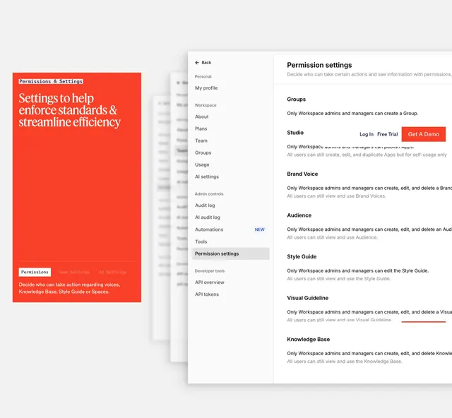
Orange intro card with serif headline and tab labels beside a detailed admin permission settings sidebar UI listing workspace controls.
Summary
An enterprise governance feature showing an orange marketing card about permissions standards opposite a realistic admin settings page with sidebar and policy list.
Visual description
Left: solid orange-red card with white bordered "Permissions & Settings" label, large white serif headline "Settings to help enforce standards & streamline efficiency", three tab labels (Permissions active in white box, Team Settings, AI Settings), and caption about voices, Knowledge Base, Style Guide, and Spaces. Right: light gray sidebar admin UI with Back, Personal, Workspace, Admin controls (Permission settings highlighted, Automations with NEW tag), Developer tools. Main white panel titled Permission settings with sections for Groups, Studio, Brand Voice, Audience, Style Guide, Visual Guideline, and Knowledge Base, each stating admin-only edit rules. Orange Get A Demo appears inside Studio section copy area.
Key takeaway
Marketing card plus real settings UI side by side sells enterprise control without abstract claims. Tab preview on the card hints at multiple settings areas before click-through.
Reuse notes
Strong for security or admin-feature pages targeting IT buyers. UI capture must stay readable at marketing scale. Orange card pattern works for any deep product surface preview.
More feature detail sections
See all



More like this
Keep what you find
A free account saves references to boards and can send you a weekly email of picks based on what you save.
To see every result, go Pro.