Preview image. Unlock full-res
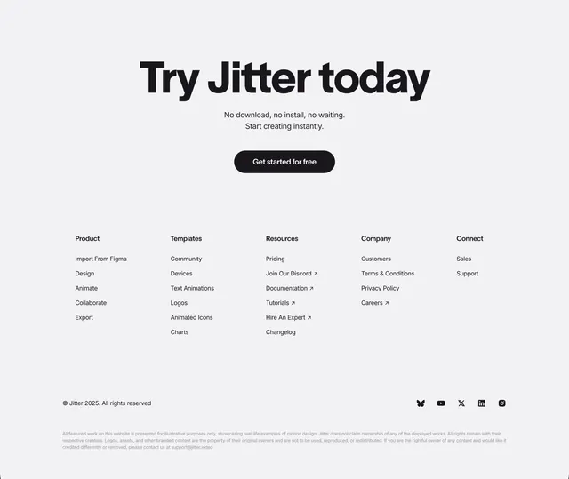
A light footer leading with an oversized centered CTA headline, then a five-column link grid and fine print.
Summary
A footer that opens with a large centered "Try Jitter today" CTA before dropping into a five-column link directory and legal fine print. The defining move is treating the top of the footer as a final conversion moment with oversized type and a single dark button.
Visual description
On light grey, a very large bold black headline "Try Jitter today" is centered up top, with two lines of grey sub-copy ("No download, no install, no waiting. Start creating instantly.") and a black "Get started for free" pill beneath. Below, five link columns sit left to right: Product, Templates, Resources, Company, Connect, each a bold header over a list of grey links, some with small outbound arrows. A thin rule separates a bottom bar showing the "Jitter 2025" copyright at left and a row of monochrome social icons (Bluesky, YouTube, X, LinkedIn, Instagram) at right. A small-print legal disclaimer paragraph closes the section.
Key takeaway
Front-loading the footer with an oversized centered CTA recaptures visitors who scrolled all the way down before they leave. The clean five-column link grid with outbound arrows on external links is a tidy, conventional directory pattern.
Reuse notes
A reliable default footer for SaaS and tool sites that want one last conversion push plus full navigation. The monochrome treatment keeps it quiet beneath busier sections. Scale the column count to your real link inventory; five works when you have distinct Product, Resources, Company, and social groupings.