Preview image. Unlock full-res
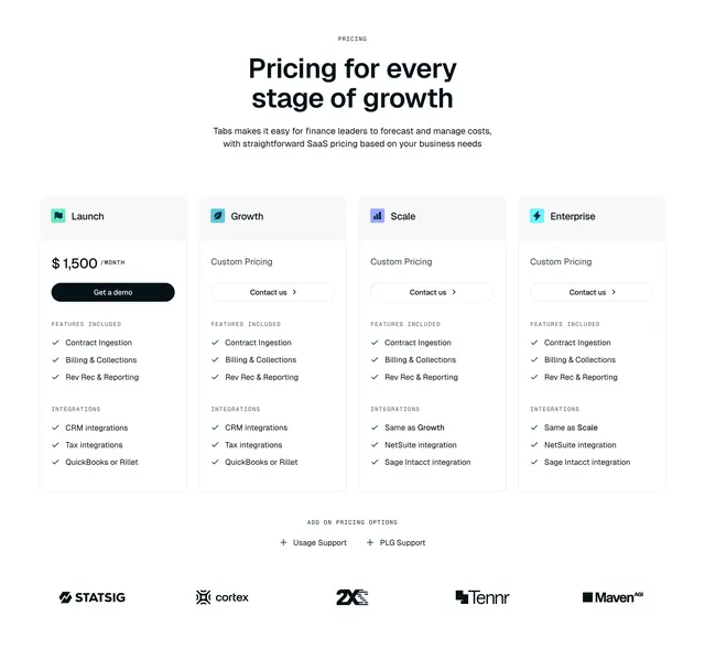
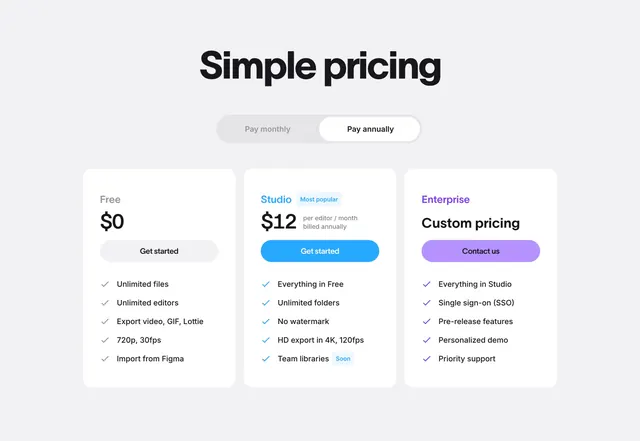
A light three-column pricing section with a monthly/annual toggle and a highlighted "Most popular" middle plan.
Summary
A standard but polished three-tier pricing block (Free, Studio, Enterprise) with a pill-style monthly/annual toggle and a colored "Most popular" highlight on the middle plan. The defining move is the accent-colored Studio card and its blue CTA pulling the eye to the recommended tier.
Visual description
Centered at top, a bold black "Simple pricing" headline sits above a grey pill toggle with "Pay monthly" and an active white "Pay annually" segment. Below are three white rounded cards on light grey. Free ($0) has a grey "Get started" button; Studio ($12 per editor / month, billed annually) is labeled with a blue "Most popular" badge and a blue "Get started" button; Enterprise (Custom pricing, purple "Contact us" button). Each card lists features with colored check icons, Free in grey, Studio in blue, Enterprise in purple. Studio also shows a small blue "Soon" badge next to "Team libraries". Tier names are color-keyed: black, blue, purple.
Key takeaway
Color-keying the recommended tier end to end, the "Most popular" badge, check marks, and CTA all share the same blue, so the upsell reads at a glance. The monthly/annual pill toggle and the "Soon" badge on a roadmap feature are clean, reusable details.
Reuse notes
A dependable three-plan pricing layout for SaaS with a clear good/better/enterprise ladder. Best when one middle tier is the intended default to highlight. The light boxed cards suit a soft modern brand; keep the accent color consistent with the rest of the site so the highlight tier matches.