Preview image. Unlock full-res
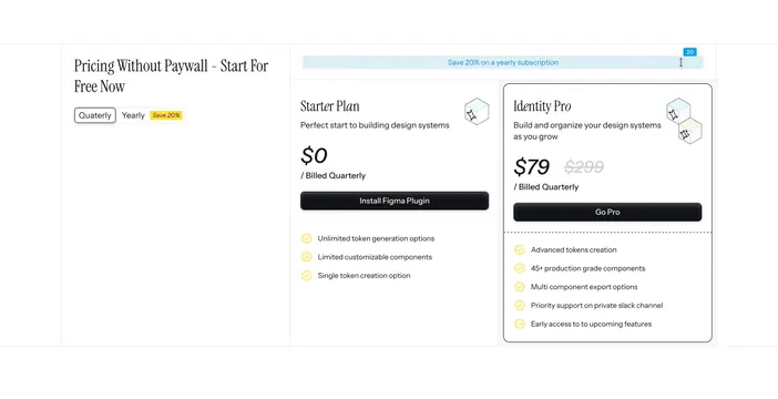
Light split pricing section with a serif heading and billing toggle on the left and two side-by-side plan cards, one highlighted, on the right.
Summary
A light pricing section that keeps the heading and billing toggle in a left column and places two plan cards to the right, with the paid tier visually promoted by a rounded outline and a struck-through original price. The defining element is the Quaterly/Yearly toggle plus a separate "Save 20%" billing banner.
Visual description
On the left, a two-line serif heading ("Pricing Without Paywall - Start For Free Now") sits above a small pill toggle switching between "Quaterly" and "Yearly", the latter tagged with a yellow "Save 20%" chip. The right two-thirds holds two plans. The Starter Plan card is borderless: name, one-line description, an oversized "$0 / Billed Quarterly", a black "Install Figma Plugin" button, and three yellow-check feature rows. The Identity Pro card is enclosed in a rounded black outline: "$79" shown next to a struck-through "$299", a black "Go Pro" button, and five yellow-check features below a dashed divider. Each card header carries a small isometric wireframe cube icon. A full-width hatched banner above the cards reads "Save 20% on a yearly subscription".
Key takeaway
Splitting the heading and toggle into their own column lets two cards breathe and keeps the controls from crowding the plans. Promoting one tier with an outline plus a struck-through anchor price ($299 to $79) is a clean value cue without a loud "most popular" badge.
Reuse notes
Good for a two-tier freemium product where one plan is the obvious upsell. The "Quaterly" label is a visible typo in the source, so do not copy the spelling. Works on light; the highlighted-card outline carries the hierarchy, so keep the other card flat.