Preview image. Unlock full-res
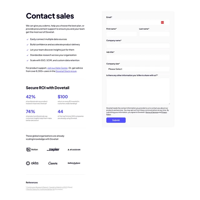
Two-column contact-sales section pairing a benefit list and ROI stats on the left with a boxed lead form on the right.
Summary
A contact-sales layout that justifies the form before asking for it: a checklist of benefits and four ROI stats on the left, a multi-field lead form boxed on the right.
Visual description
The left column opens with a bold "Contact sales" heading and a short intro, then a five-item checklist with small violet checkmarks. A "Secure ROI with Dovetail" sub-block follows with four large violet stat figures (42%, $100, 74%, 44) each over grey caption text, then a help-center and Slack-group line, and a tidy two-row grayscale logo wall (Notion, Zapier, Atlassian, Okta, Canva, SafetyCulture) above a small references footnote. The right column is a light grey rounded form panel: email, first/last name, company name, job title, a "Company size" dropdown, a multiline message field, fine-print consent text, and a solid violet "Submit" button. Everything is sans-serif, cool and restrained.
Key takeaway
Surrounding the form with proof (benefit checklist, hard ROI numbers, known customer logos) answers "why fill this in" right next to the fields. Boxing only the form in a grey panel makes the input area read as its own focused task.
Reuse notes
Strong default for a B2B "talk to sales" or demo-request page where the form is long and you need to reduce drop-off. The stats and logos are content-heavy, so it suits a mature product with real numbers to show. Keep the single accent color consistent across checkmarks, stats, and the submit button.
More contact sections
See all


More like this


Keep what you find
A free account saves references to boards and can send you a weekly email of picks based on what you save.
To see every result, go Pro.