Preview image. Unlock full-res
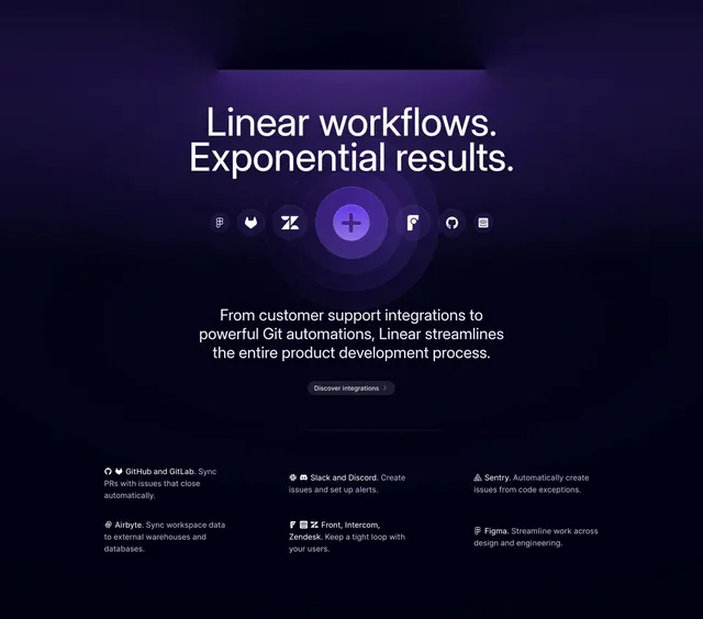
Purple-dark integrations hero with orbital icon ring, headline on exponential results, and three-column integration feature list.
Summary
Integrations section using a glowing plus hub and partner icons on rings above a categorized integration catalog.
Visual description
Black-to-purple gradient with thin top light slit. Large white headline "Linear workflows. Exponential results." Center graphic: purple glowing plus in concentric rings with small circular logos for Figma, GitLab, Zendesk, Front, GitHub, and Intercom. Gray paragraph on support and Git automations plus dark pill "Discover integrations >". Bottom three columns list pairs like GitHub/GitLab PR sync, Slack/Discord alerts, Sentry exceptions, Figma design handoff, each with icons, bold title, and gray line of copy.
Key takeaway
The orbital diagram makes integrations feel connected rather than listed. Grouping related tools in one row reduces repetition while showing ecosystem breadth.
Reuse notes
Strong for integration index heroes. Icon ring needs recognizable marks at small size. Purple glow fits developer SaaS but may clash on warmer brands.
More integrations sections
See all











More like this




Keep what you find
A free account saves references to boards and can send you a weekly email of picks based on what you save.
To see every result, go Pro.