Preview image. Unlock full-res
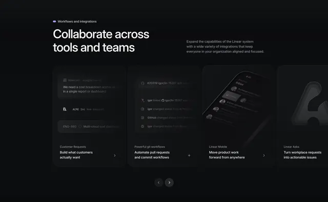
A dark-mode integrations showcase built as a horizontal carousel of four large feature cards, each previewing a different workflow in dim UI mockups.
Summary
A dark integrations section presenting four workflow capabilities as a swipeable row of large cards, each carrying a dim product mockup over a short title and description.
Visual description
On a near-black background, a small violet pill eyebrow ("Workflows and integrations") sits above a two-line oversized white headline ("Collaborate across tools and teams"), with a three-line muted support paragraph set to its right. Below, four wide cards sit in a row: Customer Requests, Powerful git workflows, Linear Mobile, and Linear Asks. Each card shows a low-contrast dark UI mockup in its upper area (an Intercom request thread, a git activity feed, a phone inbox, a large faint "A" glyph) and, in its footer, a small grey category label, a bold two-line white title, and a circular control (chevron or plus) at the lower right. The fourth card is partially cut off at the right edge, and a pair of circular prev/next arrow buttons sits centered below the row.
Key takeaway
The dim, near-monochrome mockups inside each card keep the focus on the captions while still showing real UI, a restrained alternative to bright screenshots. The half-visible fourth card plus centered arrow controls makes the carousel obvious without instructions. The per-card circular chevron doubles as an affordance and a visual full stop.
Reuse notes
Well suited to a developer or workflow tool with several distinct integration stories to rotate through. The peek-card and arrow pair are the load-bearing motion cues, so keep them. Works only on dark; the muted screens depend on a black field for contrast. Pairs with a short eyebrow plus split headline and support copy.
More integrations sections
See all




More like this


Keep what you find
A free account saves references to boards and can send you a weekly email of picks based on what you save.
To see every result, go Pro.