Preview image. Unlock full-res
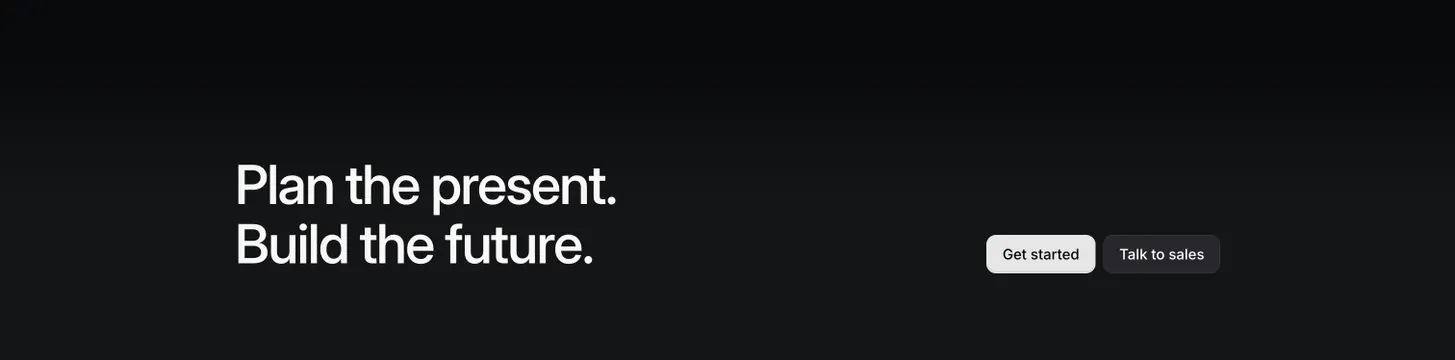
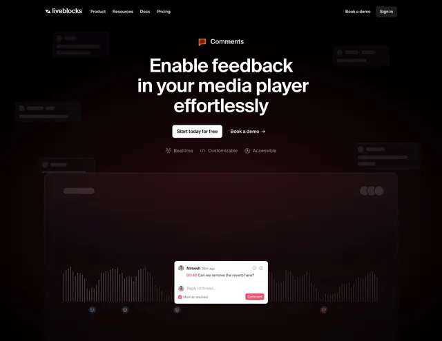
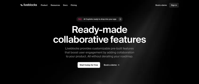
Centered dark SaaS hero with a huge two-line headline, an announcement pill, two CTAs, and a single diagonal light beam.
Summary
A centered, near-black SaaS hero leading with an oversized two-line headline and anchored by a single diagonal beam of light from the top-right corner. The light beam is the only visual texture in an otherwise empty dark field.
Visual description
A slim transparent navbar runs across the top with the Liveblocks wordmark, four left-aligned links (Product, Resources, Docs, Pricing), and "Book a demo" plus a "Sign in" button at right. Centered below sits a dark pill badge with a pink "New" tag reading "AI Copilots ready to drop into your app" and an arrow. Then a very large white sans-serif headline, "Ready-made collaborative features," over two lines, followed by three lines of muted grey sub-copy. Two CTAs sit side by side: a white filled "Start today for free" button and a ghost "Book a demo" link with an arrow. A faint diagonal light beam streaks down from the upper-right, the only lighting in the black space.
Key takeaway
One soft diagonal light beam doing all the atmospheric work over a flat black background, so no imagery or product shot is needed above the fold. The announcement pill with a colored "New" chip gives a place to surface a launch without cluttering the headline. Pairing a filled CTA with a quiet ghost link keeps a single clear primary action.
Reuse notes
A clean default for a technical or developer SaaS that wants a confident type-only opener. Works only on a dark theme and needs strong headline copy since there is no supporting visual. Leave the lower half open for a product shot or feature grid to follow.