Preview image. Unlock full-res
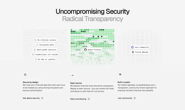
Three-column trust and transparency section with a two-tone headline, a green contribution-graph visual, and icon-led value columns below.
Summary
A trust-focused three-column section led by a stacked two-tone headline, with a GitHub-style green contribution grid as the centerpiece visual and three icon-led value columns beneath.
Visual description
Centered headline reads "Uncompromising Security" in solid black over "Radical Transparency" in grey, stacking emphasis through color. Below sit three aligned visual zones on a light grey field. Left: faint binary-digit texture with a stack of white pill labels (No internal access, Encrypted data, Bank-grade security, Credentials not stored, No ads or upsells), each with a small icon. Center: a dense green-shaded contribution heatmap grid (GitHub-style) with a "maybe-finance" pill in the middle. Right: more faint texture with two white social pills (Join community, Follow @maybe). The lower band is a clean three-column grid: each column has a small circular outline icon (lock, code, heart), a bold label (Secure by design, Open source, Built in public), two lines of grey body copy, and an underlined link with an arrow ("Ask about security," "Start contributing," "Join community").
Key takeaway
Using a GitHub contribution grid as a hero visual to signal "open source and actively built" without a single screenshot. The monospace pill labels and binary texture quietly code the brand as developer-trustworthy. Color-splitting the headline (black vs grey) creates a two-tier message in one line.
Reuse notes
Ideal for an open-source or security-forward product targeting a technical audience. The contribution grid only reads as a signal to people who recognize it. Restrained light palette and mono accents keep it feeling engineering-grade rather than marketing-glossy.