Preview image. Unlock full-res
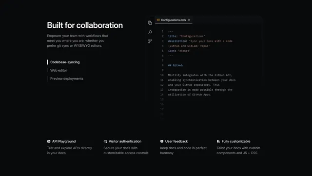
Dark feature section pairing a vertical tab list and a syntax-highlighted code editor mockup over a four-column icon feature row.
Summary
A black documentation feature section with a left vertical tab list and a right code-editor mockup, sitting above a four-column row of small icon features.
Visual description
Top zone is split: the left has a large white two-line headline (Built for collaboration) and a three-line muted intro, then a stacked tab list of three items (Codebase-syncing active with a white accent bar, Web editor and Preview deployments dimmer below). The right shows a realistic dark code-editor window with a tabbed file (Configurations.mdx), a left activity-rail of three icons, line numbers, and syntax-highlighted MDX content using an amber file badge and blue keywords. A thin horizontal divider runs full width, and below it a four-column row lists API Playground, Visitor authentication, User feedback and Fully customizable, each with a small line icon, a bold title, and a two-line description.
Key takeaway
Pairing a vertical tab list with a faithful code-editor mockup to demo a developer workflow, then resetting with a divider and a flat four-column icon row for the remaining features. The monochrome dark palette with a single amber and blue accent confined to the code window keeps the whole section calm.
Reuse notes
Best for developer tools and docs products where a believable code mockup carries the hero feature. The four-column row needs short, parallel labels to stay aligned. The realism of the editor matters; a generic placeholder would undercut the technical credibility.