Preview image. Unlock full-res
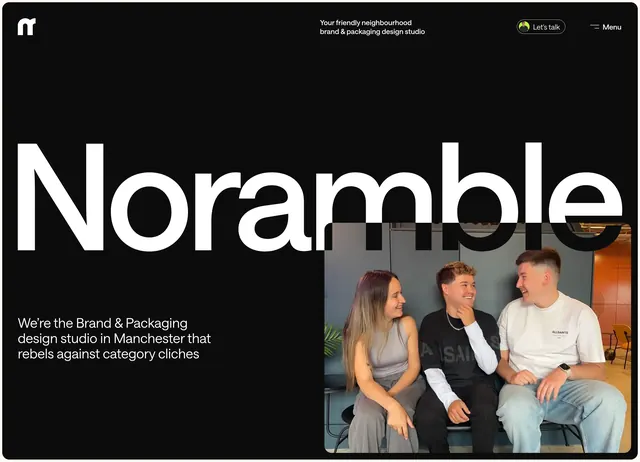
Black hero with screen-filling Noramble wordmark, minimal nav, and inset team photo overlapping type.
Summary
A stark black startup-style hero where the brand name at extreme scale is the primary visual, with a small team photo tucked into the lower right.
Visual description
Solid black background. Top nav: white lowercase "n" logo left, small white tagline center ("Your friendly neighbourhood brand & packaging design studio"), "Let's talk" outlined pill with avatar and hamburger "Menu" right. Dominant white "Noramble" wordmark spans nearly full viewport width. Bottom-left white positioning line about rebelling against category cliches. Bottom-right rounded photo of three team members on a bench overlaps the tail of the wordmark.
Key takeaway
Let the logotype do the hero work at maximum scale, then add humanity with one small overlapping photo instead of a full-bleed image.
Reuse notes
Agency homepages that want confidence and restraint. Long wordmarks need horizontal room; photo overlap only works on dark fields.