Preview image. Unlock full-res
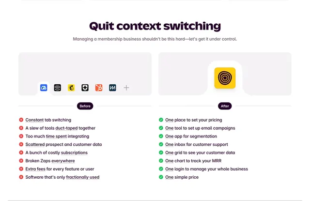
Before-and-after section contrasting scattered app icons and pain points against a single Outseta tile and unified benefits list.
Summary
Outseta Quit context switching comparison with icon sprawl versus single yellow app tile and mirrored pain and benefit lists.
Visual description
Purple headline and grey subcopy about membership complexity. Top row shows Before card with seven small third-party app icons plus sign versus After card with one large yellow Outseta icon in a white cutout. Purple Before and After pills divide the section. Bottom lists eight red-X pain points on the left and eight green-check One-platform benefits on the right in parallel columns.
Key takeaway
Visual icon sprawl immediately communicates tool fatigue; repeating One in every benefit line reinforces consolidation linguistically. Pill labels make the comparison scannable.
Reuse notes
Template for all-in-one SaaS positioning against best-of-breed stacks. Works best when recognizable competitor logos can be shown.
More comparison sections
See all











More like this



Keep what you find
A free account saves references to boards and can send you a weekly email of picks based on what you save.
To see every result, go Pro.