Preview image. Unlock full-res
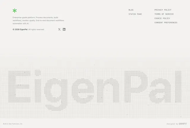
Light gray footer with compact company info and legal links above a full-width pixel-grid "EigenPal" watermark and a slim credit bar.
Summary
A light minimalist footer that leads with practical links and company blurb, then drops a massive pixelated brand wordmark as decorative filler before a thin location and design-credit strip.
Visual description
Very light gray background. Top row splits left and right: left side shows a small green asterisk-like logo, a short product description paragraph, copyright line, and X plus LinkedIn icons; right side holds two columns of small all-caps links (Blog, Status Page, Privacy Policy, Terms, Cookie Policy, Consent Preferences). Below, the word "EigenPal" spans nearly full width as oversized type built from a fine square pixel grid, slightly darker than the background so it reads as a watermark. Bottom edge: "Built in San Francisco, CA" left, "Designed by GRAFIT" right in small gray type.
Key takeaway
The pixel-grid wordmark turns dead footer space into brand presence without adding navigation clutter. Keeping utility links small and uppercase above the spectacle preserves hierarchy.
Reuse notes
Best for technical or AI-forward brands with a strong logotype. The watermark needs vertical room; cramped footers will lose the effect. Light backgrounds only; the pixel treatment disappears on busy imagery.