Preview image. Unlock full-res
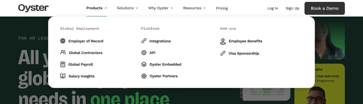
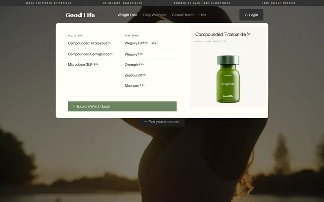
Minimal white navbar with a three-column products dropdown, monospace category labels, and line icons over a dark green hero.
Summary
Oyster header with Products megamenu open: three labeled columns of icon-linked items floating over a dark green homepage hero.
Visual description
White top bar with bold Oyster wordmark left, center nav links (Products active with up-chevron and green underline, Solutions, Why Oyster, Resources with down-chevrons, Pricing), and right-side Log In, Sign Up text links plus a filled dark "Book a Demo" button. Below, a large white rounded dropdown panel spans the content width in three columns with small gray monospace headers: Global Employment (Employer of Record, Global Contractors, Global Payroll, Salary Insights), Platform (Integrations, API, Oyster Embedded, Oyster Partners), and Add-ons (Employee Benefits, Visa Sponsorship). Each row pairs a thin black line icon with bold link text. The menu overlays a deep forest-green hero with partial large headline type and UI card previews visible at the edges.
Key takeaway
Monospace column headers inside an otherwise sans-serif nav to create hierarchy without heavy dividers. Active nav state uses a subtle green underline rather than a filled tab. Icon-plus-label rows scale cleanly across many links in a wide megamenu.
Reuse notes
Solid reference for B2B SaaS navigation with dense product catalogs. Requires a wide viewport; three columns will collapse on mobile. Dark hero beneath the white menu adds depth and makes the dropdown feel anchored, not floating in void.
More navbar sections
See all




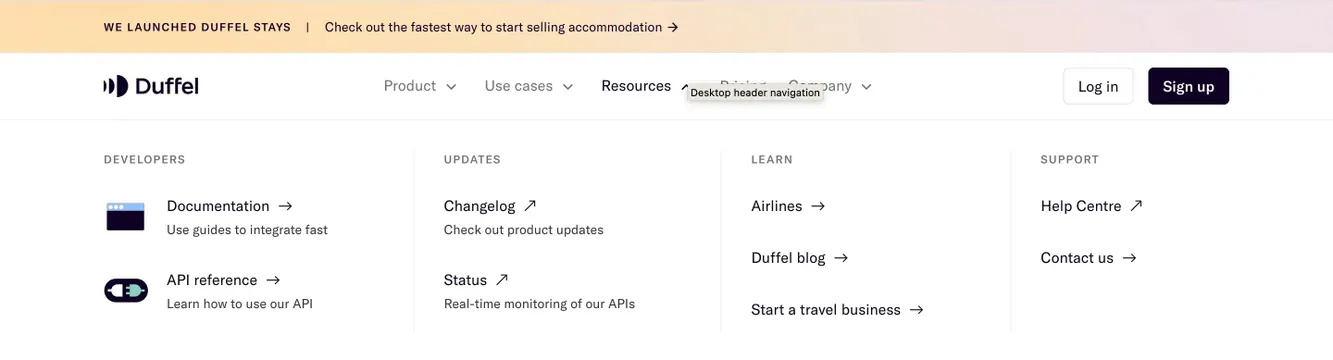
More like this
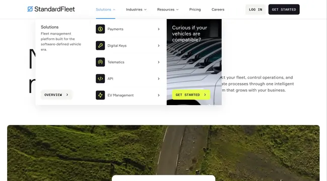

Keep what you find
A free account saves references to boards and can send you a weekly email of picks based on what you save.
To see every result, go Pro.