Preview image. Unlock full-res
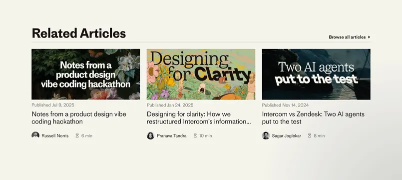
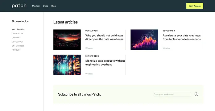
Dark nav over a white blog index with a left topic sidebar, three article cards with cinematic thumbnails, and a pale newsletter strip.
Summary
Patch's blog landing pairs a dark top bar with a topic-filter sidebar and a Latest articles grid of image-led cards, finished by a full-width subscribe row.
Visual description
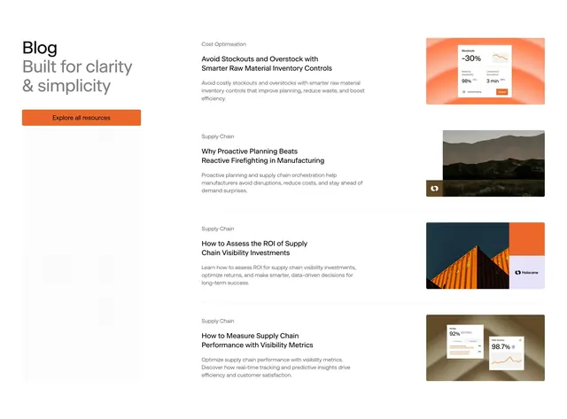
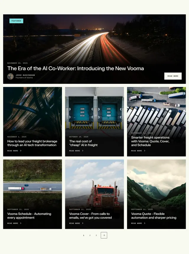
Dark charcoal header spans the top: white lowercase patch wordmark left, Product/Docs/Blog links center, and a bright lime-green Early Access button right. The main area is white with generous padding. A left column lists Browse topics in bold, then all-caps category links (ALL TOPICS active in darker weight). The right content column leads with a large Latest articles heading, then a two-column article grid (three cards visible). Each card has a wide cinematic thumbnail, small all-caps category label, bold black title, and light gray author name. Below the grid, a pale mint-green band holds Subscribe to all things Patch on the left and a work-email input with circular arrow submit on the right.
Key takeaway
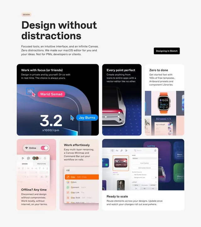
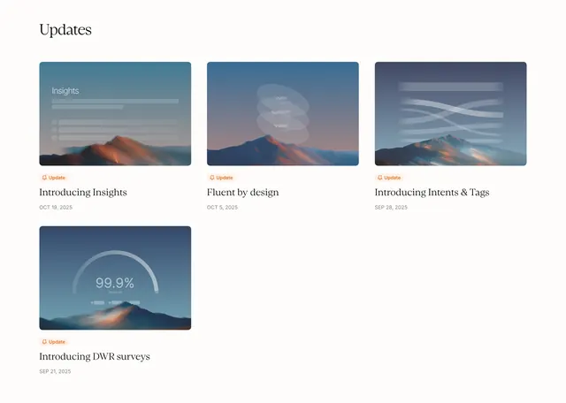
The sidebar taxonomy that makes a content hub feel browsable without tabs. Large moody hero images on every card give a developer blog a premium editorial look while copy stays minimal.
Reuse notes
Good reference for technical company blogs that need category wayfinding plus list density. The lime accent only appears on the primary nav CTA, keeping the article area calm. Capture includes nav and newsletter, not a single hero block alone.