Preview image. Unlock full-res
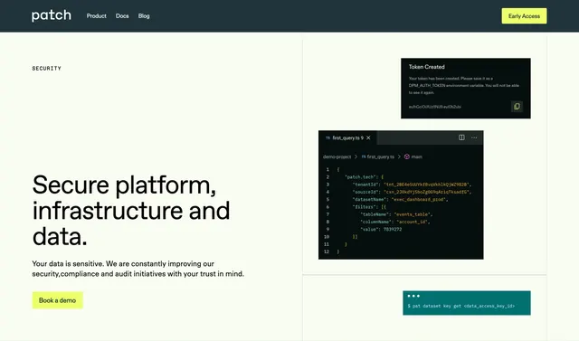
Split security hero with cream copy and Book a demo CTA on the left, layered developer UI mockups on the right under a dark Patch nav.
Summary
Patch's security page hero pairs trust copy and a lime demo button with stacked token, TypeScript config, and terminal visuals that prove the platform is developer-native.
Visual description
Dark charcoal top bar: lowercase patch wordmark left, Product/Docs/Blog links center, bright lime-green Early Access button right. The hero body uses a pale cream background in a roughly 40/60 split. Left column: small spaced SECURITY label, oversized bold headline Secure platform, infrastructure and data., muted paragraph about trust and compliance, and a lime Book a demo button with dark text. Right column layers three product mockups over a faint grid: a compact dark Token Created alert with blurred secret and copy icon, a black code editor titled first_query.ts showing JSON tenant and filter config, and a teal terminal header with $ pat dataset key get <data_access_key_id>. Mockups overlap slightly, implying depth without heavy shadow.
Key takeaway
Security messaging backed by real-looking dev artifacts instead of stock shields or locks. The cream-and-lime palette keeps a serious topic approachable while the code stack sells technical credibility.
Reuse notes
Ideal for developer-platform security landings where demo booking is the conversion goal. Right-side mockups need legible monospace at capture size; trim snippets if scaling down. Includes full nav, so crop or adapt if reusing only the hero body.