Preview image. Unlock full-res
Centered process section that uses a three-stage architecture diagram of dashed boxes and connector arrows to explain the data flow.
Summary
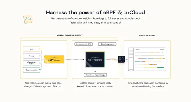
A centered how-it-works section that explains the product through a literal architecture diagram: three grouped stages connected by dashed arrows, each captioned with a one-line benefit. The defining element is the diagram itself acting as the layout.
Visual description
A monospaced centered headline "Harness the power of eBPF & inCloud" sits over two lines of grey sub-copy and a small note-paper-with-cloud icon. Below, two large dashed rounded containers labeled "YOUR CLOUD ENVIRONMENT" and "PUBLIC INTERNET" group the diagram. Inside the first, four stacked input boxes (Logs, Traces, Infrastructure Metrics, Custom Metrics) feed a yellow "groundcover eBPF Sensor" box, which connects by dashed arrow to a dark "groundcover inCloud Backend" chip flanked by "Enrichment with OTel" and "Cloud Integrations" tabs and a "Retention to Object Storage" box. A shield icon bridges to the second container, which holds a simplified dashboard window of colored timeline bars. Three short grey captions sit beneath the three stages.
Key takeaway
Using a real architecture diagram with grouped dashed regions and dashed connector arrows lets a technical product show exactly how data moves, which is more convincing to engineers than abstract feature copy. The two large labeled enclosures ("your cloud" vs "public internet") communicate the security story spatially.
Reuse notes
Best for infra, security, or data-pipeline products whose value is the architecture itself and whose audience is technical. The diagram must stay legible and uncluttered; too many nodes and it becomes unreadable. Pairs with the brand's monospaced headlines and yellow accent components.